Design Systems Case Study (IPTS)

The Case Study
This was part of the final submission to Dribbble’s ‘Design Systems Course’ created by Dan Mall. With the help of several mentors, this 8 week course taught the best practices and strategy in creating a scalable and flexible Design System. The following case study is the result of our 8 week deep dive of this design discipline.

Context (Project Brief)
You’re the Head of Digital for the newly launched
IPTS: the Interplanetary Travel Syndicate, a bustling transportation network that shuttles people from world to world within our galaxy. Leadership has decided to launch with 3 unique offerings:
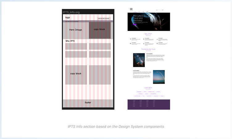
1) IPTS.org- an informational website where you can find the latest news and happenings with the IPTS.
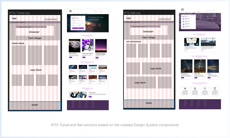
2) IPTS Travel- a website where you can browse and book travel to and from multiple destinations within our galaxy.
3) IPTS Rail- a real-time updated web app where you can view lines, routes, and times for all the different commuter lines.
Your job is to create all three websites. Each website has to be at least 1 page with at least 5 components on it.
==============================================================
Goal
To build a Design System that is flexible and scalable for the IPTS product.
Problem To Solve
The IPTS has 2 product offerings with their own set of specific user needs. I needed to create a UI (ultimately a Design System) that is usable, scalable, and allows the user to complete their jobs to be done.
Duration of Project
March 24 - April 13 (3 weeks)
==============================================================
Roles and Responsibilities
For the IPTS (Inter Planetary Travel System) Project, I had to wear different hats. My primary role was to serve as the Design Director for the Design System in overseeing the strategy in building the system from the ground up. As the
UX Designer, I researched into benchmarks of similar sites looking for patterns our users are familiar with. I took on the role of Information Architect in laying out what components were needed for each page of the product’s offerings, displayed on 3 separate websites. And lastly, I acted as the UI Designer in creating those components needed for the system based off of the research findings. While I would have gladly pushed the role of UX Researcher in investigating our user base further, conducting usability studies, etc. this was unfortunately out of scope.
Tools Used:
Figma
Google Spreadsheets
==============================================================
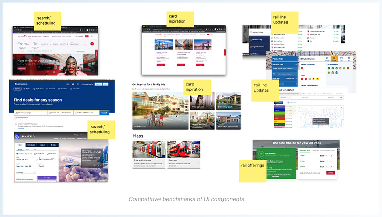
The Research Goal and Overview
My goal in the initial research was to get an understanding of the ‘landscape’ of the product space that IPTS was entering.
Since conducting any focus groups interviews, drilling into consumer insights, etc. was out of scope for this project, I relied solely on looking at competitive benchmarks of companies that offer similar offerings. From there, I was able to get an understanding of what users can come to expect when entering the site and seeing the product offerings. And then from an Information Architecture and Content Strategy standpoint, I gathered ideas as to how to set up the pages.
Lastly, putting together common UI traits from the benchmarks allowed me to notice patterns emerge, and I was able to decide what design components were needed to get the product offering at an MVP (minimum viable product) level.
==============================================================
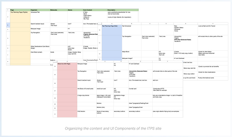
Information Architecture
From here, I then wanted to place the information for the different product pages in a structure that allows for decisions to be maintained at a high level
Process
After going through benchmarks, I was able to write down what a lot of the sites had in common on each of their pages. For example, with airline companies,
I knew that having some type of ‘tab system’ would be needed so users could quickly toggle through bits of related information.
Using a spreadsheet was the best format for organizing these buckets of information, as it allowed me to focus purely on the information and not get caught up with any visuals.
==============================================================
Creating the Components
With a rough checklist of components now scoped out, it was time to start documenting them, and creating them. The goal was to have a repository that was flexible and scalable for the various components. This was all done in Figma.
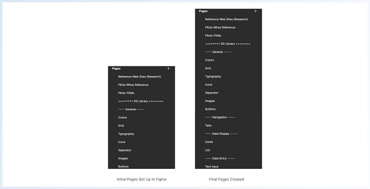
Component Process (Page Set Up)
In Figma, I had already created a page of research, and now I needed to create pages for my components. I first started laying out a few general pages I knew I needed to make: typography, colors, icons, etc.
I also created my general wireframe pages in the ‘Pilots-Wires Reference’, and the eventual final mocks in the ‘Pilots-Final’
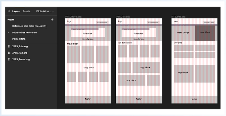
Component Process (Grid System)
In the ‘Wires-Reference’ page, my intention was to figure out my grid system for spacing. I started my web pages with a 1664 px width. Based on my spreadsheet, I knew I would have different card blocks, separators, navigation tabs, etc. For the time being, I simply created wireframe boxes that would stand in for these UI components. I would go back and forth, between grid spacing, and updating card widths, until I landed on a layout that I was satisfied with.
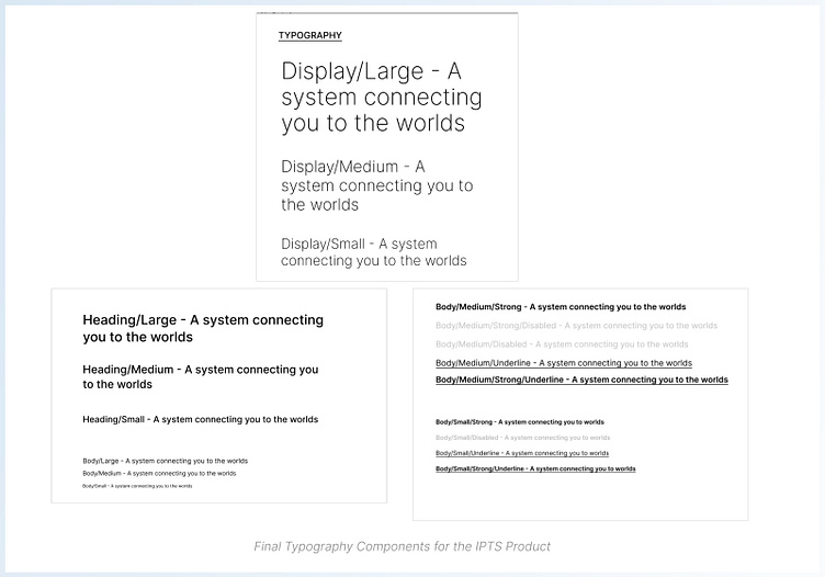
Component Process (Typography)
With the grid in place, I then quickly set up my typography pages. I started with this because as an Atom component, the Typography could help me quickly build out smaller molecules from there, such as tabs and buttons. I leaned a bit on Ant Design and Material 3 Design Systems in setting up my type hierarchy, and giving a proper naming system (i.e. Display, Heading, Body, etc). I created a few sizes of typography (almost arbitrarily) as I knew I could quickly edit these sizes as I went along the design.
And as I went along creating components such as tabs, input forms, etc. I found that I would later need specific weights as well. This led me to creating disabled, underlined, and even bold/disabled states.
This ‘back and forth’ of atoms to molecules, was the common workflow as I went along expanding on the site of the product.
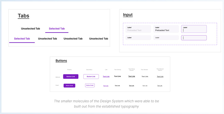
Component Process (Tabs/Buttons/Text Inputs)
As mentioned, with typography in place, I was able to move to smaller molecules such as tabs, button, even text input fields
For color, I arbitrarily chose a color, (again, to save time!) as I had the intention to circle back to proper color decisions, once I started piecing together the components.
==============================================================
Growing the Components
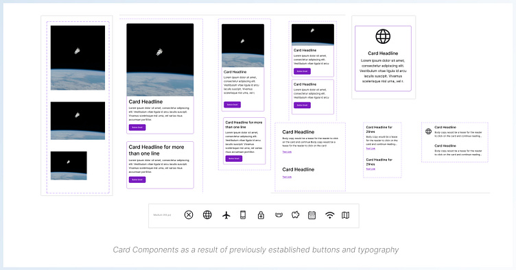
With the Atoms and small molecules defined, I was now able to move forward with the larger molecule of Cards.
Component Process (Cards)
Again for sake of time, I just followed a simple card UI of:
Image(or Icon)/Headline/Body Copy/Link. And because I’ve already laid out my grid and simplified wires, I knew what different widths I would be working with. Establishing different atoms and sizes to the card, also was beneficial in giving me some versatility to different layouts of the site.
And as mentioned earlier, I would have to revert back to creating atoms
(e.g. images and icons) when I realized there were smaller components that were needed to build up the card.
==============================================================
Putting It Together!
With my rough wireframes and grid in place, I was now ready to assemble an early version of my different product pages. I started with the travel site as I thought that would be the main draw for the product, with rails and the info page to follow. However, I would still make sure to work on all 3 sites together in order to keep consistent in designs.
Along the way, I allowed myself to update the designs, if I felt the overall feel looked too structured and flat. And while I did have the template as reference, I certainly was not tied to it.
==============================================================
Not So Final Words...
In order to deem this Design System successful and usable, we would need to see how the components stand up to change. As part of the case study, we were also thrown a bit of a 'monkey wrench' to test if the system we created, can be seamlessly edited to allow for quick shipping. I created the Shuddle Case Study to prove that this Design System was scalable.


