#85 Green & Black's


Country: Great Britain
Industry: Food and Beverage
About: Green & Black's is a British chocolate company founded in 1991 by the couple Craig Sams and Josephine Fairley, organic food pioneer and journalist. The name was derived from a wordplay — "Green" standing for the environmental concerns of the founders, and "Black" for the high cocoa solids chocolate they wished to provide. The company produces a range of organic food products, including: chocolate bars, ice cream, biscuits and hot chocolate.
Words: Organic; quality; chocolate
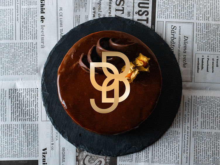
Strategy: I decided to design an alternative version for the brand logomark. I started with redesigning the initials “g” and “b” using drop-like shapes (resembling both a natural element and a drop of chocolate) and intersected one into the other. i kept the particular color shade and intensified the gold effect in the gradient between the two letters.