ROCK CLIMBER PORTFOLIO

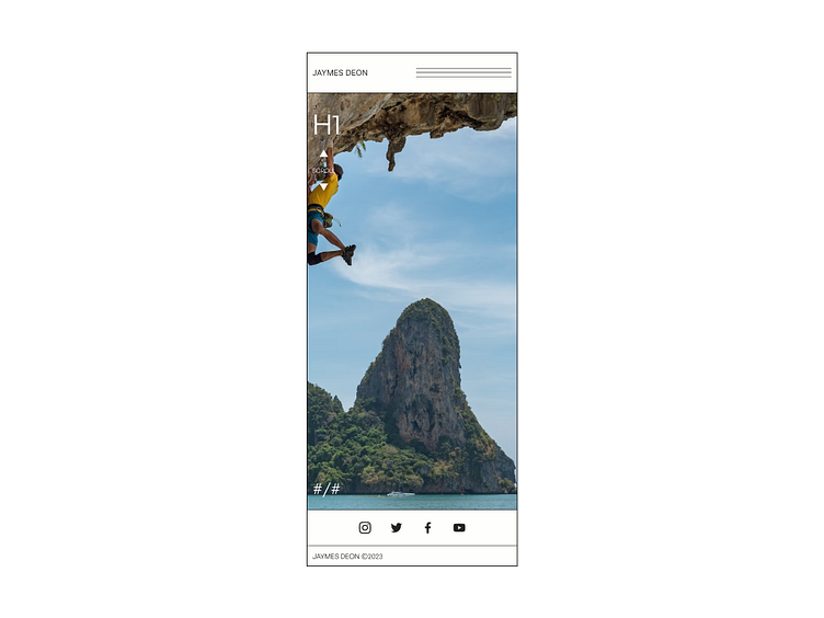
LANDING
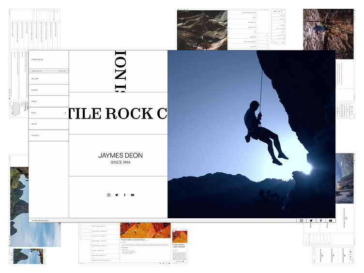
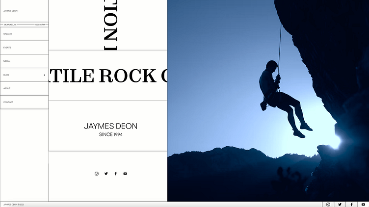
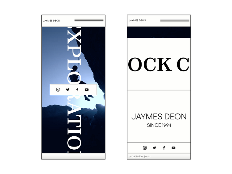
As you enter the website, the first thing you notice is the marquee text that both horizontally and vertically scrolls in an endless loop. An image of the climber with his name and birthdate follow up the moving text with a call to action of all their social medias.
GALLERY
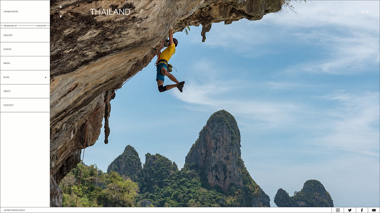
Some of the most inspiring content that we get from rock climbers is the photography of their incredible feats. The gallery page consists of a scrolling image layout with titles that allow the user to get more insight on the specific shots.
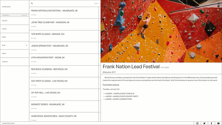
EVENTS
A rock climber is always traveling to the next big event. The events page allows a user to keep up with where their next stop is. There are more details on each event, describing more about it.
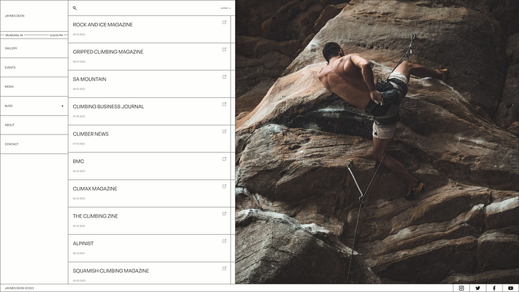
MEDIA
There are many forms of media in the rock climbing bubble. The media page highlights some of the climbers public appearances by leading a user to an external link to the content.
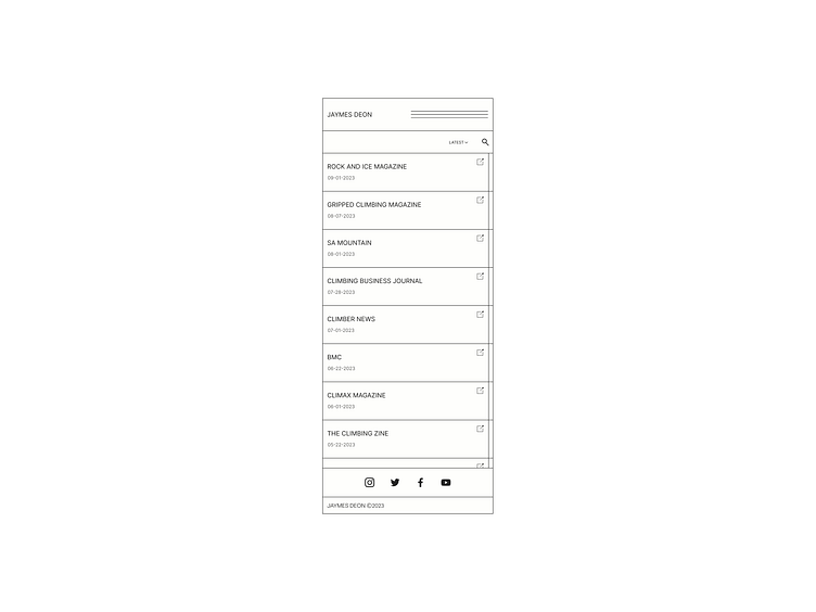
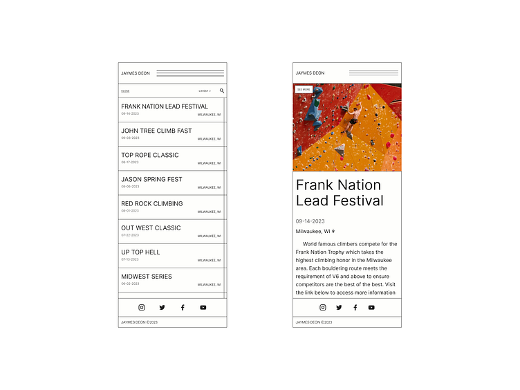
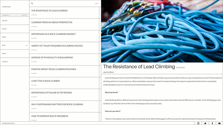
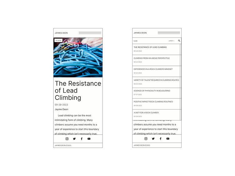
BLOG
A professional has a lot of information and tips to share, so a blog would be a great asset to the website to build more content and SEO. A user can navigate through the blogs via the navigation and sort/search them on any page.
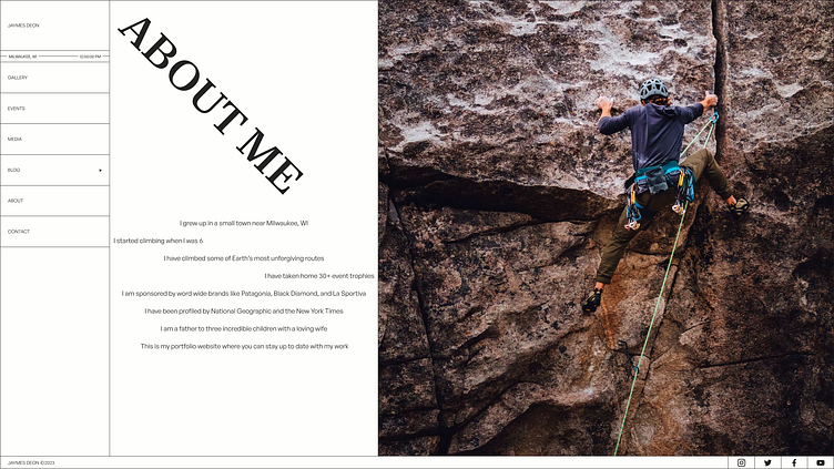
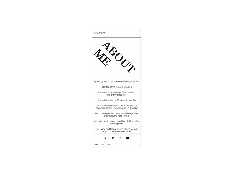
ABOUT
Bio pages are usually boring to read... This page offers a more unconventional text layout that lets the user's eyes go for a little ride.
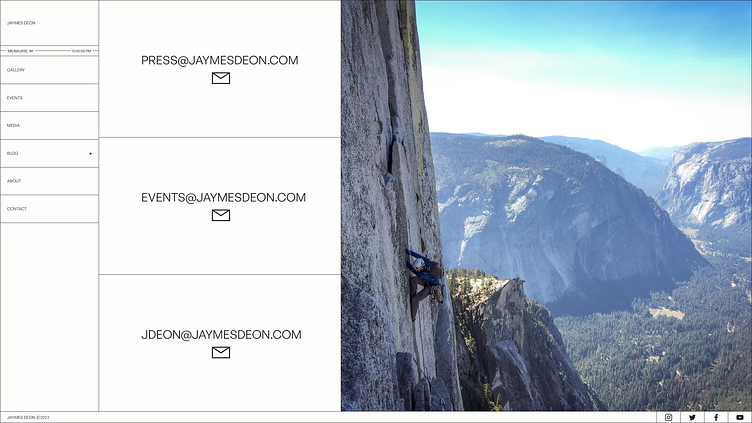
CONTACT
Multiple emails are displayed on the contact page, which easily allows for specific connection channels.

WEB DESIGN PROCESS
USERS
Two demographics were in mind for this design. A user that is a fan of the rock climber and a user that is interested in collaborating with the rock climber These personas were used to determine the pages and functionality of the website.
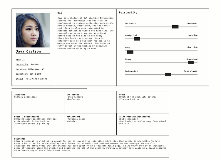
Jaya's persona helped determine pages such as Gallery, Media, and Blogs, so she could stay up to date with the rock climber she's interested in. This also gave insight on the social media CTA on the landing page to help build a following for the climber.
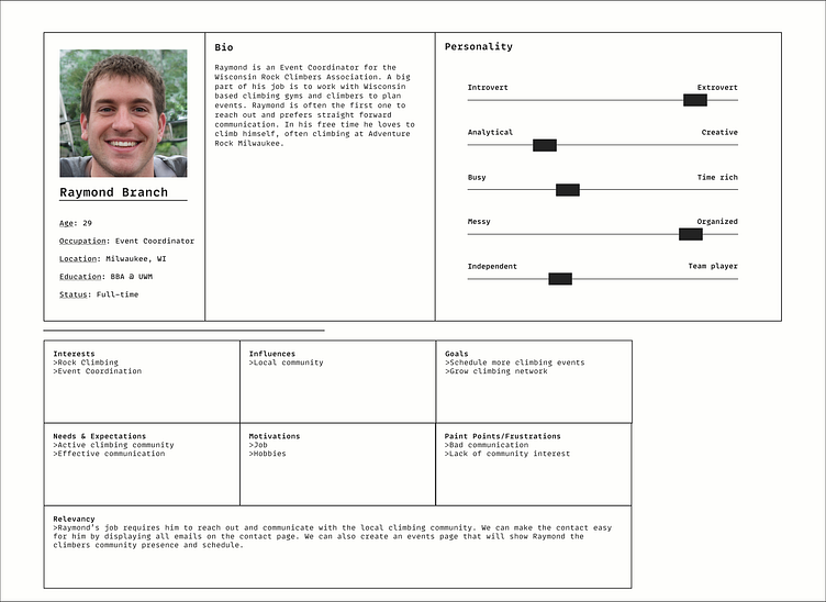
Raymond's persona gave more life to the Events, Media, and Contact pages. Having a collaborator in mind was beneficial to the idea of highlighting the public appearance of the climber.
STYLE GUIDE
The main pieces of the style guide were the color palette and typography styles for the design. This also determined a 12-column grid layout for desktop frames and a 4-column for mobile frames.
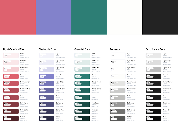
The triadic color palette is used to give great contrast and a better aesthetic to the design. Neutral tones used in this were slight off-tones of white and black, complementing the palette even more.
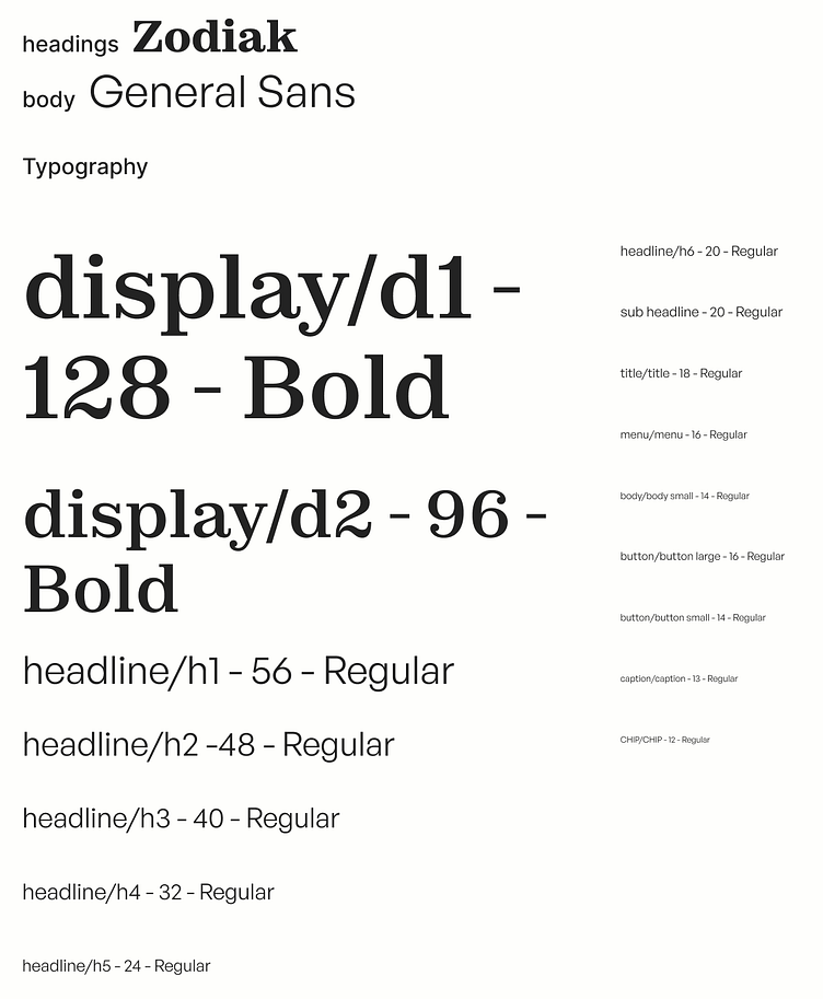
Zodiak was used as the display family and General Sans as the main content text.
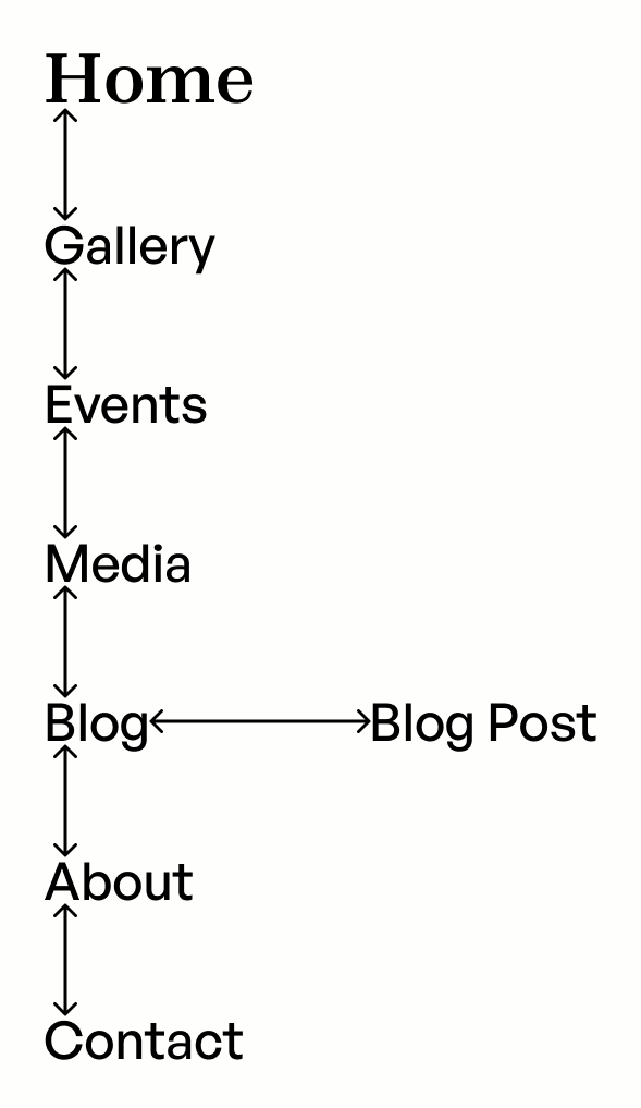
SITE MAP
The navigation of this website needed some site mapping to make things clear for the design. It's pretty simple, you can switch to almost any page from the always showing navigation.
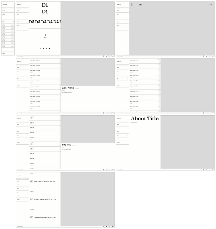
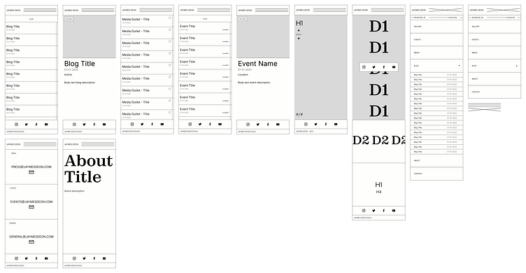
WIREFRAMES
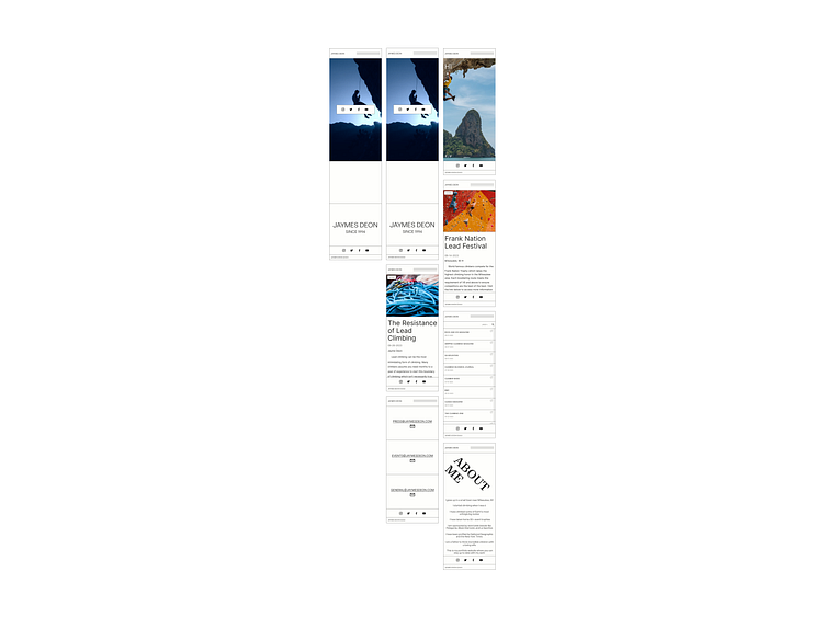
With the sectioned-off design, the wireframes in this process made the mockups very easy to create. These determined the layout for desktop and mobile views, with mobile navigation included.
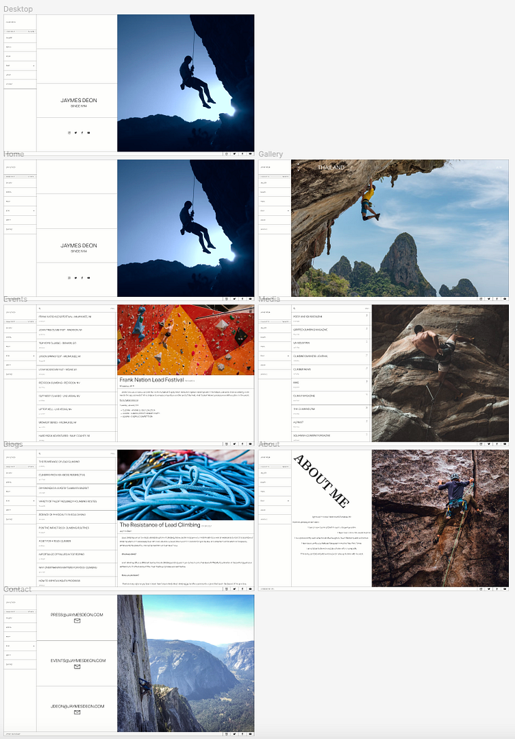
MOCKUPS
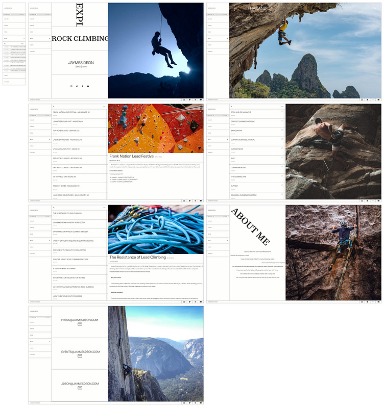
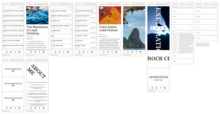
The levels between the wireframes and mockups are not too different, but in the mockups, more realistic and specific content was created. A more realistic look at the design gives a whole lot more meaning to it.
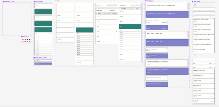
COMPONENTS
Moving pieces for the design felt like a requirement. The main highlights of this design were going to be the marquee text and navigation. These components were highly reusable and powerful for the prototype in both desktop and mobile views.