Design Systems: Why Use Them?

You may have heard of the hot new term in web design: Design Systems. If you're anything like me, you've heard the term but it's left you with more questions than answers...things such as:
What they are?
How are they used?
Should my design team build one?
Is it too late for me to start one??
Well, I'm here to tell you I went to the edges of the galaxy to find the answers and would love to share them with you.
The Basics
What is it?
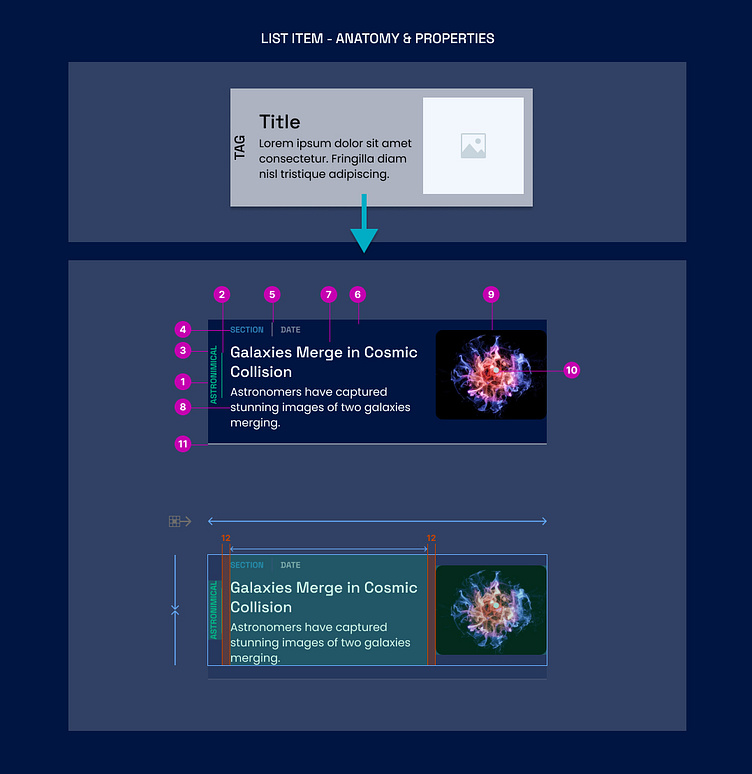
In simple terms, a Design System is a library of reusable components and principles that help maintain a consistent visual and functional design across an application or website.
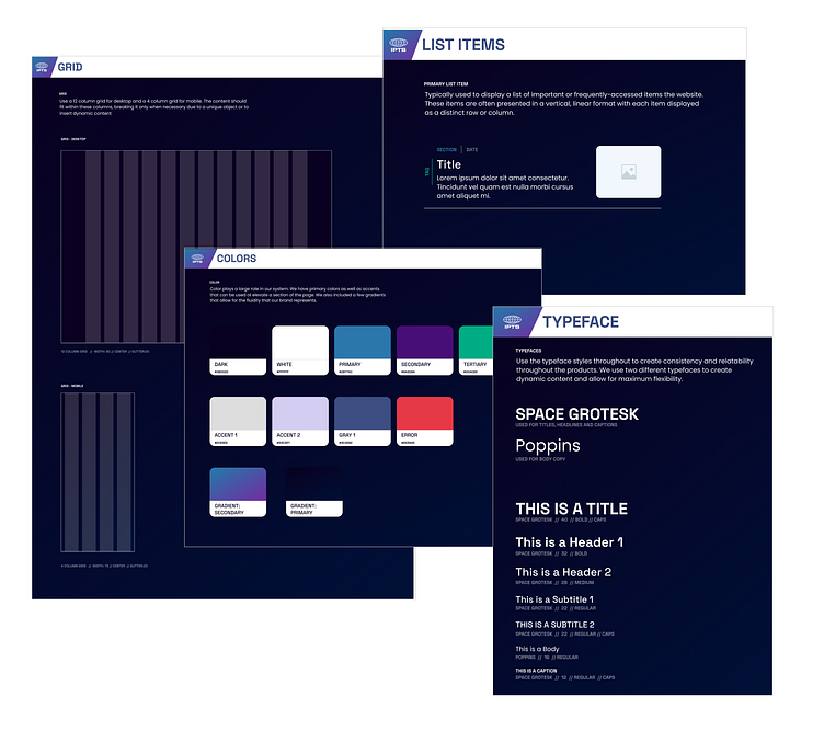
Some common elements that are typically included in a Design System are:
Typefaces
Colors
Specs and guides for components
Components that have been shown
Grid layout
Code snippets for developers
They streamline the design and development process, increase efficiency, create consistency, and ensure a cohesive user experience. They help teams avoid duplicative effort and minimize inconsistencies in design and functionality. Ultimately, this leads to a more polished and user-friendly end product. For future designs, designers can spend 20% of their time leveraging a design system and it's components, and then the remaining 80% creating something unique and new for that particular feature.
How we do it?
There are two main phases at which a design system can be started. It depends on your team and the project ahead of you to know which direction to head in. Each scenario has it's own considerations.
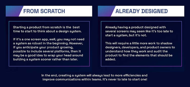
The Creation
Great and all... but let's see it in practice!

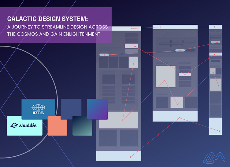
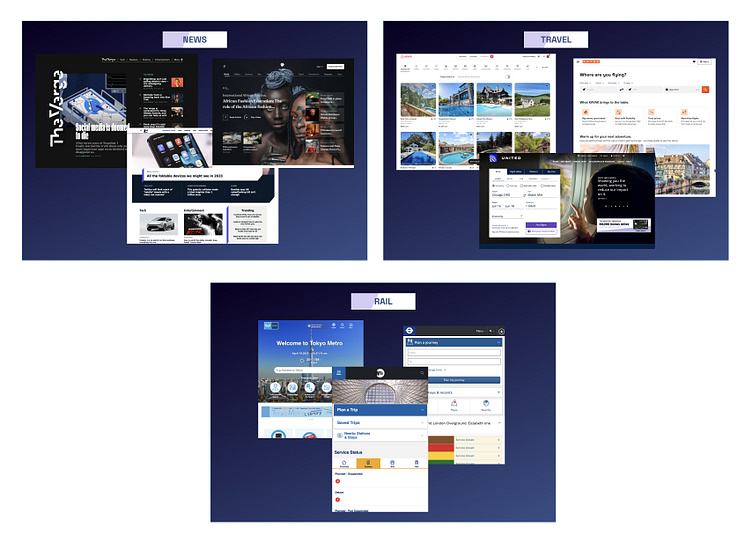
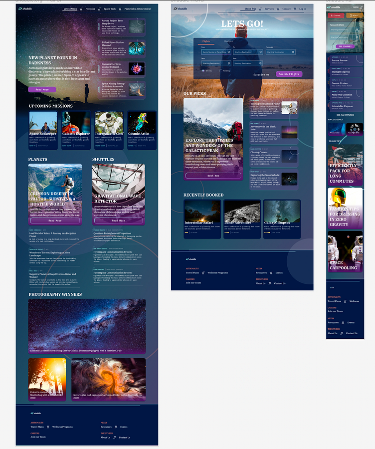
Let's pretend we work for a newly launched company: IPTS: the Interplanetary Travel Syndicate. The task at hand is to designs 3 sites that live together but are different in use and even style.the three sites are outlined as
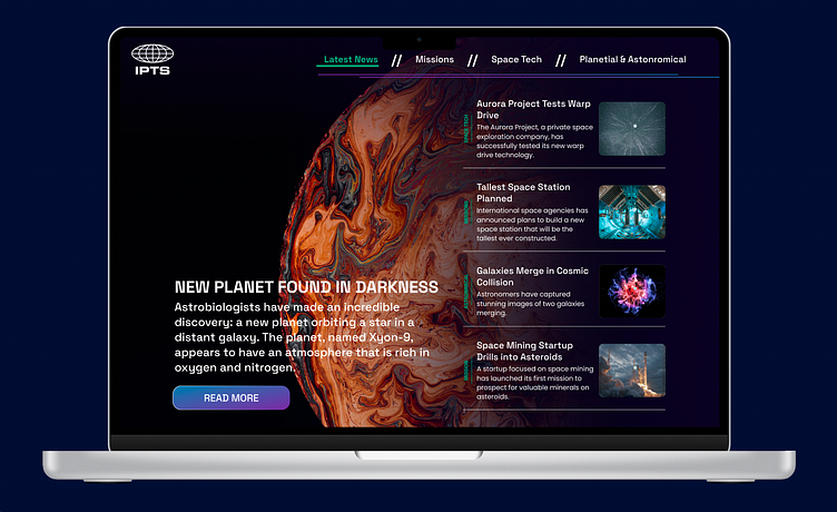
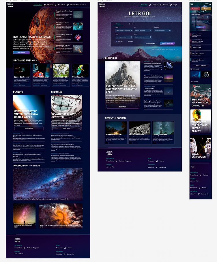
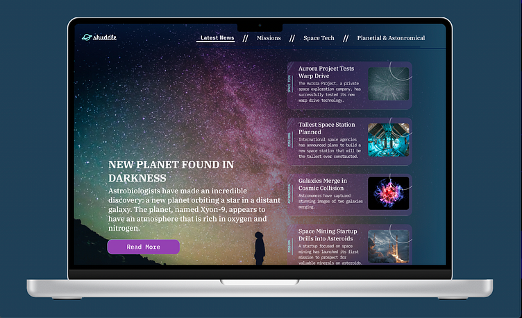
Ipts.org, an informational website where you can find the latest news and happenings with the IPTS
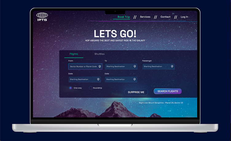
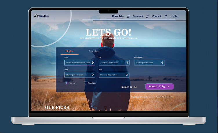
IPTS Travel,a website where you can browse and book travel to and from multiple destinations within our galaxy. Like Expedia for space.
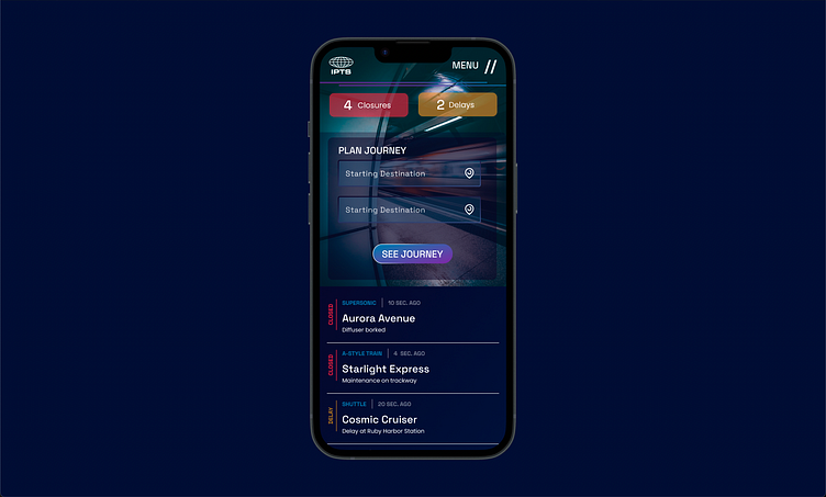
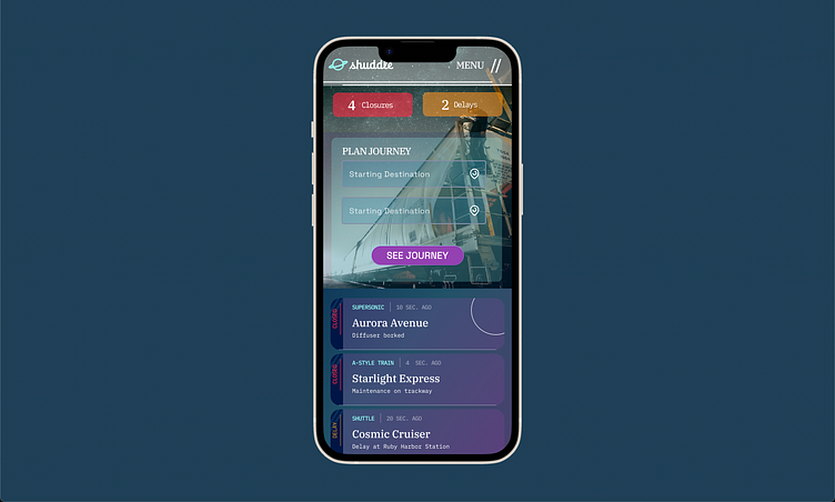
IPTS Rail, a real-time updated web app where you can view lines, routes, and times for all the different commuter lines. Think NYC subway or the London Underground, but for interplanetary travel.
Numbers 1&2 should be desktop first and #3 is mobile first.
We have been given the brief and the logos, everything else is up to us.
So let's get to work!
The Process
1. Research
Like any other project, I started by doing some research into how others have solved these problems. Since we had a news, travel and rail sites, I focused on those in both desktop and mobile views.
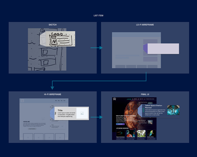
2. Sketch
During this part, I started to think about the "main ideas" and what elements start to arise as being similar that I can start to think about as the first atoms, molecules, and organisms I can include in my Design System. Basically, what are the smallest and most basic element that cannot be broken down further and then the ones that are made up of those elements. Brad Frost has a great book on this concept.
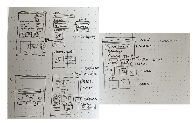
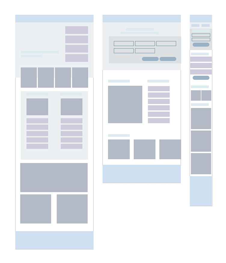
3. Wireframes
At this stage, I can very clearly confirm if the patterns I started to see when I was sketching can really be re-used throughout the products.
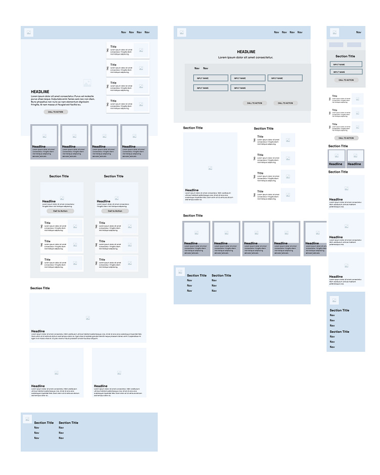

4. Build out Components
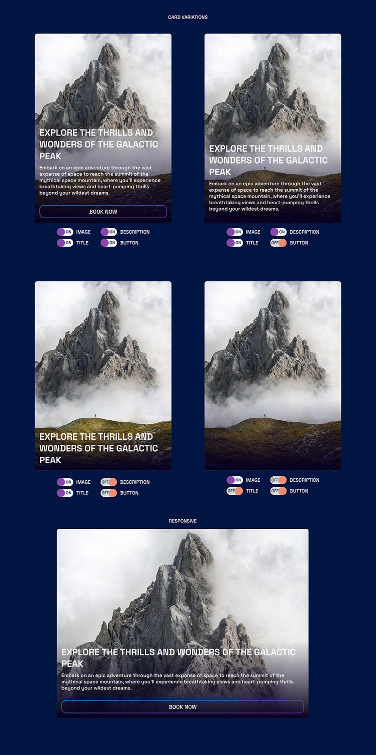
The higher the fidelity becomes, it becomes very apparent that we now have our first components that can be created as part of our design system. A good rule of thumb is use the rule of 3... so after 3 times that a pattern is used, that is a good indication it should be included in your system. The thing to keep in mind here, is that even if an element looks slightly different, they may still be the same component, just with some variation built in that can be toggled on/off.
5. Chronicle Usage & Specs
As I continue to mold my components, I also chronicle how they are to be used so that other designers and engineers can easily use them in their designs and communications. It doesn't matter if I don’t get it right the first time, it’s a living document and there is always room for change and improvement.
5. Build out the UI
The fidelity becomes greater and my new components seamlessly get dropped in as I build out the UI. The thing to keep in mind here, is that even if an element looks slightly different, they may still be the same component, just with some variation built in that can be toggled on/off.
6. BAM! All done!
Now I can sit back and enjoy the new site! (with a margarita in hand)
The Twist & Validation of System
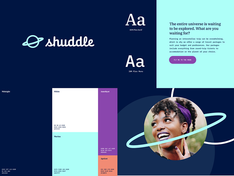
The time when a design system really shines is when a client, stakeholder, or team decides to change the look of a component that is being used throughout the entire product. Or, in this case, when there is a large overhaul of colors, logos, type, and foundational elements.
So let's add that twist in, there's a new brand in town and we now need to adapt all our designs to it.
Putting it to the test
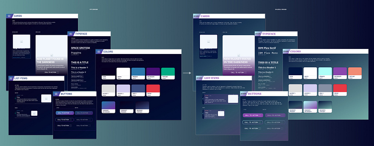
Well, this shouldn’t be too much work. Due to the magic of my design system, I will only have to create a new library and swap them out, as long as I keep the layer names the same, it should magically convert…hopefully.
Voila!
Now, we just need to go in and choose new images, make some tweaks to the background patterns, and modify any components to make it match the brand closer. Remember, we spent 20% of our time doing this, so the 80% we have left can be to make things unique and special.
One System to Rule them all
So what are they good for? Well, they are invaluable in saving designers and developers time by ensuring everyone is on the same page. This leaves most of the creative muscles to be used in creating distinct elements that wow users and allow them to engage with the product in unique ways...or you know, you save enough time to grab that margarita after work. Sit back, relax, and bask in the glory of your own efficiencies.
Thanks for joining me in this journey!
Now, go forth and create your own systems!


