Flatish Instagram Icon

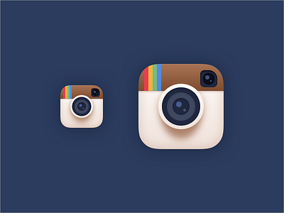
So sometimes I get a bit restless and just make something random. In this case I decided to do a new take on Instagrams iOS icon.
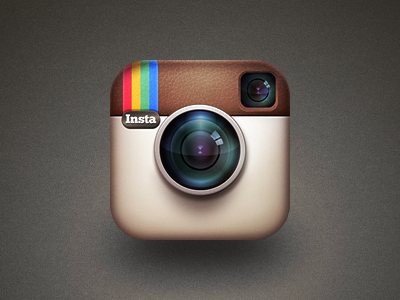
The current icon is great - in a vacuum. The icon doesn't live in a vacuum however, it lives in iOS, and that means it has to fit in. Ever since iOS 7 the Instagram icon has looked dated on the home screen next to its neighbours.
And while a redesign is needed I don't think they should throw everything out of the window and start completely fresh like with the watchOS icon that just features a white glyph over a background of Instagram-blue. The current icon carries to much brand recognition to be scrapped, they should just get the iron out and flatten it a bit!