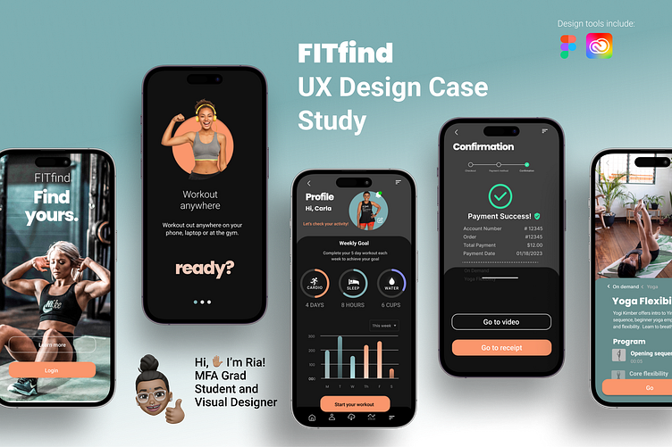
FitApp case study

The product
Fitness mobile app for busy fitness enthusiasts, in urban or suburban regions, ages 18-62
Project duration
November 2022 to February 2023
The problem
Customers (users of the FITfind FitApp) want to solve pain points for the following:
• take fitness classes anytime or anywhere to accommodate busy schedules
• find local classes to maintain health and wellbeing and
• network with other fitness enthusiasts for opportunities
The goal
Our Fitness Mobile App FITfind will let users Increase individual health (exercise) which will affect how users feel about their health by giving them ability to easily find new local classes, on-demand online classes, and network with other users.
My role + responsibilities
Lead User Experience Designer • Information Architect • Interactive Designer • UX Writer • UX Researcher
Developed user journey-maps, user stories, affinity maps, competitive analysis, wireframes, storyboards, using persona demographics and data from Usability Studies. Created paper wireframes, low-fidelity, high-fidelity mockups, and UI assets for user interface. Provided user research data for design of a responsive mobile application. Wrote preliminary UX copy for app.
Understanding the user
User research summary
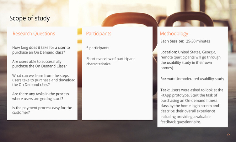
Research goals: We’d like to figure out specific difficulties users encounter when they try to complete the core tasks of purchasing On Demand fitness classes, specifically navigation and menu task options.
Second Usability Study: Our first usability study was on December 27, 2022. On February 5, 2023, we conducted a second usability study with five participants of various demographics using unmoderated survey study including methodologies, research questions, prompts, and questionnaire, during Jan 30-Feb. 6, timed for 25-30 minutes.
Important Findings: Significant changes were revealed during the two usability studies resulting in iterations that improved the overall design of our FITfind FitApp focusing on the users' pain points, problems and goals statements, journey maps and user flows. Overall, user’s’ wanted easy to use navigation, menu features, and intuitive functionality that solved their workout goals (local and online fitness) availability and networking capabilities.
Defining the User
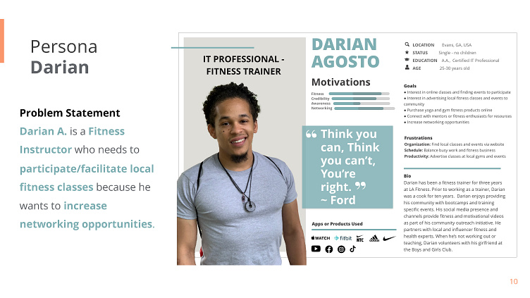
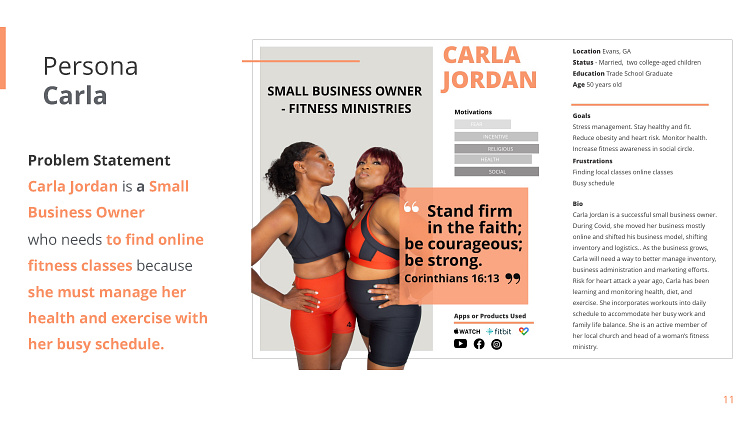
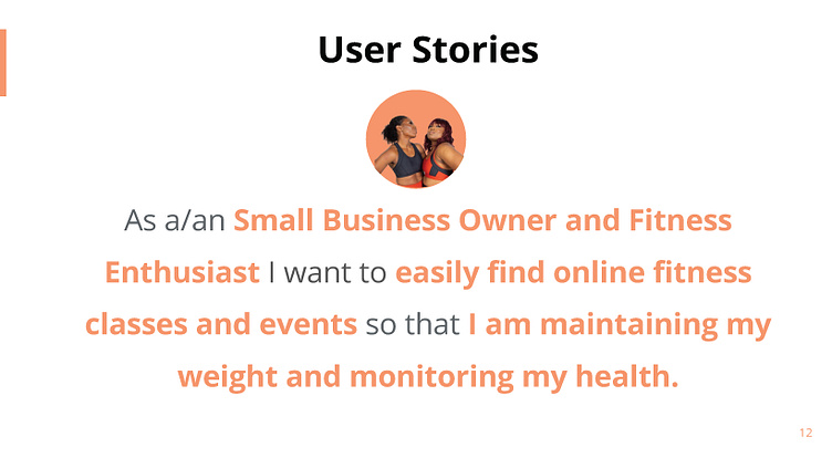
Empathizing with Personas, Problem Statements, and User Stories
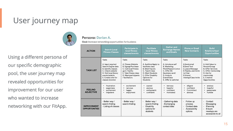
User journey maps
The user journey maps allowed my research to uncover specific details such as how the users of our FITfind app would maintain health and wellness with on-demand classes and opportunities for improvement for our user who wanted to increase networking with our FitApp.
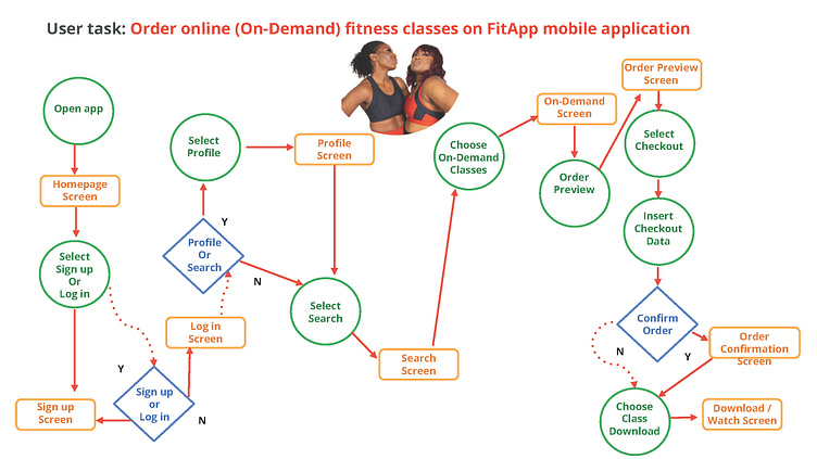
User flow diagram
User flow diagram helped greater understanding of Persona use of FitApp steps through the mobile application choosing On-demand classes screen selection and user navigation and choices to completion of tasks and thinking process.
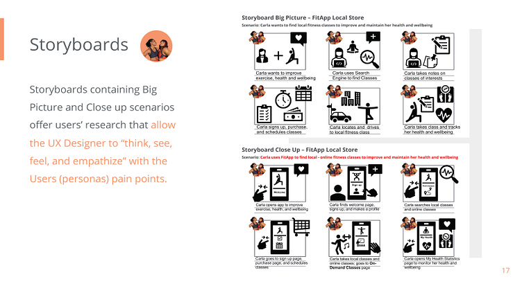
Storyboards
Storyboards containing Big Picture and Close up scenarios offer users’ research that allow the UX Designer to “think, see, feel, and empathize” with the Users (personas) pain points.
Storyboards further provide users’ experience with the FITfind FitApp exploring the user’s journey and ideal flow. Big Story and Close up storyboards tell a story a persona encounters using your product based on problem statements, goal statements, and paint points. Big Picture, what the user needs. Close –Up, how the product works.
Starting the design
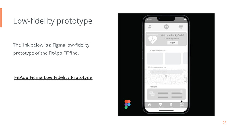
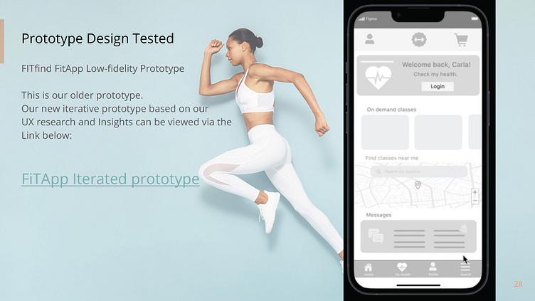
Paper wireframes, Digital wireframes, Low-fidelity prototype
and Usability studies.
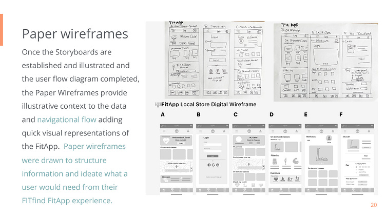
Paper wireframes
Once the Storyboards are established and illustrated and the user flow diagram completed, the Paper Wireframes provide illustrative context to the data and navigational flow adding quick visual representations of the FitApp. Paper wireframes were drawn to structure information and ideate what a user would need from their FITfind FitApp experience.
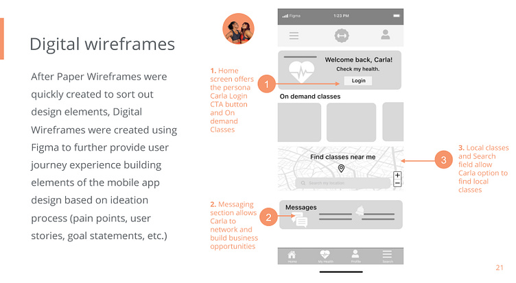
Digital wireframes
Once the Storyboards are established and illustrated and the user flow diagram completed, the Paper Wireframes provide illustrative context to the data and navigational flow adding quick visual representations of the FitApp. Paper wireframes were drawn to structure information and ideate what a user would need from their FITfind FitApp experience.
The User Persona, Carla, wanted to purchase On-demand class options for her busy work and home life schedule.
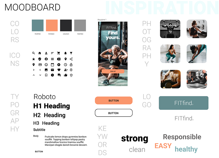
UI Design Branding
Usability Studies
Project Background
We’re creating a new fitness app called FitApp to allow busy people in the Georgia communities to have the option of finding local fitness classes or purchasing On-demand classes for monitoring their fitness needs and allowing networking reach.
In this phase of research, our team focused specifically on user segments purchasing an On-demand fitness class, using KPI metrics methodology, insights and recommendations to iterate further app development and design to solve potential customer (user) pain points.
Thus, from our Research Study & Report, our development and design team hopes to create a FitApp for users that is easy and simple to use allowing fast and intuitive navigation to minimize user error rates while increasing higher conversion rates.
Insights, Themes and Infinity Mapping
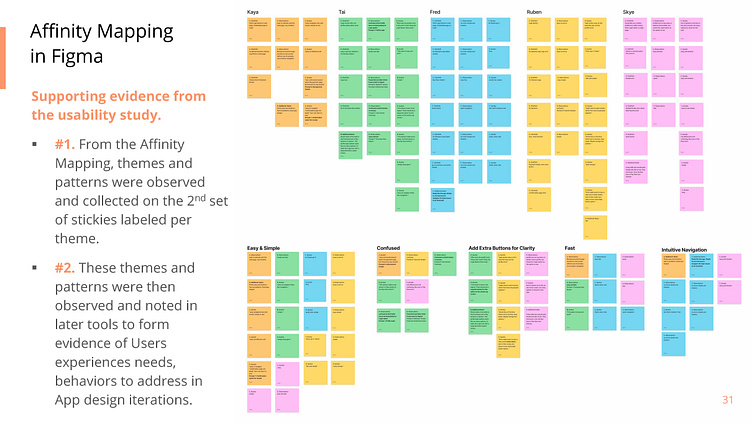
Affinity Mapping in Figma
Supporting evidence from the usability study.
#1. From the Affinity Mapping, themes and patterns were observed and collected on the 2nd set of stickies labeled per theme.
#2. These themes and patterns were then observed and noted in later tools to form evidence of Users experiences needs, behaviors to address in App design iterations.
Affinity Mapping from Usability Study One and Usability Study Two
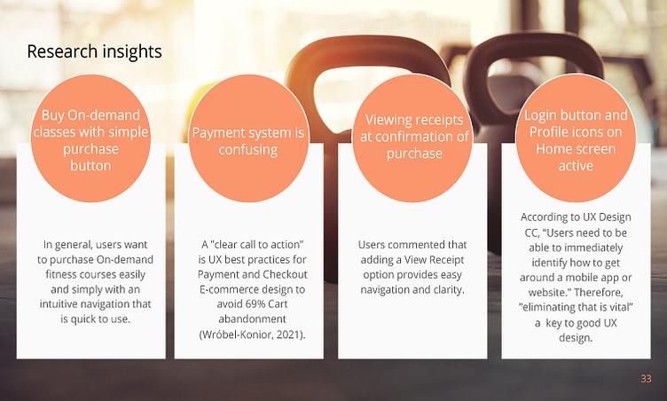
Research Insights and Recommendations
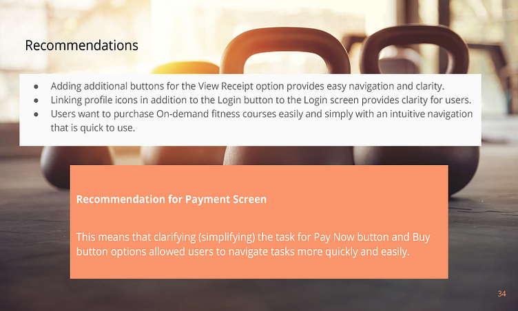
●Adding additional buttons for the View Receipt option provides easy navigation and clarity.
●Linking profile icons in addition to the Login button to the Login screen provides clarity for users.
●Users want to purchase On-demand fitness courses easily and simply with an intuitive navigation that is quick to use.
Recommendation for Payment Screen
This means that clarifying (simplifying) the task for Pay Now button and Buy button options allowed users to navigate tasks more quickly and easily.
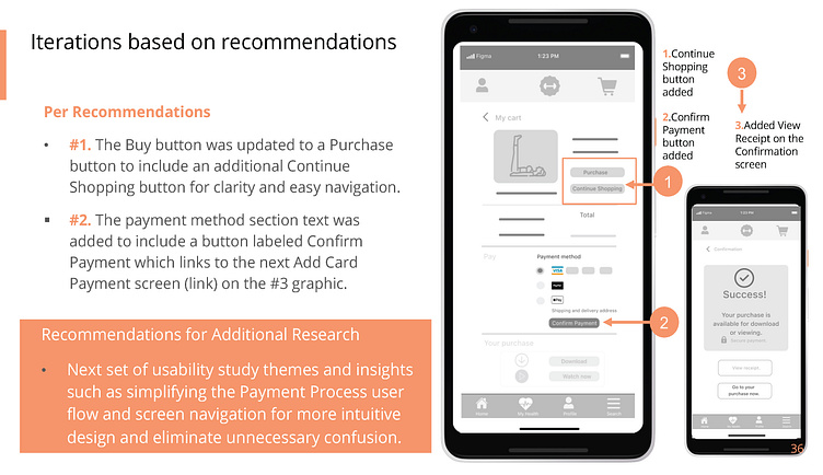
Iterations based on recommendations
Per Recommendations
#1. The Buy button was updated to a Purchase button to include an additional Continue Shopping button for clarity and easy navigation.
#2. The payment method section text was added to include a button labeled #3 Confirm Payment which links to the next Add Card Payment screen (link) on the graphic.
Recommendations for Additional Research
•Next set of usability study themes and insights such as simplifying the Payment Process user flow and screen navigation for more intuitive design and eliminate unnecessary confusion.
Usability Study One : Findings and Iterations
Conducted an unmoderated usability study with FITfind app users (demographic) to study how they try to complete the core tasks of purchasing On Demand fitness classes.
Round 1 findings
Users want easy, simple, and fast navigation to order On-Demand classes.
Users want additional buttons for On-Demand purchase options.
Users want clarity of the Pay Now, Buy, and an additional Receipt option for ease of navigation and clarity of tasks.
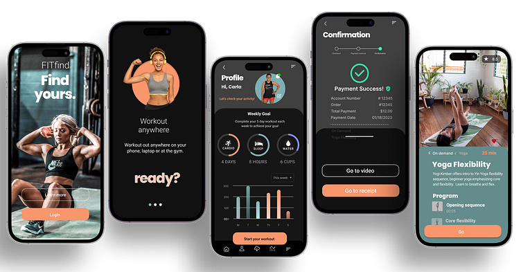
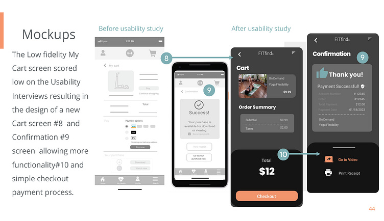
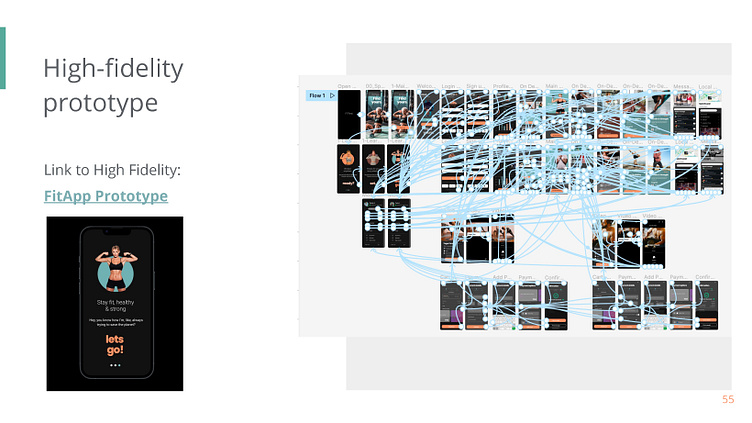
Mockups and High-fidelity prototypes
The Low fidelity My Cart screen scored low on the Usability Interviews resulting in the design of a new Cart screen #8 and Confirmation #9 screen allowing more functionality#10 and simple checkout payment process.
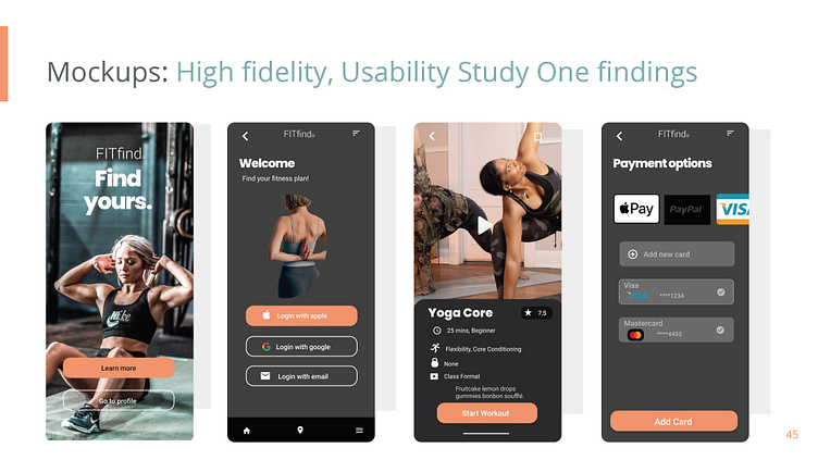
Mockups: High fidelity, Usability Study One findings and Affinity Mapping from Usability Study Two
Usability Study Two: Findings and Iterations
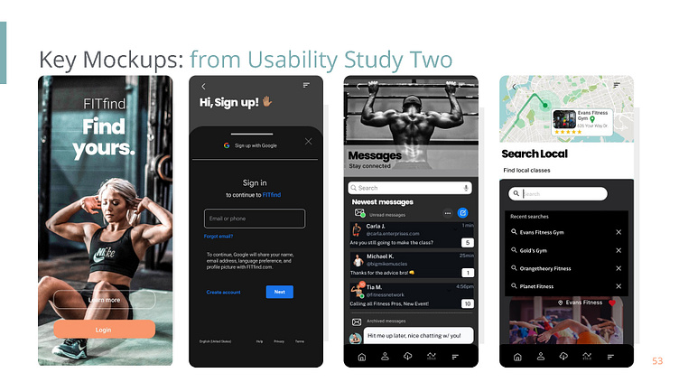
Conducted an unmoderated usability study with FitApp users (demographic) to study how they try to complete the core tasks of purchasing On Demand fitness classes, navigate Messaging (network), and finding Local Fitness classes.
Round 2 findings based on High Priority (P1) to Lowest Priority (P2)
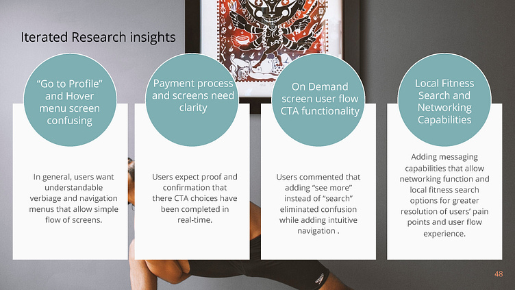
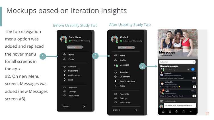
Users were confused by verbiage of “Go to profile” on splash screen and the hovering menu from top navigation menu icon.
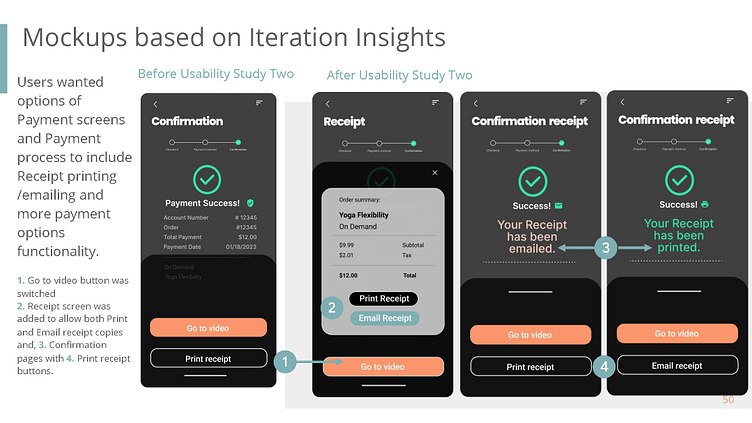
Users wanted options of Payment screens and Payment process to include Receipt printing /emailing and more payment options functionality.
Users expect to easily navigate to the On-Demand screen by clicking the “See more” and the “Continue” button.
Users wanted local fitness search and networking capabilities to be simple and easy to navigate.
Iterations based on Insights
Based on Key findings user interviews iterations were made in order of importance.
Round two findings and insights produced P1 and P2 immediate changes in the iteration process. P1 iterations include splash screen changes to provide clarity for the users based on User interviews, questionnaires, and feedback.
Mockups and High Fidelity Prototypes based on Iteration Insights
Users wanted options of Payment screens and Payment process to include Receipt printing /emailing and more payment options functionality.
1. Go to video button was switched
2. Receipt screen was added to allow both Print and Email receipt copies and,
3. Confirmation pages with
4. Print receipt buttons.
High-Fidelity Prototypes and Accessibility considerations
Some important Accessibility considerations include adding sound and video where needed. Checking this functionality is within brand and Accessibility guidelines and with ability for Users to control variables and turn off distracting sound.
Continuously checking for Hierarchy emphasis for different elements so that the User Flow and navigation of app is intuitive and easy to use. As well as for those who may use Assistive Technology.
Follow UX Best Practices to ensure following UI patterns that allow Users the best experience with FITfindapp.
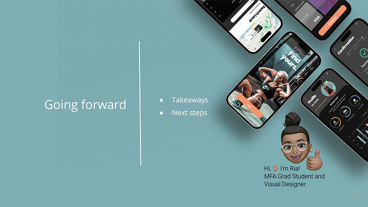
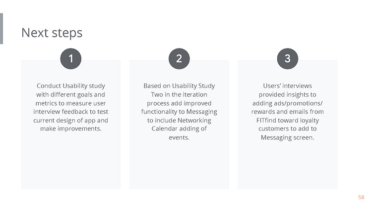
Takeaways and Next Steps
Impact:
Overall Participants and Peers found FITfind app “easy to use, simple to navigate” and said they would use this app in real-world settings.
The Iterative Process allowed me to see how invaluable User Interviews and User Research provide real-time feedback improved designs. Following the UX best practices and processes allowed more successful outcomes.
What I learned:
The Iterative process using user research methodology tools measuring tools like the usability study, affinity mapping, and insights result in greater understanding of the users’ pain points throughout the design process. I learned the importance of how data (user, competitive analysis, behavioral, demographic) provide profound understanding in what design elements are preferred and successful.