Medici Candle Co - Branding and Packaging

The Brief
After being approached by Medici Candle Co, a luxury organic candle company, I was tasked with re-branding their image. The client's brief called for custom watercolour illustrations to depict scents and a natural and classical theme.
After learning about the company's history and aesthetic, I began the design process by incorporating shapes commonly used during the Victorian period.
To maintain this theme, I scoured botanical illustrations from the same era and sketched out their shapes in my notebook. I drew inspiration from brooding Baroque music, which was being experimented with during this classic age, to determine the colour palette for the project

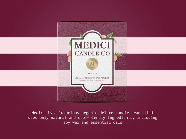
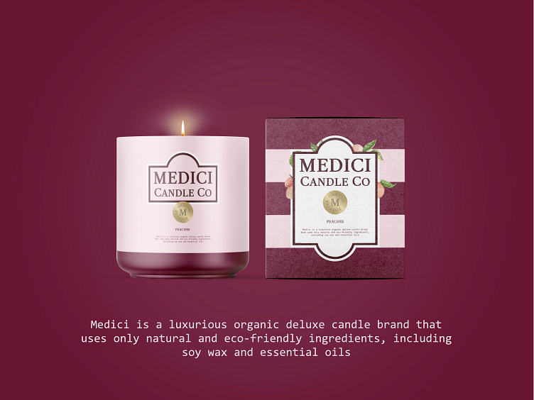
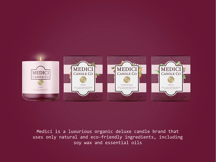
Packaging
For each candle's scent packaging, I created unique watercolour illustrations that were tailored to the fragrance. Rather than repeating the same illustration on the candle jar, I deliberately kept the design separate. To strengthen the brand identity, I added a single strip at the bottom of the jar. This minimal approach to the jar design allowed the packaging to be more visually rich and intricate, without overwhelming the product itself.
Poster
As part of the re-branding project, I was also responsible for designing posters to be displayed in shop windows. To create the pattern, I used the shapes from the new logo and interspersed them with images of the product. I then incorporated a custom gold emblem to add a touch of regalness to the overall design.


