ScaleUp Case Study


Client: ScaleUp
Services: Brand identity / Web design
Year: 2021 / 2022
Design: Sanjin Halilovic / Reveal Studio®
Publication: WBDS
About
Scale Up was founded in 2019 in the city of Sarajevo, in Bosnia and Herzegovina. To date, we have worked with startups from Europe and the USA, helping them make minimally viable products maximally sustainable. Our aim is to partner with you on all your tech needs, and be the last full-service and full-cycle product development agency you work with. We deliver on our promises. No surprises and no hidden costs. We take your success personally, and don’t just write lines of code or design nice logos. Our goal is to see you grow - because that’s how we grow too.
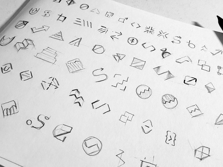
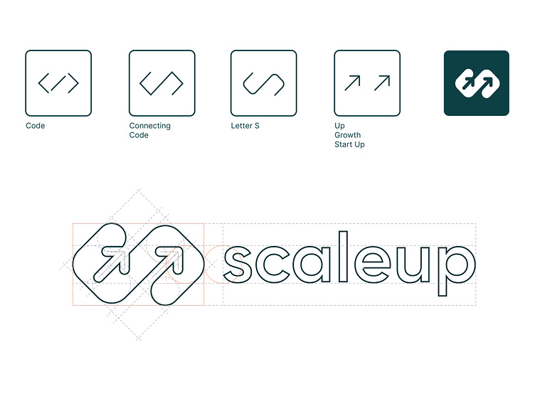
Concept
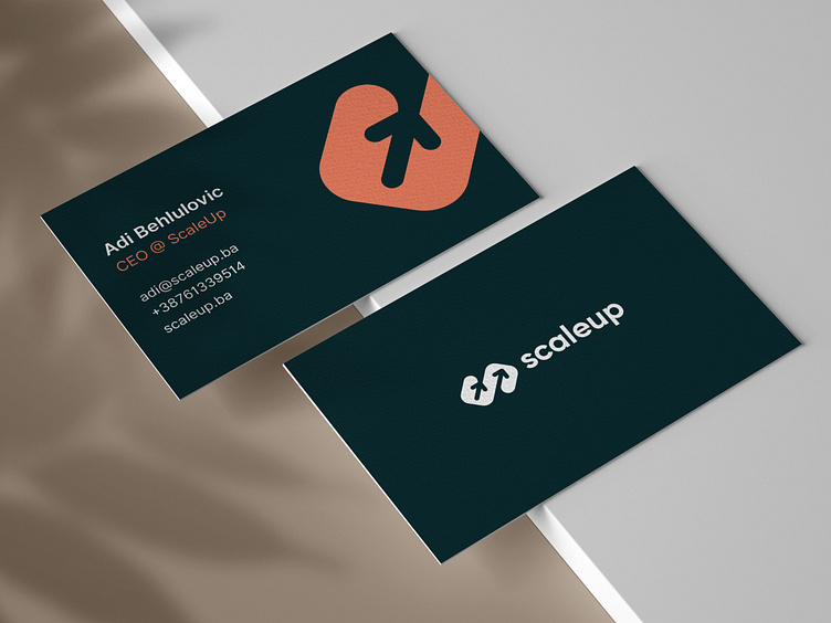
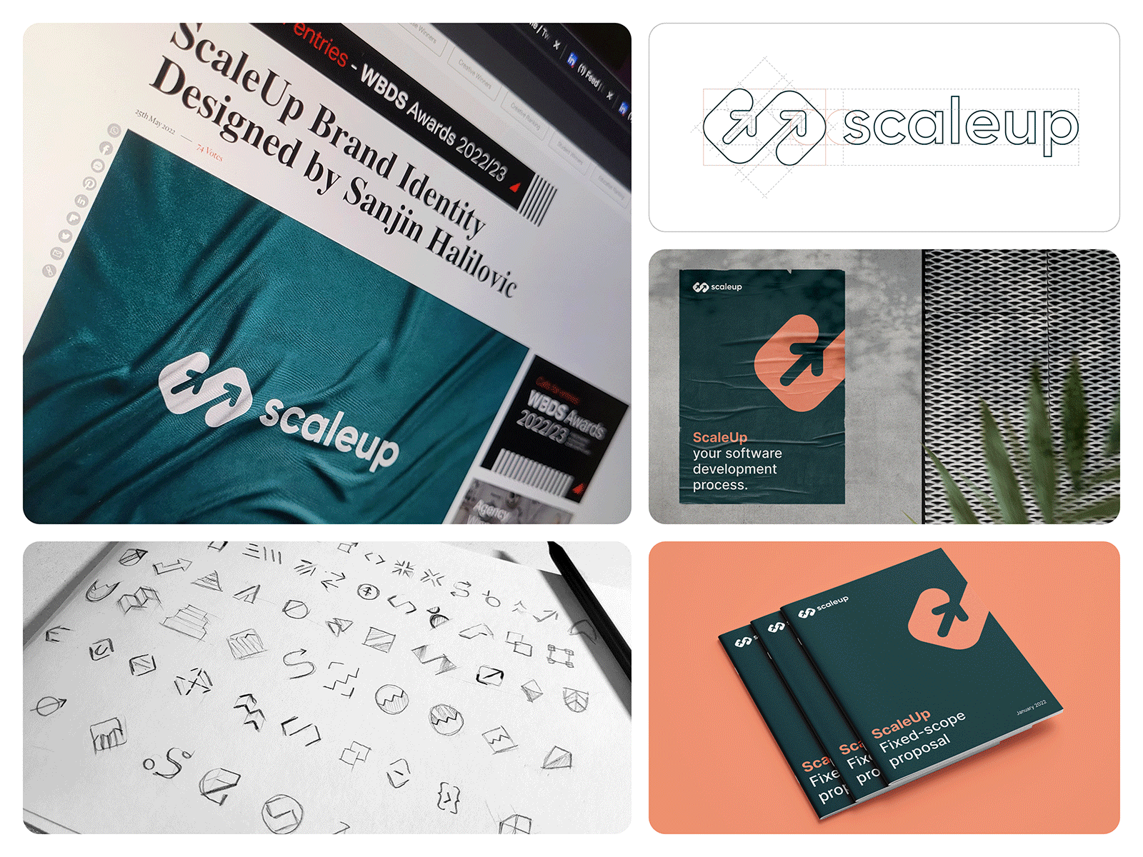
The brand symbol combines symbols - code, letter S, growth, and development process. Based on these three symbols merged together into a new one, the goal was to make a recognizable brand mark that would work well from the smallest UI to the most prominent printed formats.
The visual identity uses a high contrasting color palette (dark shades of green and orange) to create a nice balance between background and typography segments. The baseline color palette is the nice starting point for future brand improvements and updates.