Arch Firm Visual Identity Design 🏛️


Arch Firm's Story
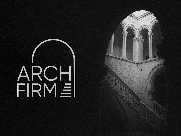
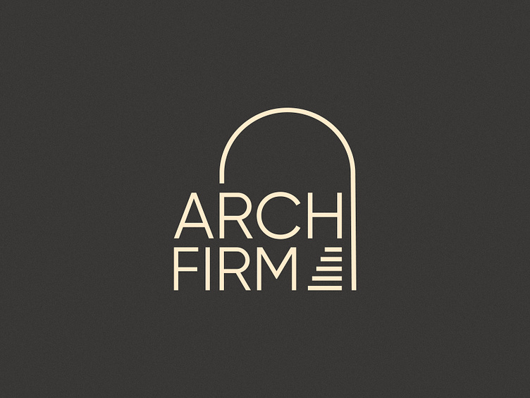
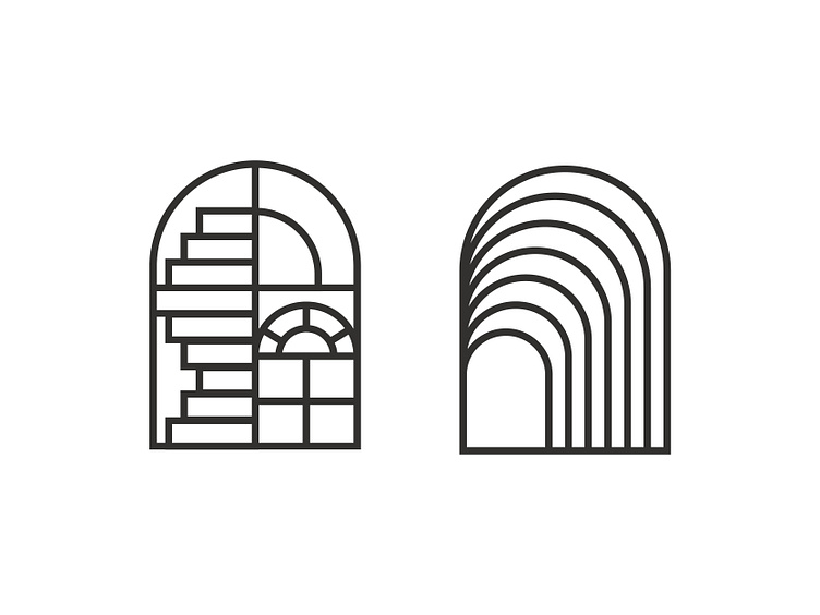
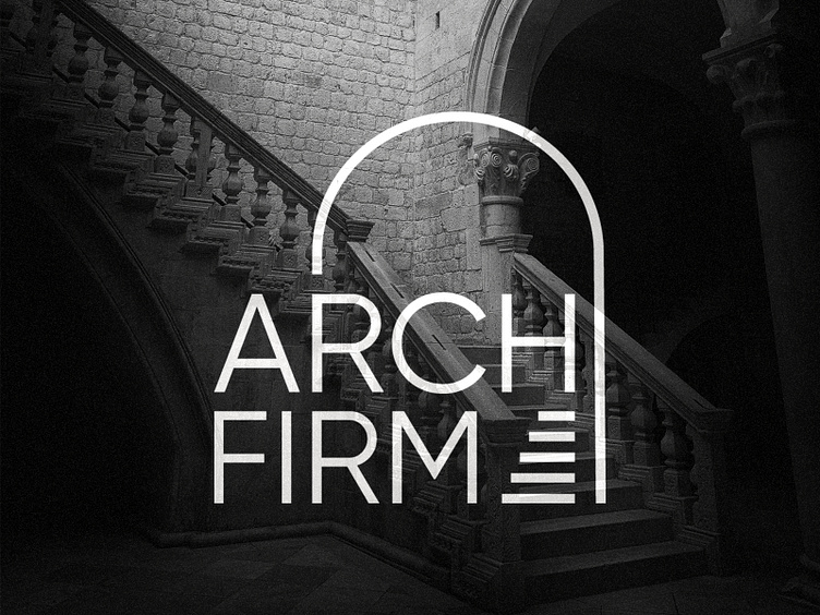
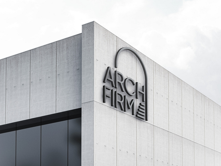
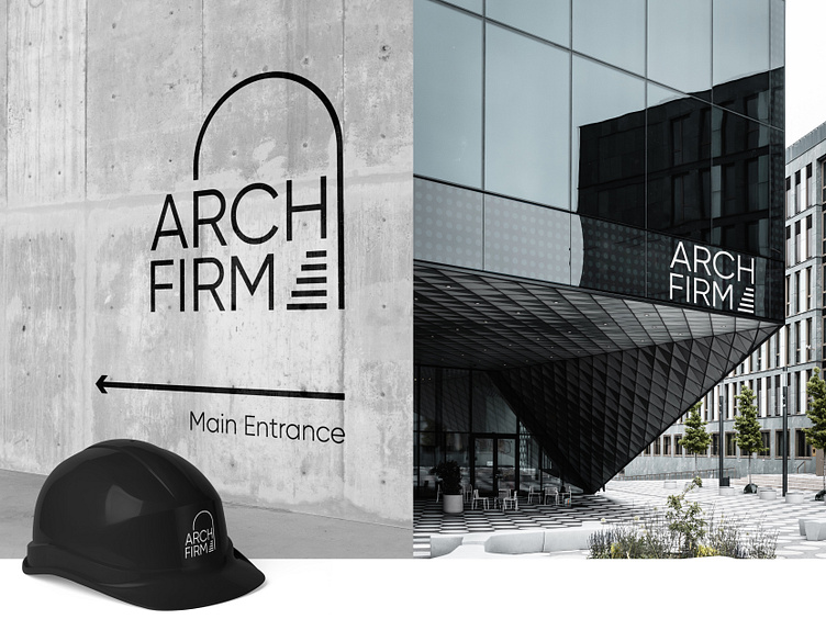
Arch Firm is a modern architecture firm that values innovation and precision. The brand's name is derived from the curved, symmetrical structure that supports and spans an opening, symbolizing the firm's ability to provide strong and reliable support to its clients. It also cleverly incorporates an optical illusion to showcase a staircase, representing the firm's ability to take clients on a journey towards achieving their architectural needs. As a shortened form of the word "architecture," the name also represents the brand's expertise and specialization in the field. The visual identity of Arch Firm reflects these values, utilizing clean lines, bold typography, and a monochromatic color palette to convey a sense of professionalism, sophistication, and modernity. The brand's logo incorporates the curved structure of an arch, creating a memorable and unique visual that is both timeless and contemporary.
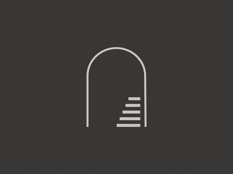
Secondary Logo
Arch Firm's secondary logo is a simpler version of the primary logo, featuring a single line that creates the illusion of an arch with a staircases.
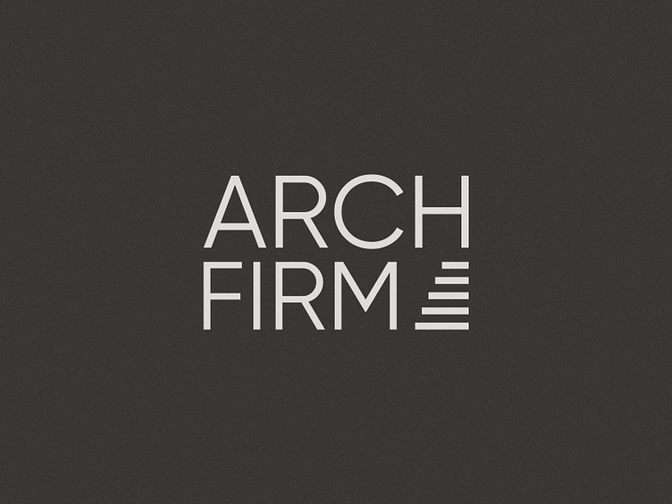
Logotype
The logotype that only uses the type in addition to the stairs from the optical illusion in the Arch Firm's logo creates a memorable design.
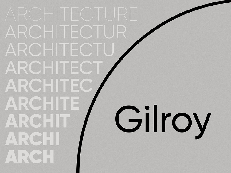
Typography
Gilroy is a modern sans-serif typeface that has become popular in recent years for its clean, geometric shapes and versatility in various design applications. It features a wide range of weights and styles that make it a go-to choice for many designers.
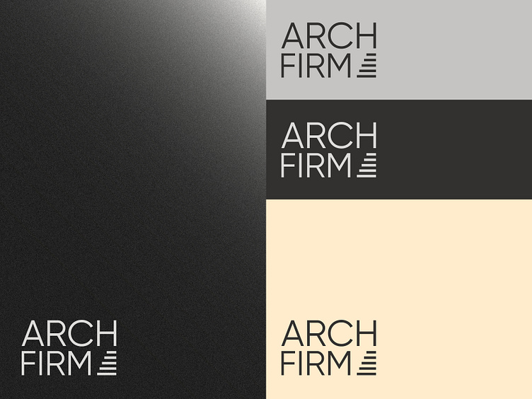
Color Palette
The off-white color scheme creates a clean and elegant look, while the addition of a subtle accent color in Blanched Almond adds warmth and depth to the design.
Illustration
Illustrations can add personality and character to a brand's visual identity, making it more engaging and memorable to the audience. It can also help to communicate complex ideas and messages in a simple and creative way.
I set a challenge for myself to design the complete visual identity of Arch Firm within a tight deadline of 5 hours, which typically takes me around 3-4 weeks. It was an exciting and demanding task that motivated me to work productively and creatively, requiring me to make rapid yet smart choices to establish the brand's identity. Despite the time pressure, I could produce a memorable and coherent visual identity that conveys the firm's principles and proficiency. The challenge taught me the significance of efficient time management, finding solutions, and relying on my design skills.
Do you have any projects?
🟢 I'm available | ✉ My Email: skeizie@proton.com
-----------------------------------------------------------
We are available for a design project:
📩 Work With Us: raventeamstudio@gmail.com


