Alerts Components

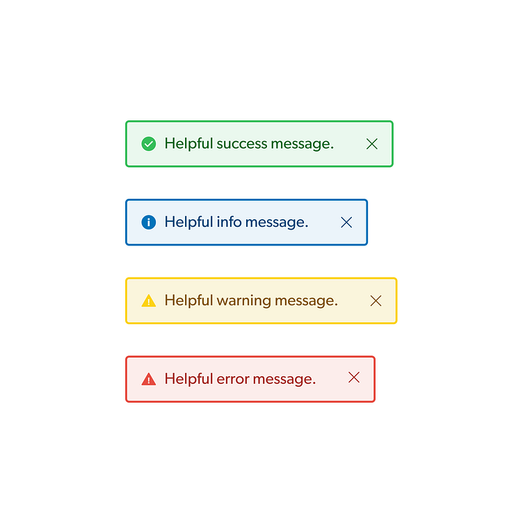
My team and I explored adding alert components to our product.
We started with the standard success and error alerts and found that we'd also like to add a general info and warning alerts as well.
Each alert uses an icon, a message, and an optional dismiss action. The message should always be helpful and brief. Warning and error alerts also include an action for the user to take.


