T.O.T.S Branding Project
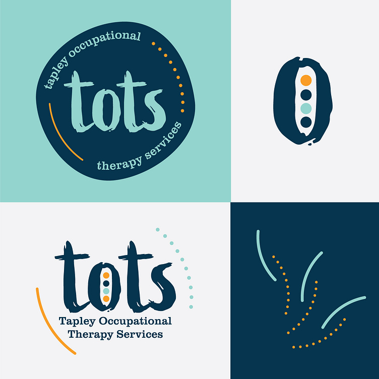
Branding for an occupational therapist starting her own business. She asked for a logo that was calming, simple, text-based and joyful. We landed on two examples, and she wanted to use both! I used organic elements to emphasize play and movement, & the color blue for calming and contrast with the yellow. Thanks for looking!
Posted on
May 8, 2023
More by Jennifer Machen View profile
Like


