MindHero: The Learning App for Kids with Learning Difficulties

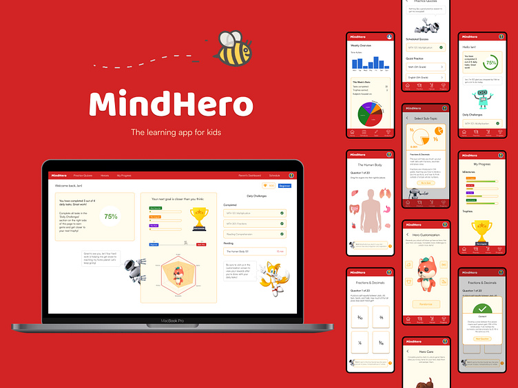
MindHero is a solo project I completed as part of the 'Design for Social Good' segment of the Google UX Design Professional Certificate program. My goal was to design an educational platform that caters to the unique needs of children with learning difficulties- such as ADHD and autism- by framing learning in a more enjoyable and familiar context, relying heavily on mascots known as 'heroes' that motivate and encourage the child to take positive steps in their academic progression.
Equal access and opportunity in education is an important cause to me, and I strongly believe in the idea that every child is equally capable of excelling in and out of the classroom, as long as their unique strengths and approaches to learning are catered to. This is what MindHero aims to accomplish.
The User Problem
Attention Deficit Hyperactivity Disorder (ADHD) is a common neuro-developmental disorder that has affected 9.6% of 6-11 year olds and 14% of 12-17 year olds in the United States in 2016 alone, with the number of diagnoses increasing each year. The disorder is characterized by patterns of inattention and impulsivity, significantly impacting a child's academic performance and the ability to focus on and keep up with other students due to the diagnoses' associated problems of lacking attention, drive and motivation.
Children with ADHD often also exhibit signs of other comorbidities, such as anxiety, autism and depression. As such, the CDC suggests modifications to the classroom environment to help children with ADHD focus and complete tasks, including tailored assignments, hands-on tasks as opposed to written format, positive reinforcement, technology-assisted tasks and additional breaks. Despite these recommendations, many schools don't have the bandwidth to cater to these cases, so children are left to catch up on their own time.
While there are many learning applications available to assist with this, few or none are designed with the specific needs of children with learning difficulties and attention problems in mind.
The Goal
The goal was to design a quiz-based learning application that is colorful, engaging and re-contextualizes academic learning to hold the interest of young children (aged 7 - 12) through:
Gamification: By focusing on a quiz based approach where each quiz successfully completed allows the progression of missions and quests for animated characters known as 'heroes'.
Positive Reinforcement and Rewards: Language on the application is carefully worded to be encouraging and motivating. After each quiz or task successfully completed, users are given congratulations and rewards (as part of the gamification aspect) that can be used in hero customization or to progress hero quests.
At the core of the MindHero app are the 'heroes' which are colorful animated characters with unique personalities, quests and ambitions that encourage the learner to complete daily challenges as scheduled by a parent or guardian. The app employs interactive hands-on learning wherever possible, milestone trackers and reminders, as well as non-academic activities as tasks- all recommended ways to cater to learning and attention difficulties in children.
My role:
Lead UX designer, UX researcher, & product owner
My responsibilities:
As the sole owner of this project, I was responsible for the entire end-to-end design process: user research, ideation, wireframing, prototyping, user testing, UI design, interaction design, motion design
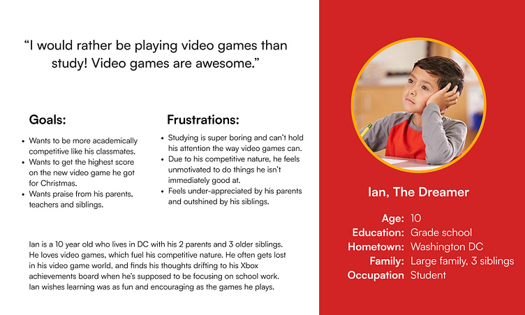
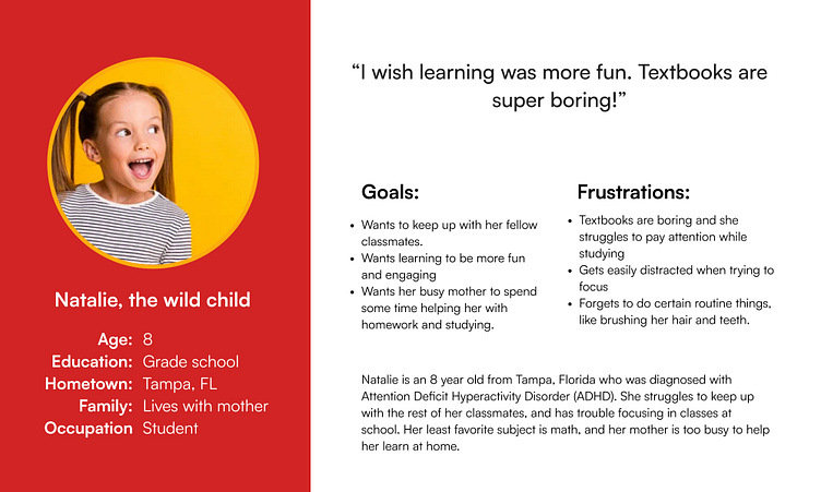
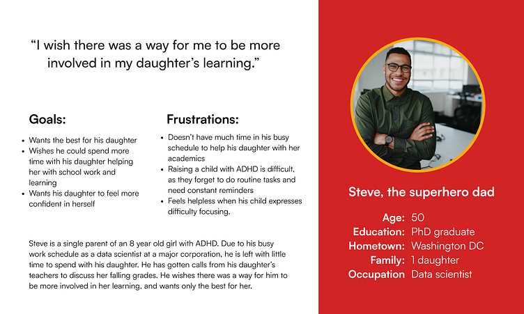
Who Are Our Users?
MindHero is an app targeted at children aged 7-12. By focusing my user research on children with ADHD and autism and designing for edge cases first, the app experience is improved for all users as a whole. In addition to children (learners) using the app, parents and guardians of learners are another user group that will use the app to schedule learning and track the learner's progress.
I reviewed secondary research gathered by the CDC on the common academic struggles experienced by children with an ADHD diagnosis, and drafted the following user personas and pain points:
Competitive Audit
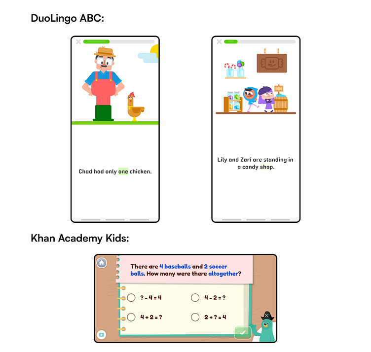
In order to understand what the existing range of children's learning apps have to offer and the existing gaps in the market to fill, I downloaded and tested the following mobile applications:
DuoLingo ABC: Popularly known as DuoLingo the language learning app, this spinoff application has interactive learning for children of various age ranges.
Khan Academy Kids: Directed towards children at or around kindergarten ages, employing a very slow paced visual-novel style of learning.
Quizizz: A quiz based learning app advertised as a trivia game rather than a means to learning.
Ideating Features to Address Pain Points
Having tested competitor apps like DuoLingo, Khan Academy Kids and Quizizz, I had a good idea of the existing gaps in the market and gained some insight as to what worked and could be incorporated into my own designs.
I conducted two crazy 8s exercises and came up with the following features to include in my app:
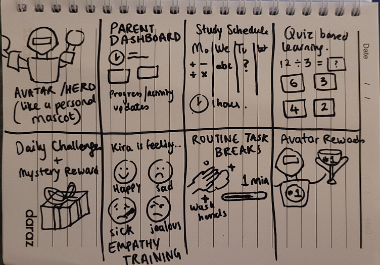
Among the features ideated that were shortlisted and incorporated into my final designs were:
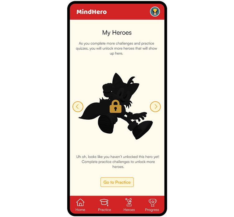
Heroes/Mascots: Heroes are colorful animated characters chosen by the user that encourage the learner to complete daily challenges in order to progress hero questlines (similar to questlines in a video game).
Connected to the heroes idea is the Hero Customization and Hero Care features. The former allows the user to customize the appearance and accessories of their hero using customization items unlocked by completing quizzes and tasks. The latter gives the user a sense of responsibility in caring for their hero as a virtual pet- feeding them, grooming them, and serves as another motivator to complete tasks.
Mystery Rewards and Gems: Each quiz or challenge completed will reward the learner with a mystery reward (anything from hero quest or customization items to free gems) as well as progression on their milestones. Gems can be exchanged for hero care items like food, toys, etc.
Daily Challenges & Study Scheduling: Parents and guardians can schedule tasks and quizzes for the child to complete on a daily basis. The daily challenge system encourages consistency and discipline, which can be difficult to establish for children with learning disorders.
Routine task breaks & Physical activity breaks: One of the recommendations the CDC gives on modifying the classroom environment for kids with ADHD is to introduce more breaks. In the middle of a learning or practice session, users will sometimes get an impromptu daily routine task to complete, such as "Organize your desk- 1 minute" which can be customized by the parent or guardian. These time sensitive tasks will promise the user large rewards, encouraging them to complete these tasks. These tasks also double as physical activity breaks, as they will always require the learner to get up from their spot and move around to complete the task, which is another way to keep learning engaging for children with difficulty paying attention and focusing.
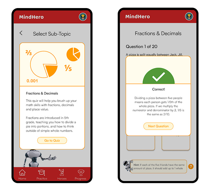
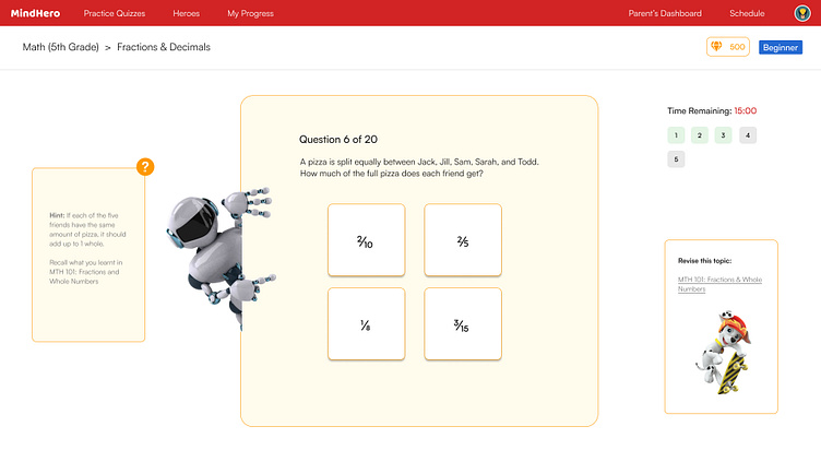
Interactive learning (touch/drag gestures): Wherever possible, the quizzes on the app will be gamified, mimicking a game rather than a multiple choice quiz, allowing users to touch and drag objects around to solve the question, (e.g. drag the skeleton's bones into their rightful places).
Empathy Training: In addition to purely academic quizzes and tasks, some challenges will help the learner empathize better with other people. For example, an interactive story where the learner will have to correctly guess what word best describes a character's emotions. This kind of empathy training is especially useful for children on the autism spectrum, but benefits all children anyway.
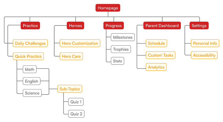
Sitemap, Wireframe Sketches, and Low-Fidelity Prototype
With the ideation phase complete, I began drafting the layout for my screens, starting with sketches before moving to digital wireframes and a low fidelity prototype. While working on my wireframes, I also drafted the sitemap for how pages would be organized on the app.
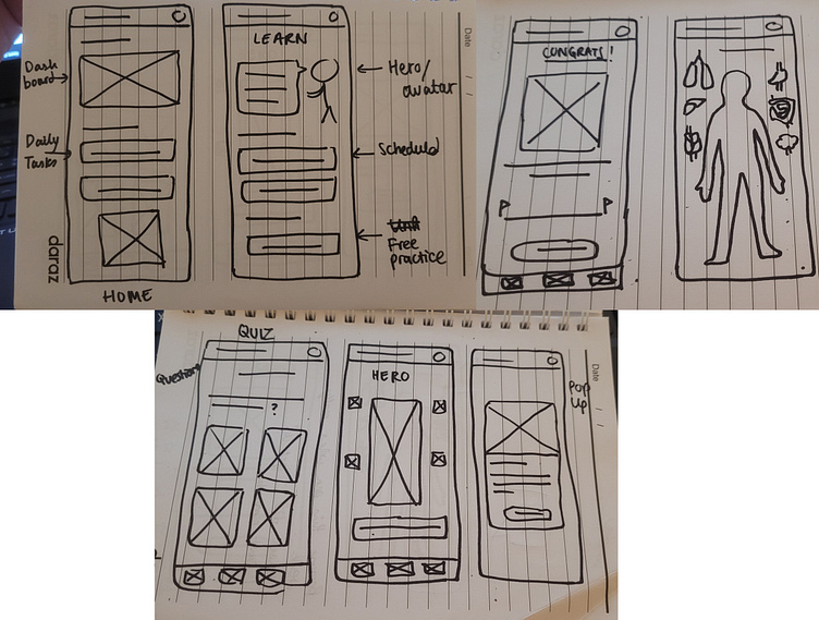
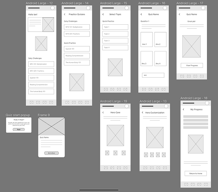
Challenge 1: Testing a Low Fidelity Prototype with Children
One of the core features of the app- and its unique selling point- are the heroes/mascots. The low fidelity prototype did not feature these heroes, had only placeholder copy, and no coloring.
I decided that planning a user testing phase on children at this stage would be unlikely to net any meaningful results, due to how much reliance there is on the visual aspects of the app. For children, it would be difficult to imagine the app experience effectively, and without the heroes feature which is the most important element to test, any results would be meaningless.
The low fidelity prototype was instead tested by adults, with the real user testing with children scheduled for after the high fidelity prototype was complete. Below are the results collected from the user testing with adults:
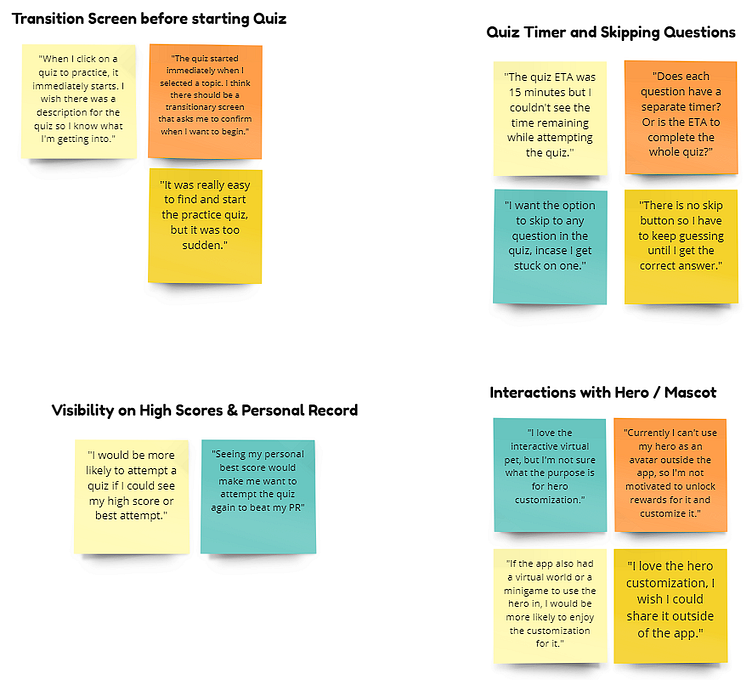
The summary of issues and suggestions raised in this phase of testing were:
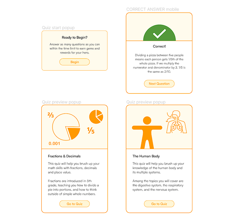
Transition screen before quiz and between questions: Since quizzes are timed activities, participants in the study noted the lack of a transition screen as they were immediately and abruptly placed in the quiz environment upon clicking on the sub-topic. At the time of the low fidelity prototype phase, there was also no transition between questions that explained the reasoning behind the correct answer.
Quiz timer & skipping questions: All quizzes have a designated time to complete them within, ranging from 10 minutes to 25 minutes. Due to screen busyness and potential distractions, I deliberately left this out of my mobile app designs. However, with the additional space on a desktop screen, a countdown timer could be easily incorporated to help learners keep track of the remaining time. The ability to skip questions was removed in order to keep the quiz format linear and prioritize quality of understanding over quantity of questions completed by the learner.
Visibility on high scores and personal best: This was an interesting suggestion made by a study participant on motivating the learner to re-attempt difficult quizzes by showing them their own score to beat, similar to high scores in a video game.
Interactions with Hero/Mascot: Although the study participants enjoyed the hero customization feature, they felt limited by the use of this customization. A common question asked was "Now that I have accessorized my hero, how can I show this off?".
High Fidelity Designs: The MindHero Design System
Colors
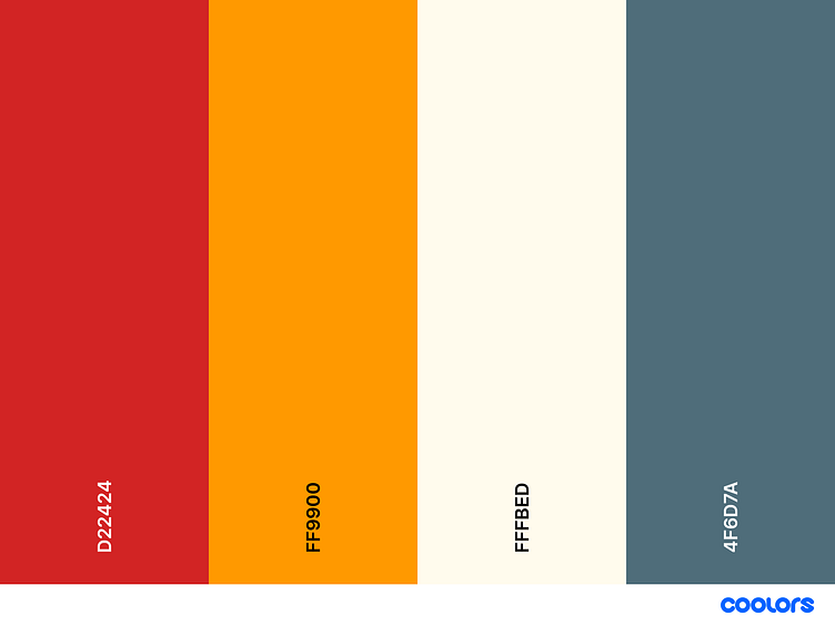
With my low fidelity prototype tested, I was ready to move on to designing my mockups. At the start of the project, I already had a vision for the colors and style I would go for, relying heavily on primary colors (Red, Yellow, Blue) which are energetic and often correlated with gender-neutral media directed towards children.
The focal color of my app was red (#D22424) with the secondary color being yellow for which I picked two shades (#FF9900 and #FFFBED).
Logo and loading screen
With red being the focal color of the app, I wanted the logo to be written in white text over the red background, and opted for the typeface 'Baloo'.
I wanted to create a loading screen that would play upon launching the app while the homepage loaded in. For this, I animated a line of loading screen text- a practice often applied in loading screens for video games. In line with my red/yellow color scheme, I added a flying honeybee- symbolic of hard work and productivity- as a mascot.
Typography and Buttons
With the exception of the logo, I chose the sanserif typeface 'Satoshi' for all text on the MindHero app for its readability and rounded lettering which emits a friendly and sociable energy.
For buttons on the app and website, I chose the mid-toned yellow (#FFF6D6) with the buttons' borders and content (whether text or icons) a dark orange-gold shade (#FF9900) as seen below:
Prototyping: Animations & Motion Graphics
One of the most important design decisions I made while designing MindHero was to include animations and motion graphics wherever possible to bring the characters (heroes) to life, and make even the information-based pages (such as the progress dashboard) engaging enough to spend time on.
Below are some of the animations for the main screens on the MindHero app:
Parent Dashboard & Scheduling
Since MindHero app users can be both students and their parent/guardians, I introduced a 'switch account' feature which takes the app from the 'learner' view to the 'parent view'. One can switch to the parent account by tapping the profile icon in the top right of the screen and selecting "Switch to Parent". This opens up the parent's dashboard which summarizes the learner's progress for the day and week. Detailed analytics can be viewed under the 'Analytics' tab and the 'Schedule' tab allows parents or guardians to schedule topics for specific days of the week.
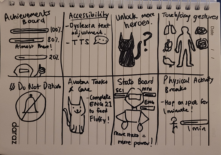
Accessibility
In order to improve the accessibility of the MindHero app, I added 2 additional features:
Text to Speech: For any dialogue that the heroes speak. This also has the added benefit of making the characters come to life more.
Text Size and Spacing: Text spacing and size can be an issue for children with dyslexia and those with eyesight problems.
Responsive Design: Scaling Up for Web
For this project, I took a mobile-first approach to design for a few reasons:
53% of children own a smartphone by the age of 7, and by age 11 this percentage climbs up to 89%.
The medium of a mobile app allows for push notifications to be sent as reminders to complete daily scheduled learning tasks.
The 'pocket hero' or virtual pet feature works best on a portable device like a mobile phone as opposed to a desktop computer (see Tamogatchi).
Despite this, many children (and parents) may prefer to access MindHero on a desktop computer or laptop as a website for the following reasons:
Distraction-free as there are no push notifications or leisurely apps to scroll endlessly through.
Some parents don't allow their children to own smartphones until they're in middle school or older, but 91% of households in the USA have a desktop computer.
Desktop learning may be preferred by many parents, as opposed to sitting on the couch or a bed learning on a phone as it can improve alertness and focus.
Below are the high fidelity website designs I worked on for MindHero:
Challenge 2: Novelty of Heroes & Customization
The second challenge I encountered while working on the app design came to light during the usability study:
"How can we ensure that the motivators of hero quests and customization continue to motivate learners in the long run? Will the learner eventually get bored and need new a new stimulant?"
In order to address this issue, I came up with 2 proposed solutions which can be implemented later down the line via app feature updates:
Complete Challenges to Unlock More Heroes: One of the ways that games keep their player base engaged for longer is by locking characters in a roster behind an experience wall. In other words, these characters can only be unlocked by playing more of the game. The same can be implemented on MindHero with heroes to keep learners motivated.
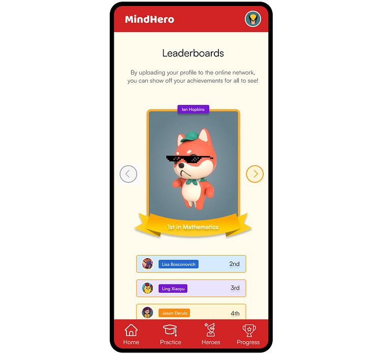
Leaderboards and Network Features: Initially, I wanted to keep the app as offline as possible to avoid distractions and limit interaction with strangers online. However, one feature which avoids interaction altogether but still allows the user to see community performance is a leaderboards network feature, where the learner can have his/her profile (and customized hero) visible to others along with achievements as depicted below.
Takeaways and Next Steps
MindHero was one of the more challenging design projects that I have thus far undertaken. In addition to requiring an extensive amount of research on designing for children, ADD and ADHD, I could not find any existing applications that targeted the same demographic with the same concept of a gamified learning app. For this project, I couldn't rely on references and examples, and instead had to rely more on my creativity and experience with studying how game designers establish and improve player engagement. Because of this, many of the design solutions I implemented in my app/website were borrowed from concepts of UX in video games.
Perhaps the biggest challenge I faced while working on MindHero was the aspect of designing for children and testing with child users. While the standard practice in many childrens' learning apps is to adopt a 'slow paced' easy-to-follow interactive learning experience, this slow pace has proven to be counter-intuitive for children that struggle with focusing and paying attention. Too slow of a pace can result in being easily distracted and moving on to other activities. Instead of this condescending approach to designing for children, my idea was to match the pace, language and motivators of a video game. If a child is able to meet the challenge in such a context, they will be capable of doing so for learning and academics as well- provided that the right motivators are there.
I fully intend to take this project further by developing a real application based on these designs. Before that, however, another testing phase with the high fidelity designs is due with the target audience.


