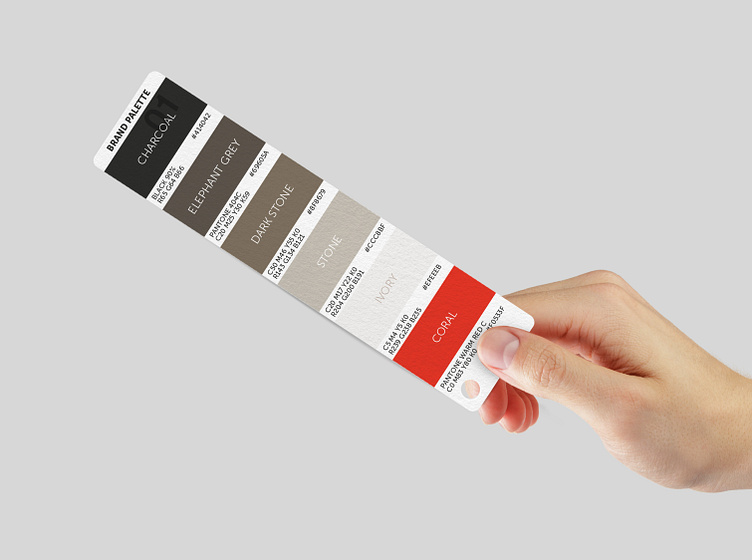
&Beyond Colour Palette
&Beyond had a brand palette that was being used quite consistently although charcoal was dominant and, along with a very blocky visual language, led to a heavy, masculine feeling for the brand.
I added additional colours to the main brand palette for flexibility and created opportunities to explore the lighter tones in the palette.
Additional colours in the original palette were randomly selected with no clear system and therefore could not be extended easily as more destinations were incorporated into the portfolio.
For clarity and longevity I developed an extensive, but cohesive, palette for the destinations across continent, region and country. The palette was made up of one colour per continent, warm and cool explorations of that same colour for regions within a continent and finally, country colours that related to the continent colour.
The ochre of Asia expanded to include warm hues that most represented each Asian country, similarly with South America and a selection of blues.
Africa included both regions (Southern Africa, East Africa, Islands) and countries, creating a need to define the regions quite clearly within the green palette. We chose teal green for islands, warm green for Southern Africa and 'true' green for East Africa. These were then expanded at the country level to create regional associations for each country.


