Endless Sunday

I was lucky to help the team of Endless Sunday and Chillhop Music finding the best visual translation for the new Endless Sunday brand.
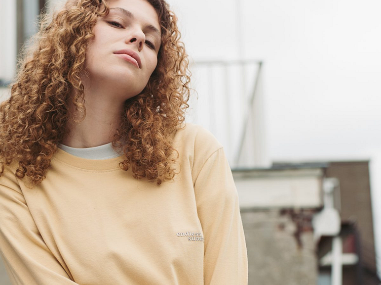
For a more relaxed everyday life
Endless Sunday represents a mix of people from all walks of life, the one thing we share is the desire for more time exploring, relaxing, enjoying our hobbies and taking the heaviness out of life once in a while. We stand for people being themselves, and we are dedicated to creating more ease of mind through clothing, music, art and experiences.
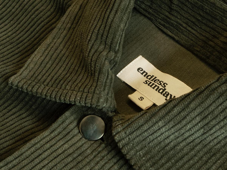
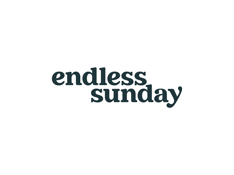
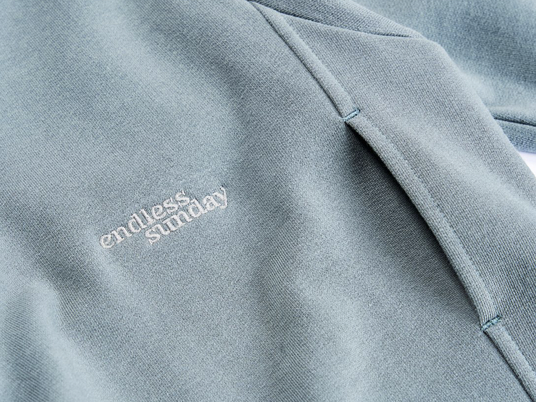
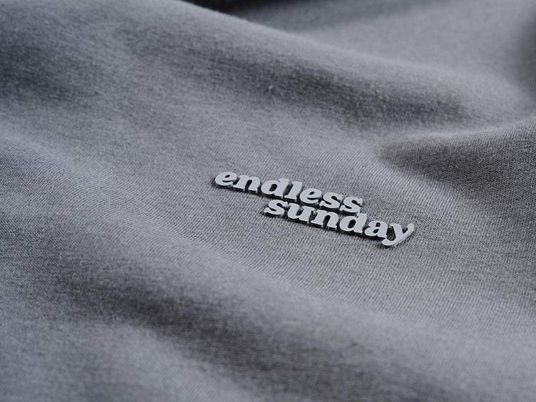
The Endless Sunday word-mark.
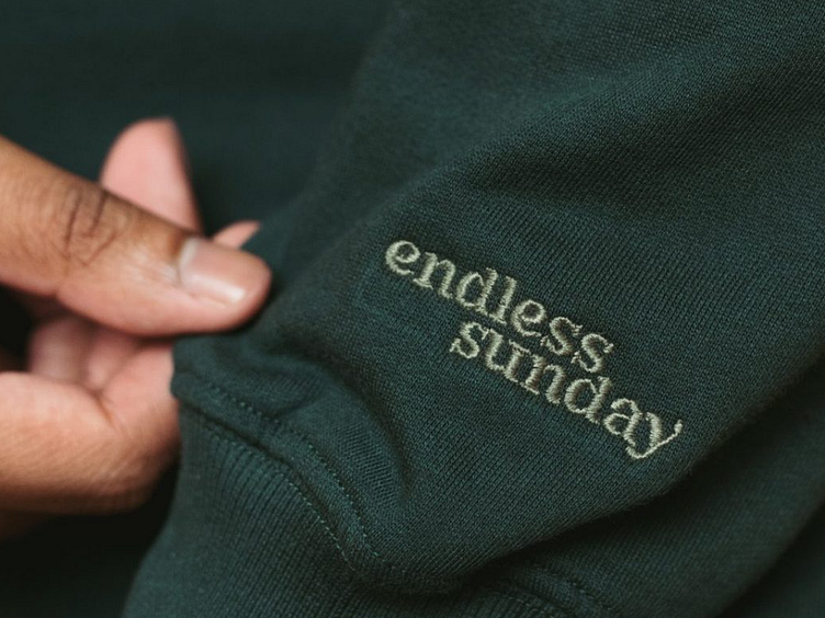
Starting with the logo, we did try various logo iterations, but ended up with a very relaxing soft serif typography. The off-center composition was partly due to reducing white-space between the words, caused by the ascender of the "d'.
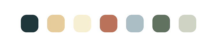
Color Palette.
We created a color palette that matched very well with the word-mark and brand tone of voice.
See it live.
— info@paulvonexcite.com


