Google Bard Ai - Logo Redesign v2

Logo Redesign idea for Google Bard - Personal Project.
Bard is your creative and helpful collaborator to supercharge your imagination, boost productivity, and bring ideas to life.
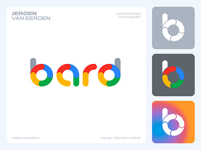
Several years ago, I worked on the Google Suite icon series with many talented designers. During that project, I made serval letter-related directions. I found these simple letter variations and applied the idea to the new Google Bard logo. Felt it was a fun approach and played on the current Google design ecosystem.
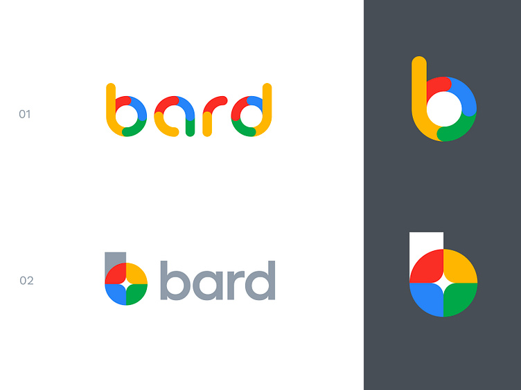
A good point of feedback was that the (01) concept had an odd feeling with the soft gray in it. Now I decided to create these out of the fully known Google colors, which feel already much cleaner and more logical in my eyes.
Which concept works best for you? Option 1 or 2?
Happy to hear your thoughts and have a great new week everyone!
Hit L to support!
___________________________________________________________________________________
___________________________________________________________________________________
Let's work together and elevate your brand! 🚀
Feel free to reach out via Dribbble DM or E-mail:
👉 info@jeroenvaneerden.nl
💼 Connect with me on LinkedIn / Read my Client Recommendations
🎬 Check my YouTube for Logo Tutorials / Learn Logo Design
🔗 Follow me on Instagram / See BTS and New Content
🛒 Buy my pre-made or unused logos from the portfolio
💬 Tweet with me