NetNation Logo

The goal of the redesign was to improve and modernize the existing design while ensuring its timelessness. The original logo served as the foundation, preserving its core elements but infusing it with fresh and minimalist aesthetics.
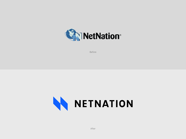
the overall composition and layout were streamlined and simplified. Unnecessary elements were removed, allowing the core essence of the logo to shine through. The redesigned logo embraced minimalism, focusing on essential shapes and forms to enhance visual impact. The use of negative space was strategically employed, resulting in a more balanced and refined logo.
To ensure longevity, the logo redesign incorporated elements that transcend passing design trends. By adhering to fundamental design principles and avoiding overly intricate details, the logo achieves a timeless quality. The simplicity and clarity of the new design allow it to adapt seamlessly to various digital and print platforms, making it future-proof.

Thanks for your time! press L for ❤️
_____________
Tell me about your project, and we will create a design that will work for your target audience thus helping your business grow: artamrit@gmail.com
Follow me on Instagram
See more of my projects on Behance