Mobile dashboard design | Best practices from Lazarev.


Hey there, fellow Dribbblers 👾
We're back with another set of analytics dashboard designs to get your creative juices flowing. And if you're a business owner on the lookout for some design inspiration, welcome! We'd love to chat with you and see how we can help 🤝
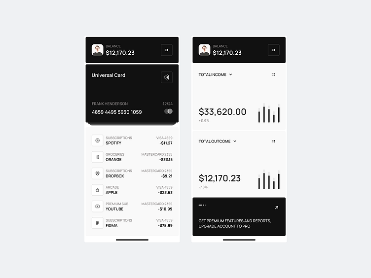
But let's get straight to the point, shall we? A well-designed dashboard can make all the difference when it comes to interpreting data efficiently, increasing engagement, improving user experience, and ultimately making better decisions. On the other hand, a poorly designed one can be a real headache, confusing and frustrating users and hindering their ability to make sense of the information.
That's why we've made simplicity and clarity our top priorities in this design process. Our goal is to create an interface that's intuitive, self-explanatory, and never distracting from the data itself ☝️ We think it's the best way to keep the focus where it needs to be: on the numbers and insights.
Agree or disagree? Let’s exchange opinions in the comments.
And if you're in need of some design help for your own product, we're just a message away: hello@lazarev.agency 📩


