Subscription Purchase Screens Design

One of our key revenue streams in our finance application is the sales of Prime subscriptions. Our users, as Prime subscribers, gain unlimited access to the American Stock Exchange through our app. That's why we have redesigned our subscription screens. Clearly showcasing the differences and advantages between the Free subscription and the Prime subscription will effectively encourage users to make a purchase.
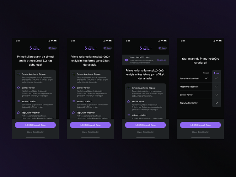
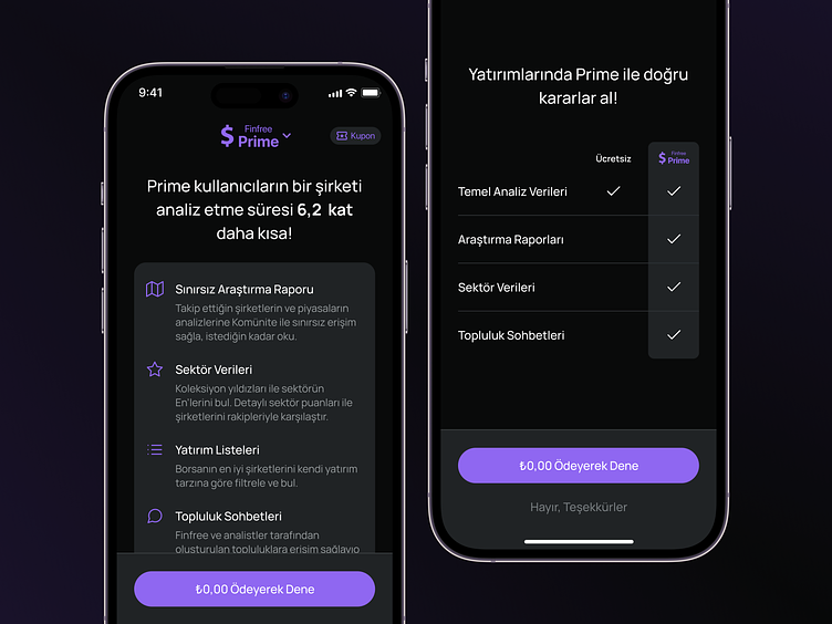
When users arrive at the subscription screen, our goal is to provide them with a detailed overview of all the features we offer, ensuring they are well-informed. We also aim to display different headline texts on this screen.
The main headline should always highlight the convenience Prime subscription brings to investors with a mathematical value proposition. Additionally, we will include a component above the main headline to guide users without investment accounts towards opening one, while also offering them a discount on the Prime subscription.
On the next screen, there will be a table displaying the differences between the Free subscription and the Prime subscription.
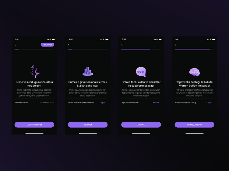
It's great to enhance features, but it's even better when users are aware of and utilize those features. After users purchase the Prime subscription, they will be guided through a brief flow. This flow will showcase our features in detail and provide users with guidance on how to use them effectively.

Thank you for reviewing my work. I hope you enjoyed it. I believe that feedback always helps individuals progress further. That's why I am looking forward to receiving your feedback.
Would you like to discuss a project? Feel free to get in touch with me. I'm open to communication and would be happy to talk with you.


