Dark mode SaaS design for a productivity platform | Lazarev.


Are you a team light mode or dark mode? 🌓
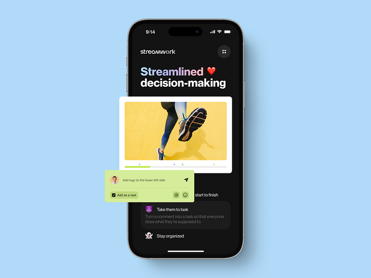
This shot is all about the latter. The thing about the dark mode is that there’s more to it than it seems. Dark UI isn’t about slapping a pitch-black color on the background, and just like that, you have that satisfying night theme.
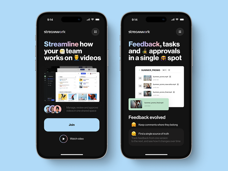
You need to be strategic about it. That’s how we approach all the projects we work with, and Streamwork, a B2B SaaS tool is no exception 🙌
Our team went for a dark gray background instead of pure black so that users don’t strain their eyes while working on the platform. We also paid close attention to the typography and combined dark mode with bold font size to enhance the readability.
Oh, and color-wise, we stroke a contrast ratio between textual content and background. Our team went for colors that both enhance brand recognition and improve UX 😎
And that was our last Dribbble shot for Streamwork but definitely not the least in our SaaS design game.
What are your thoughts on this project? Do you like it? Do you love it? Let it all out in the comments 💚
Or do you have a SaaS that needs some product designing? If so, go ahead and contact us at hello@lazarev.agency.
Website | Facebook | Behance | Linkedin | Instagram | Twitter