Logo development

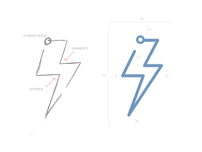
I don’t do a whole lot of branding or iconography, but here is a fairly simple logo. It’s basically a line graph with a node at the top and a combination of the E and 3 to form a lightening bolt.
As for the title of ‘Energy3,’ the 3 previously referred to the 3 benefits of Energy3 in an older web version. Currently, it doesn’t make too much sense, but people familiar with the project know it by that name. So I’ve decided to keep it thus far. It may change down the road.


