Energy Feed - Above Average Use

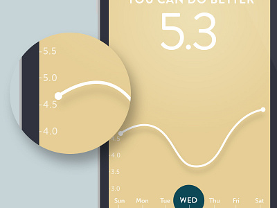
What your looking at is a different status of the Energy Feed and a users energy over the last 7 days. You can switch between: live, last 7 days, or month to see your energy use over time.
Using the graph is simple - you can tap the screen to see the x and y axis, scrub the line to specific times, and pinch zoom in and out.


