Maroon Wedding Photography
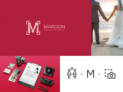
The logo for our client- Maroon Wedding Photography, creatively renders, the promise of a lifetime, as caught in a photographic frame. Looking at the logo you get to experience the logo as a culmination point of its entire personality and the niche it covers. Letter M directly correlates to first letters in the brand name. Couple holding hands and the frame encompassing the letter M speaks for the business niche of the brand. Primary colour is Maroon and is aligned with the brand name Logo can be effortlessly used for watermarking
View all tags
Posted on
Jul 24, 2015
More by Bransense View profile
Like


