Diaco.inc

Simple Design
The main idea was being so simple & by the way it is rough site so it has fractures at all points.
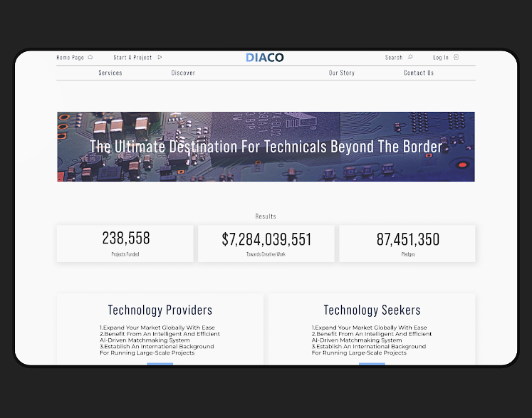
Top of the home page
It started with a simple header with logo on the top then i I put the slogan on a related photo to avoid being newspaper-like and monotonous.
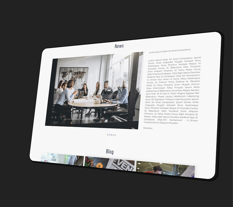
News
News needs stunning photos to stand out, so in the news section, a large photo with its summary text is considered next to it.
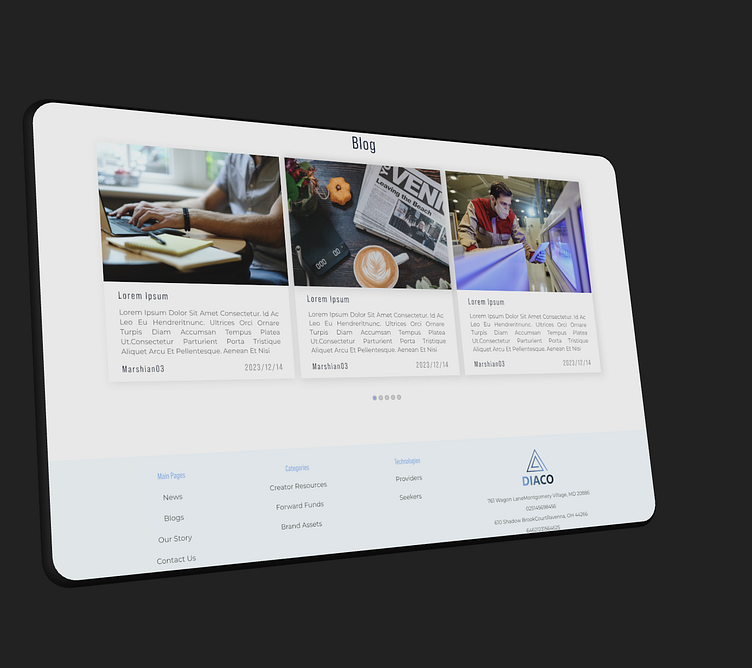
Blogs
For the blog, a smaller section is considered to support more content, the ratio of photos to text is also the same.
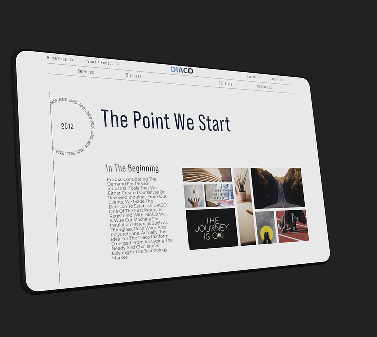
About us
We used <our story> instead of text <about us> to make this section interesting and unique instead of boring text with a story. On this page, the side circle is rotated and the negative occurrence of each section is displayed.
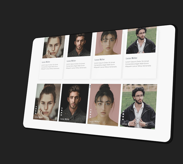
Our team
In this section, the members of the team have been exempted, the upper part of the investors with an explanation about them and the lower part of the team working on this project with their names and social networks. Of course, I agreed with another plan for the team that the project manager didn't like, but I will leave it for you in the next picture
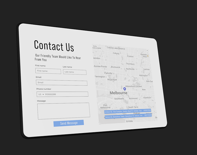
Contact us
Enter your text here...
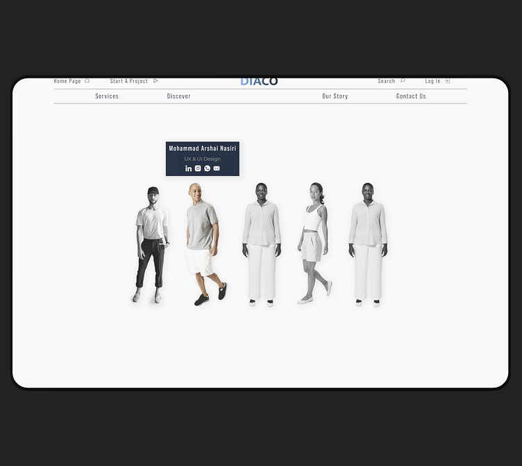
Deleted design
In this design, a full-length photo of each team member is placed. By clicking on each member, the color of the photo returns from black to normal, and a box containing that person's information appears above him.
Have an interesting idea, but don't know what to do with it? call me
Press :“L” to show some love 🖤
Interested to work with me? Send me message: Marshian03@gmail.com
🔗My social profiles: All in one


