The Energy Feed

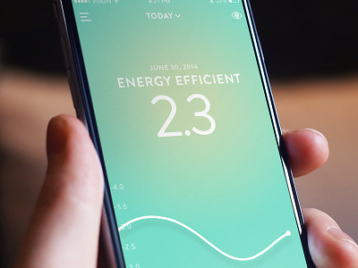

This is the main experience of Energy3 and my favorite page. After you’ve setup your sensor and savings goal, your live energy will be tracked in this feed. (Think of it as sort of a Nest thermostat combined with Fitbit type of tracker but for energy use). In a nutshell your progress is shown by a status in the middle of the screen and is reinforced by the background colour. Based on your performance your status and background colour will change. What is really neat is that the colour transitions from one to the next creating a pretty neat experience that is intuitive, fun, and simple.
The score is based on a 1-10 scale (The lower the more efficient, like golf.) This can change to either a dollar or kW value. I believe a score works best as it has a positive reinforcement feeling to it, as opposed to seeing how much money or energy your burning.
Lastly, that fancy line at the bottom is an interactive graph that further expresses your energy use, but most importantly it allows you to see your progress over a period of time. (You can view by: live, last 7 days, or month by using the filter at the top of the screen). You can tap the screen to get the x and y axis, pinch zoom, and scrub through the line to see your energy use at any time.


