WL - logo mark exploration

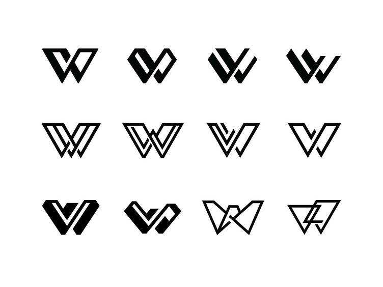
I'm working on creating an identity for a company with the initials "W" and "L", and went down a large rabbit hole of ideas. I explored a handful of ideas, and kept gravitating towards an abstracted representation. For me, I want a viewer to identify the "W" letterform first, and then, perhaps to identify the "L" letterform next, but initial explorations were less concerned about a literal interpretation of the "L". As I analyzed these particular explorations, though, except for the lower-right variation, I had a tough time NOT seeing a "V" letterform, rather than the desired "L". By the time I got to the lower-right variation, I began to lean into this interpretation & angle of the "L", which influenced future variations.


