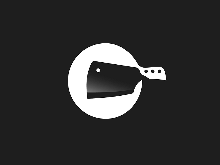
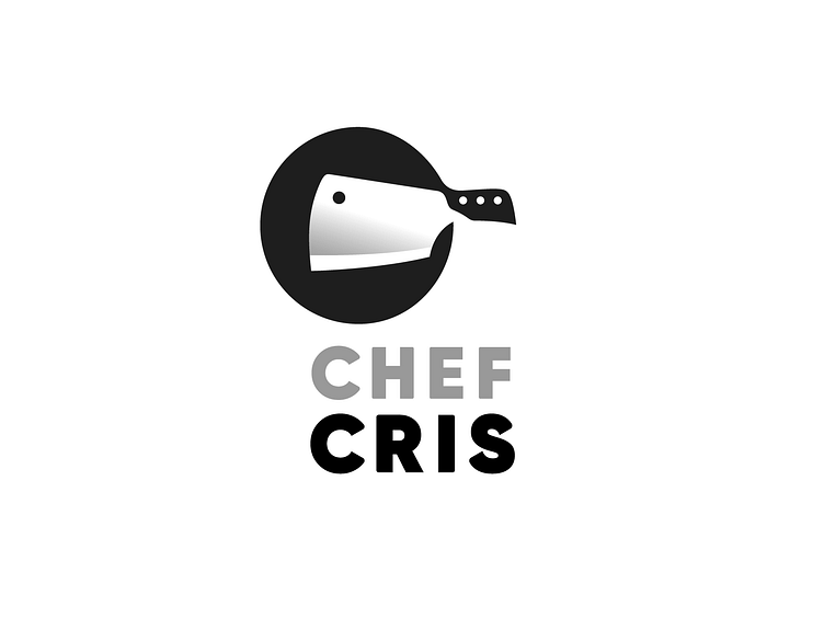
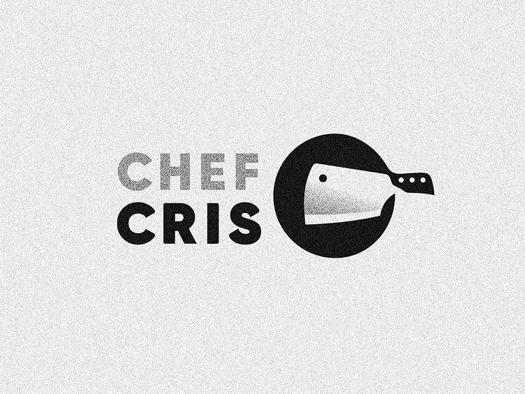
Chef Cris ✦ Logotype

After some refinements you've seen in the previous shots, here is the final version for Chef Cris logotype. It ended up in this more, let's say, sharp version of the symbol using a modified version of Gilroy Heavy type.
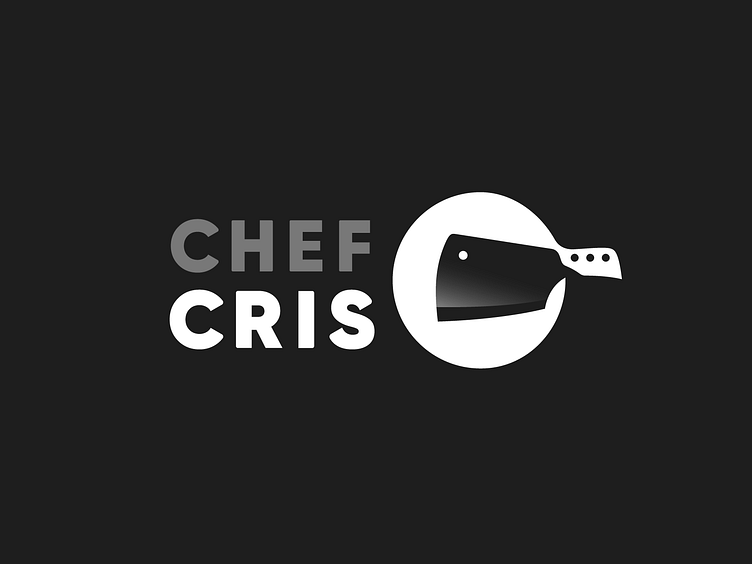
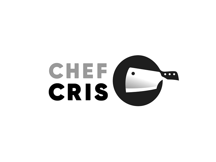
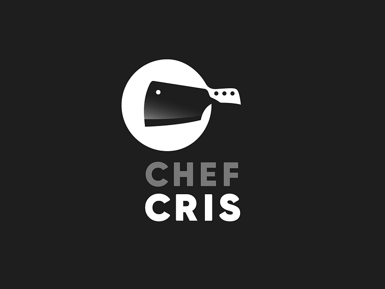
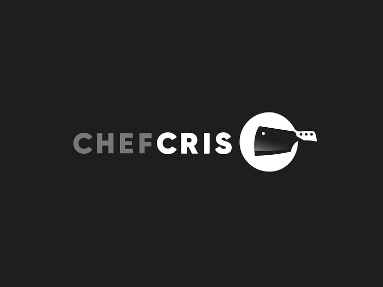
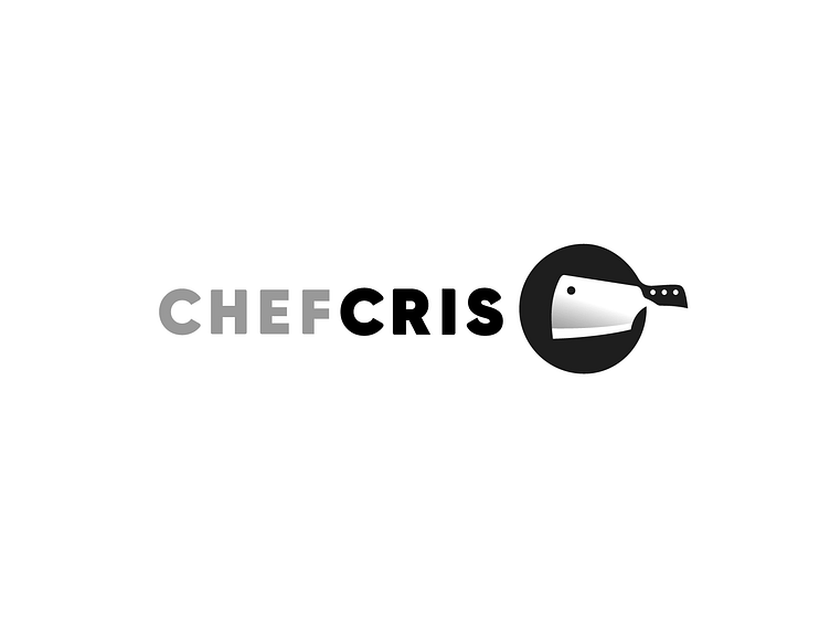
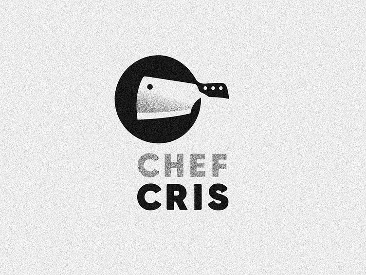
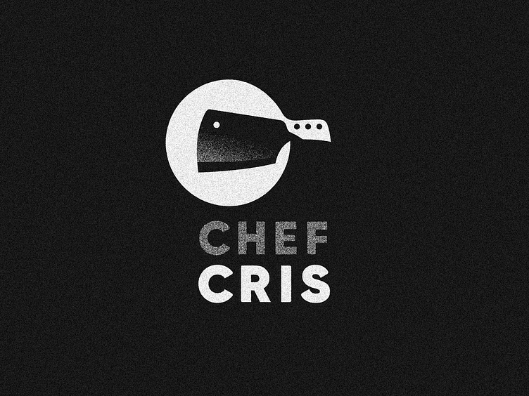
Have a look on some of the logo variations!


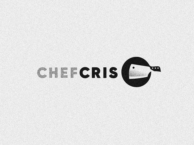
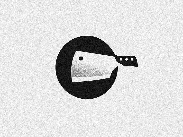
PS: I think this grainy effect is appropriate to his business, but since I know some of you like to see it in a more clean vision, here the no effect version as well as bonus :)