Framer AI redesign


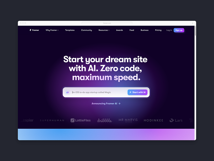
Framer's product UI has impeccable design. It's information-dense in the right areas, and breathable in the rest. The product typography is well-considered. On the other hand, their marketing sites have really missed the mark in recent releases.
With the launch of their new AI features (which Framer has admitted were received by designers at large as being underwhelming) there was nevertheless an opportunity for Framer to spruce up the marketing site.
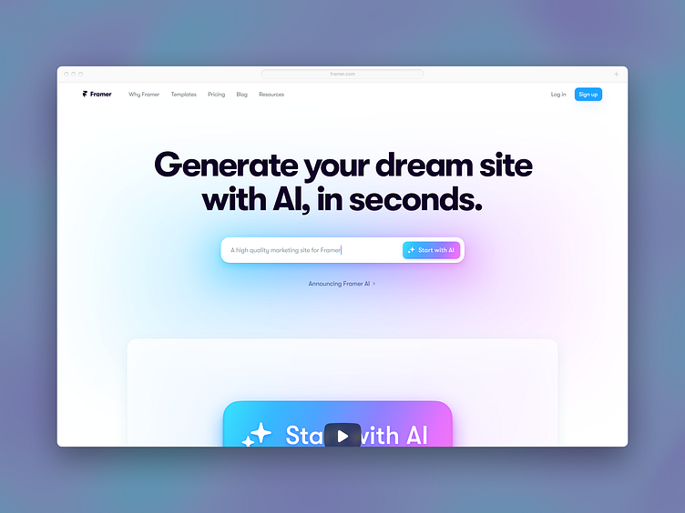
Here I've set out to redesign the hero section to show what might've been possible. It will be interesting to see how they respond to this redesign.
Copywriting
The copywriting was quite muddled between the home page and the detail page. The heading copy went as follows:
Home page: "Start your dream site with AI. Zero code, maximum speed."
Detail page: "Generate and publish your site with AI in seconds."
My revision: "Generate your dream site with AI, in seconds."
Visual design
Next up comes the visual design.
The design choices around type are uninspired. The site is far too liberal in its use of heavy fonts, and doesn't lean on a crucial missing medium weight. Also, there is a lack of size contrast in the type scale, leaving the design feeling an absence of dynamism. This also applies more broadly to Framer's UI elements throughout the marketing site.
The navigation is overly busy, reflecting a lack of prioritization in IA. I have condensed the menu to reflect a potential realignment of content. In doing so, it becomes clear that the menu was left aligned, where before it looked like it might be set to space-between and meant to arbitrarily span the full-width.
Last of all, there's a lack of tightness around the input field—both in the padding being far too generous for the type inside the input, as well as in the deeply non-conforming corner radii.
With that, take a look at the uncompressed pixels below:
Uncompressed