Bunny Studio Design System

Duration
The project was divided in four phases, spanning from 2022 to 2023.
My role
As the Lead UI Designer, I fulfilled a wide range of responsibilities encompassing UI design, interaction design, visual design, prototyping and testing, documentation, engineering handoff, and green-lighting components.
Results and impact
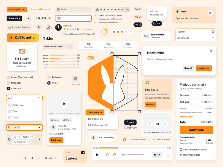
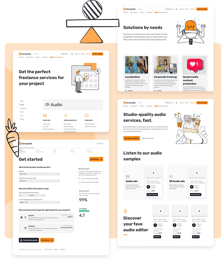
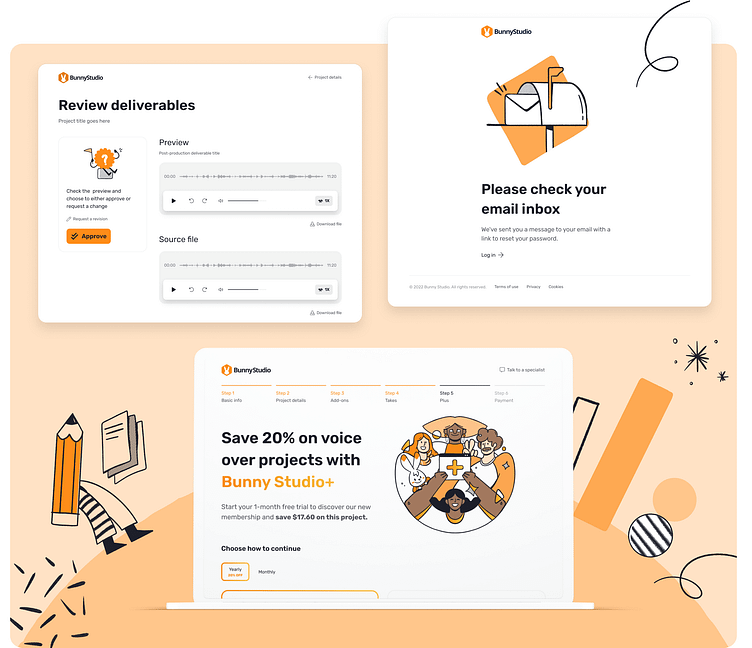
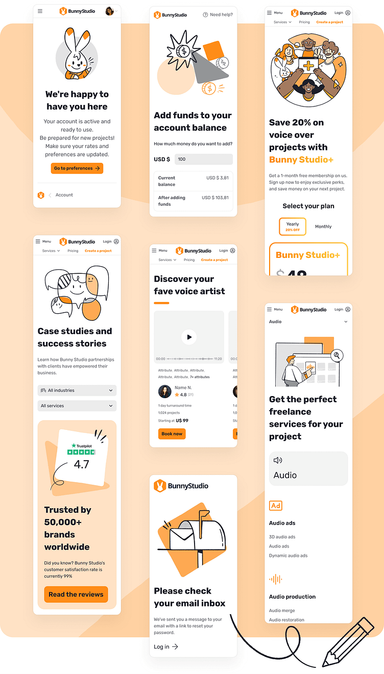
Designed and organized over 100 components in a new Figma library, improving design efficiency and consistency.
Fully documented technical component documentation on Confluence, facilitating the understanding and implementation of components by the engineering team.
Streamlined handoffs and front-end workflow, reducing the time and effort required for development.
Enhanced performance of new UI with faster page loading time
Accelerated prototype iterations for the product team, enabling faster validation and iteration of ideas.
Ensured consistent design principles across different squads, enhancing the overall user experience and brand identity.
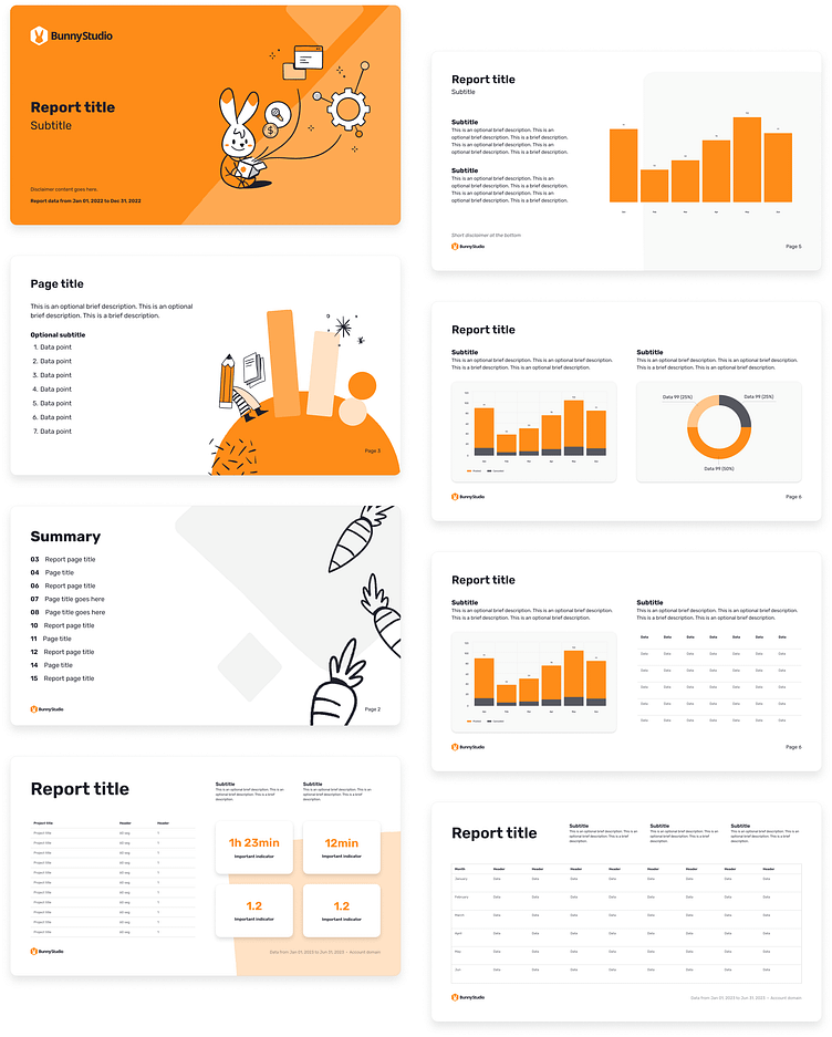
New marketing workflow and branding guidelines, enhancing brand consistency and efficiency in marketing activities.
About
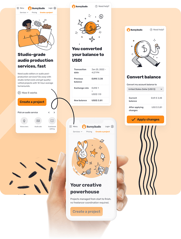
Bunny Studio attracts a significant number of daily users, including creative professionals and companies, seeking to execute their creative projects. In 2020, Bunny Studio was established to provide audio services for global brands and had plans to expand to additional industry segments. To support these plans, the team planned to implement new technologies as also a new design system, enabling a cohesive integration between engineering, marketing, and scalable product development. By 2023, Bunny Studio offered over 100 diverse creative services, with a growing number of projects being undertaken daily.
Discovery
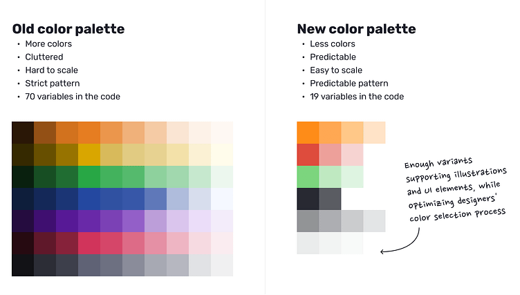
As the Lead UI designer, I use to work closely with every product squad on a monthly basis. While my fellow designers focused on specific challenges, I had a point of view that allowed me to see the bigger picture of what each team was creating and help bridge the gaps between them. However, I couldn't ignore the significant limitations posed by our former design system, which was based on Bootstrap.
The guidelines were unclear, important documentation for components was missing, web accessibility standards were not adequately supported, and the branding guidelines were too basic. These shortcomings were adversely affecting the pace and consistency of the squads, ultimately limiting the experiences we could deliver to our users.
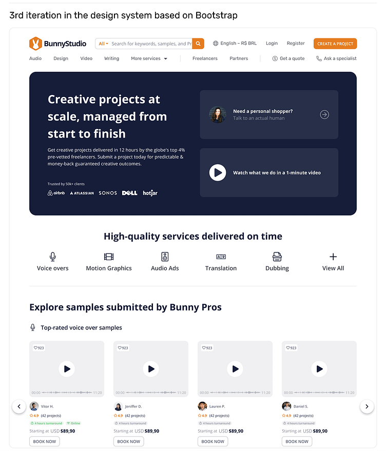
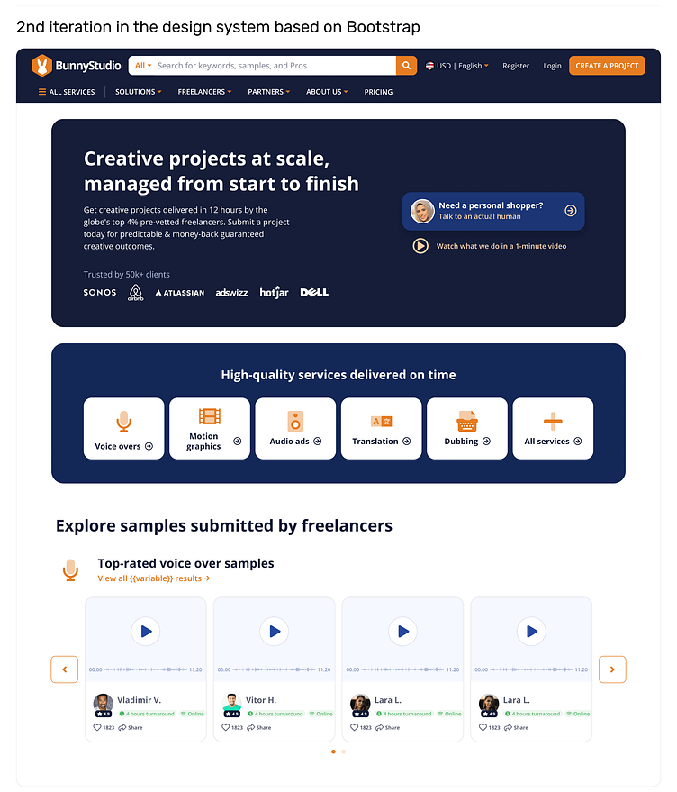
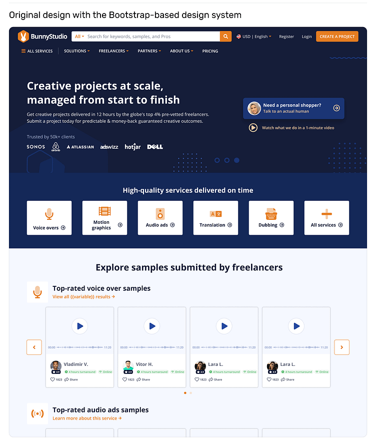
In an effort to be cost-effective, our initial approach was to revamp the existing Bootstrap-based design system (images above). However, after delving deeper into discussions with our developers, I realized that the system's problems went beyond just impacting the product—it was also hampering engineering productivity. The engineering team was already exploring alternative front-end architecture changes to address these issues. After that discovery I thought the idea of creating a new design system didn’t sound so off the curve. That’s when the visiontype work started.
The visiontype strategy
A visiontype is a prototype that embodies the designer's vision for a specific product. These high-fidelity prototypes serve as tools for discussing and iterating on the stakeholders' vision for the company.
To create my visiontype, I engaged in comprehensive conversations with managers, designers, developers, directors, and even our CEO. The primary goal was to understand their vision and gather their perspectives on technology, innovation, and branding. With this wealth of information, I began shaping the visiontype, aligning it with the common ground we discovered while adding my own unique insights based on my experience with the product.
Through four iterations, the idea gradually gained traction across the company. When I presented the visiontype to the CEO, Head of Product, and Marketing, they were already involved in the project, thus making it a natural move to discuss the next steps and determine how to divide the project into phased deliverables over the upcoming quarters.
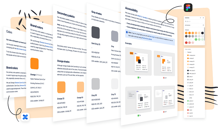
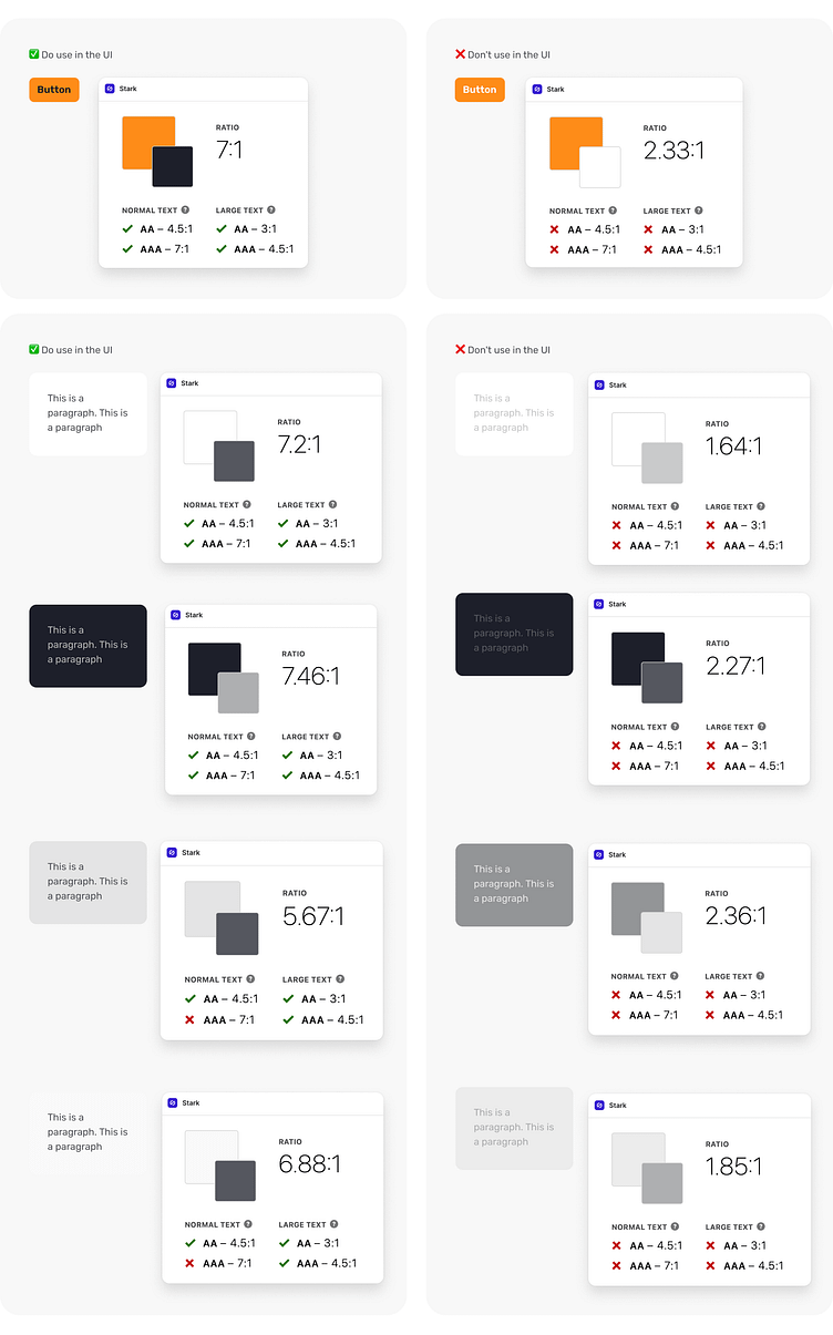
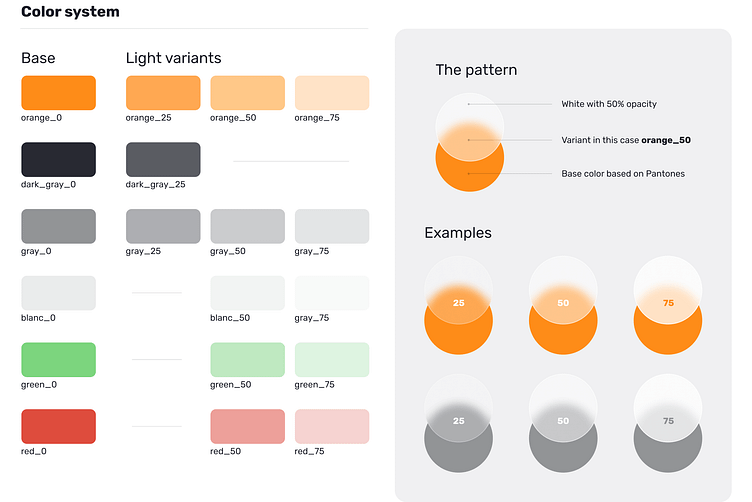
Colors and web content accessibility standards
An essential component of the new design system was enhancing web content accessibility standards. Not only did we focus on updating the colors to align with our branding efforts, but we also prioritized addressing the contrast ratio of our components from the very beginning.
As the Lead UI Designer, I took the initiative to establish comprehensive guidelines that incorporated WCAG standards into the process of specifying components and UI elements.
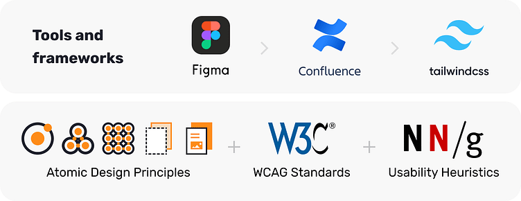
Once the colors experiments ended, we added the colors into our Figma library, using variables with names matching our engineering variable naming pattern. This was a learning from the previous library. This synchronization between design and development variables' names facilitated a smoother collaboration and enhanced the overall efficiency of the handoffs.
Typography and TailwindCSS
The choice of fonts played a pivotal role in the new design system, not only from an aesthetic standpoint but also in terms of optimizing page speed performance. In the previous design system, we encountered issues due to the mixing of multiple font-family weights, resulting in the need to embed numerous fonts in the code. As the Lead UI Designer, my responsibility was to bridge the gap between the designers' preferences and the developers' concerns regarding performance. Consequently, we reached a consensus to embed a single font family with up to four font weights for the UI.
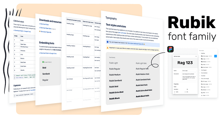
After testing alternatives that catered to the requirements of both our Marketing and Product teams, we ultimately chose Rubik as our font. This decision was influenced by three significant factors:
One: the rounded letterforms that resonated with our brand identity.
Two: the font should pair well with FontAwesome Pro icons which was the library we had licensed in our old system. This was a previous alignment between engineering and product teams considering changing it would require us to embed an additional icon library in the code thus decreasing page performance in some cases.
Three: variable font-family weight support. While not all browsers currently support scalable font-family weights, there is a growing trend towards broader support in the future. To ensure scalability within the design system, we limited our selection to four font weights. However, we are aware that our chosen font family will allow for the incorporation of additional weights in the future, as browser support for this feature becomes more widespread.
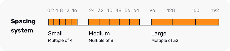
Spacing and grid testing
To be continued...
Special thanks ✨
A heartfelt appreciation and thanks to Caio Menezes for his exceptional work in designing the illustrations and bringing the branding guidelines to life. I would also like to extend a big shout out in thanks to Paulo Vieira and Erick Noriega, our esteemed leading engineers of this project, who demonstrated their utmost commitment and expertise in planning and executing the new structure.


