Web Concierge 2.0 - Capacity

When Capacity started in early 2017 the product was mostly centered around a chatbot that could answer work-related questions. As the product suite grew over the following years, the chatbot experience didn't change much.
In late 2021 we started a project to revamp the UX and UI of the Concierge. One theme we heard from customers (and something we observed from other chatbots) was that a chat interface on its own can feel like a "black box." Discovering what the bot can do is difficult if your only option is to type a question.
After conducting further user interviews we defined 4 key principles for the project:
Showcase the knowledge base content
Provide more controls to the user without sophisticated commands
Make the UI more accessible visually and physically
Make it speedy — faster than 95% of bot (Engineering goal)
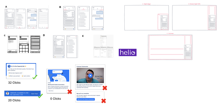
Rapid Prototyping
My team and I broadly explored various low-fidelity solutions. We then shared these with users and collected feedback using tools like Helio and Google Forms.
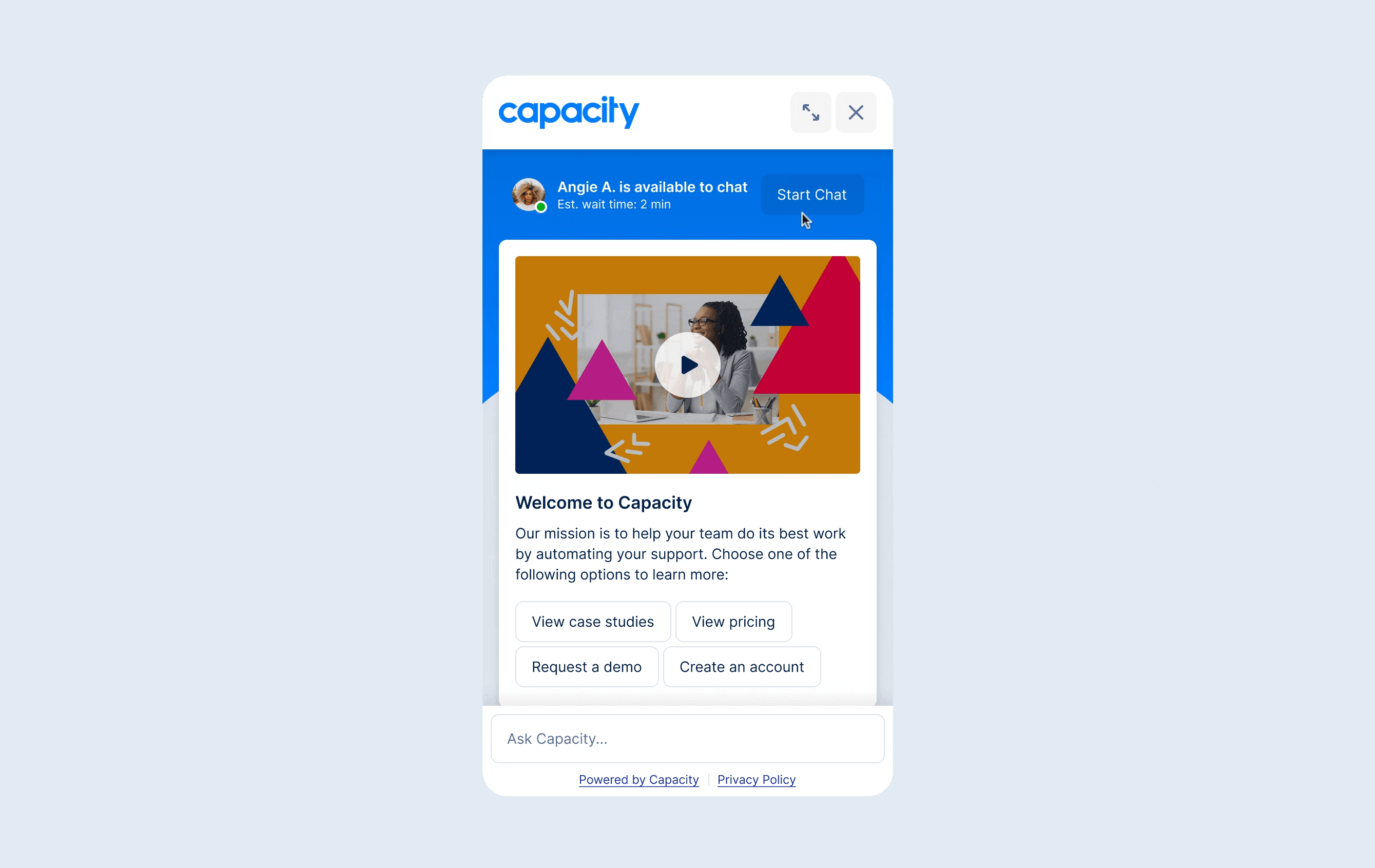
The High-Fidelity Results
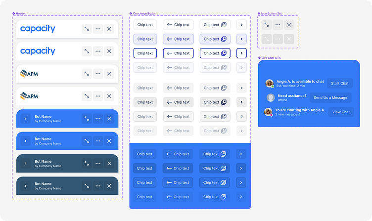
After synthesizing user feedback, I designed the high-fidelity UI and interactions. In addition, I added key components to our Design System so that future prototyping would be easy for me and other designers.

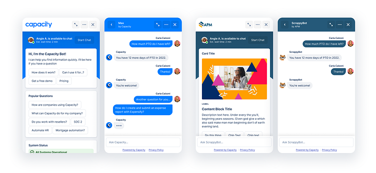
The homescreen makes it easy for customers to showcase content to their end users ☝️
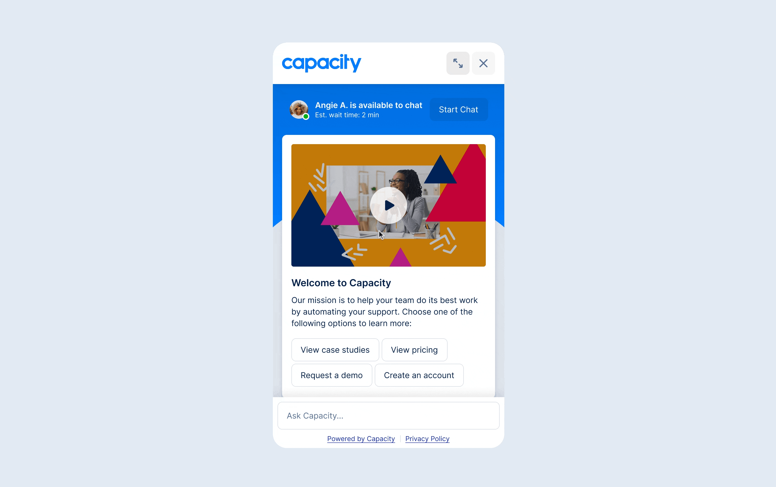
The LiveChat widget calls out when a IRL human is available to help. Nice! ☝️
Now users can read support articles in the Concierge without leaving the page ☝️ 🤓

Check the status of your helpdesk tickets. You can even comment on a ticket from the Concierge ☝️
Behind the Scenes
One challenge with this redesign is that the Concierge needs to be customizable. Most of our customers want to add their own logo and use their primary brand color, etc.
I had to take all of that into account as I designed the interface. I needed the UI to work for any customer. Here are some design decisions I made to make this possible:
Only show the customer logo on the home page header and enforce a white background on that header so that there is a high % any logo will look good
"But what about our brand color?" - Right, so after enforcing the rule in #1, I needed to throw a bone to the dog for the customer brand color. I did this by adding a background color on the home page that can be customized as well as by making internal page headers switch to the brand color as well. This switch from white header color on home to brand color on internal was also a nice way of orienting users to know whether they are on a parent level or on a child level.
I added a mode for the button component that uses opacities instead of solid colors. This allows the buttons to look uniform regardless of what customer brand color is rendered underneath the buttons.
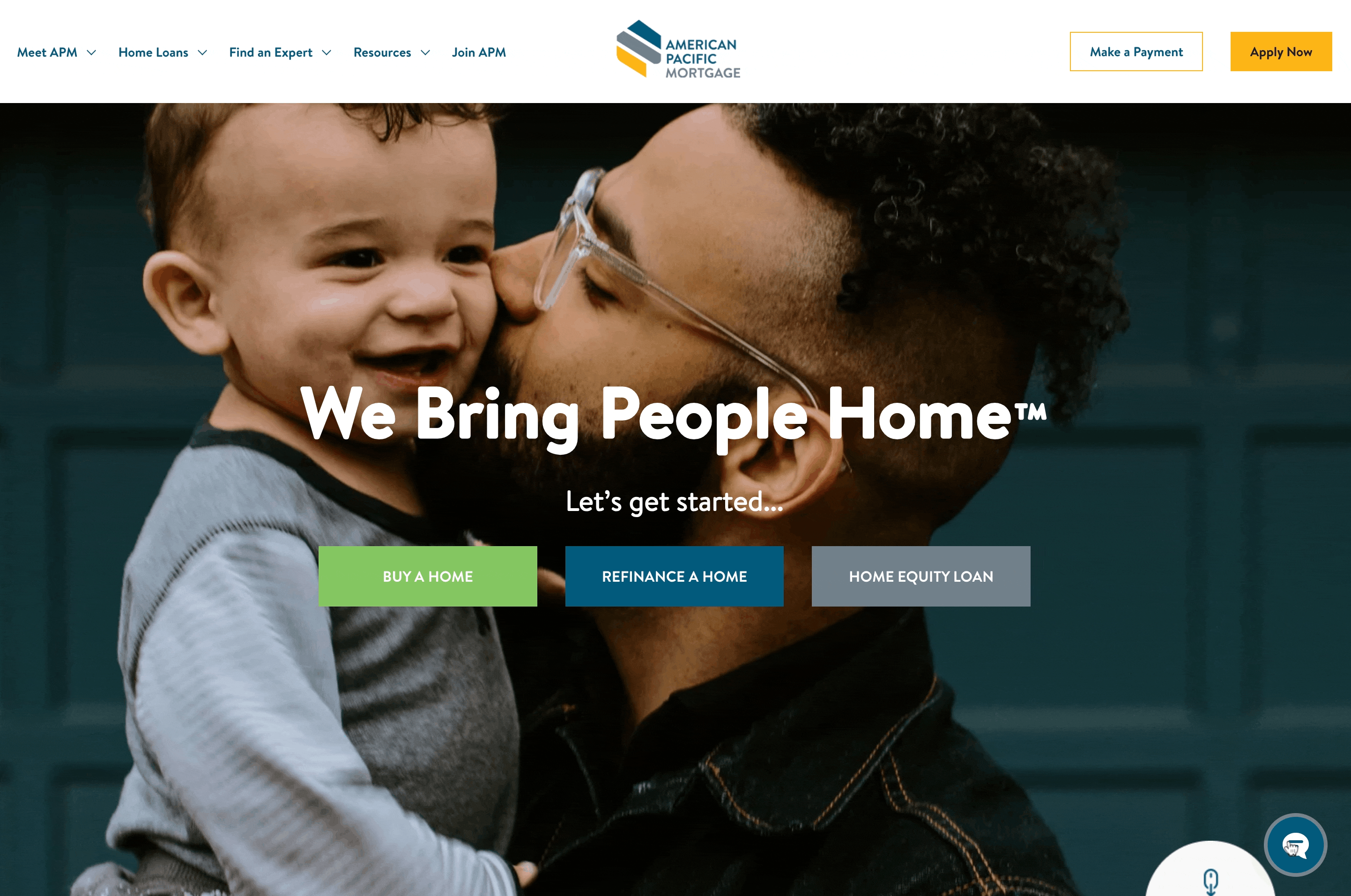
IRL Example
You can see some of the customization here in this real-life implementation of the new Concierge by American Pacific Mortgage 👇
That's it! Thanks for reading this far 🙌
If you like this project, please hit the 🩷
I am going to post another shot soon that covers UI for all of the settings/admin stuff needed to make this new Concierge work. Stay tuned...


