Enformion — Responsive Design Concept

Enformion is a cloud-based platform that harness billions of public and proprietary data records in the United States to provide accurate, up-to-date information, building out the most comprehensive profile report about people, businesses, assets, and their interrelationships.
Redesigning the Enformion web experience
Redesigns are intense, and sometimes necessary if user growth and engagement are stagnant. For the users, change isn’t easy, but being forced to deal with change that affects your daily productivity is worse.
We needed to determine where to focus our efforts. As a team, we decided to explore design possibilities and get feedback along the way. I was tasked with leading the charge. There are easily a million decisions to be made during the course of a redesign, many small and easy, some a bit more difficult. Here’s a peek into a few of the tricky challenges we had to work through.
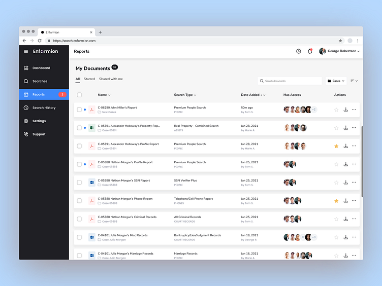
The Reports page introduces a new and streamlined way of organizing and finding reports using a card-based interface. Users can refine the list of reports by sorting and applying filters based on folders, tags, date, or by searching documents by typing part of the report name, folder, or tags.
The Favorite, Download and Hide actions allows users to view and highlight the reports that matter most to them, while hiding reports that might not be needed.
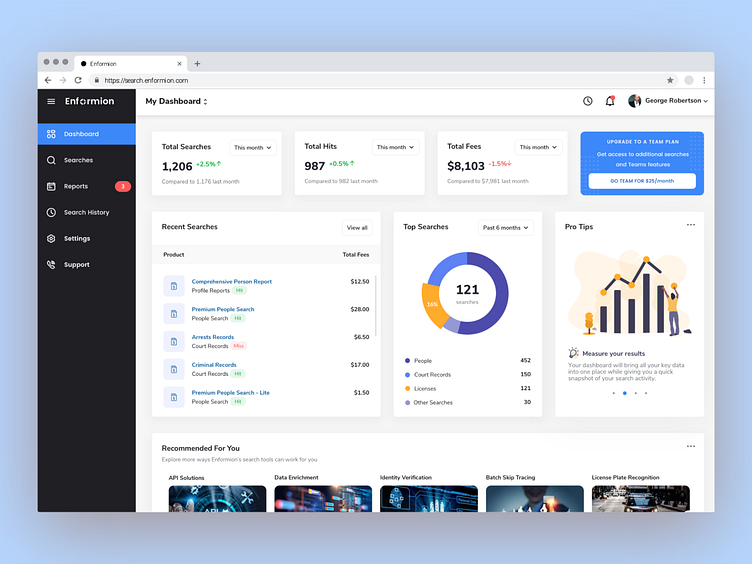
One thing we wanted to pay close attention to was the complete overhaul of the Dashboard page. The new Dashboard experience is built on an aggregation of many individual pieces of content presented using a card-based interaction model. Placing content in cards makes it digestible for users, providing easy access to the content that they are interested in, and engage in any way they want. Using cards facilitates the organization of information into logical groups, aggregate content, and show it context specific.
We wanted users to be able to login and jump right into real-time insights with actionable data, and a fully customized user experience within their workflow.
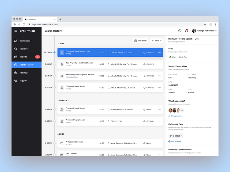
The new Search History experience creates a timeline of events using cards. A persistent side panel provides quick access to frequently used actions and content for each individual card.
I’d like to extend a huge thank you to all who were involved and came along for the ride with me on this project, including the entire product team, and of course our kick-ass engineers. Thanks for all your help and support!


