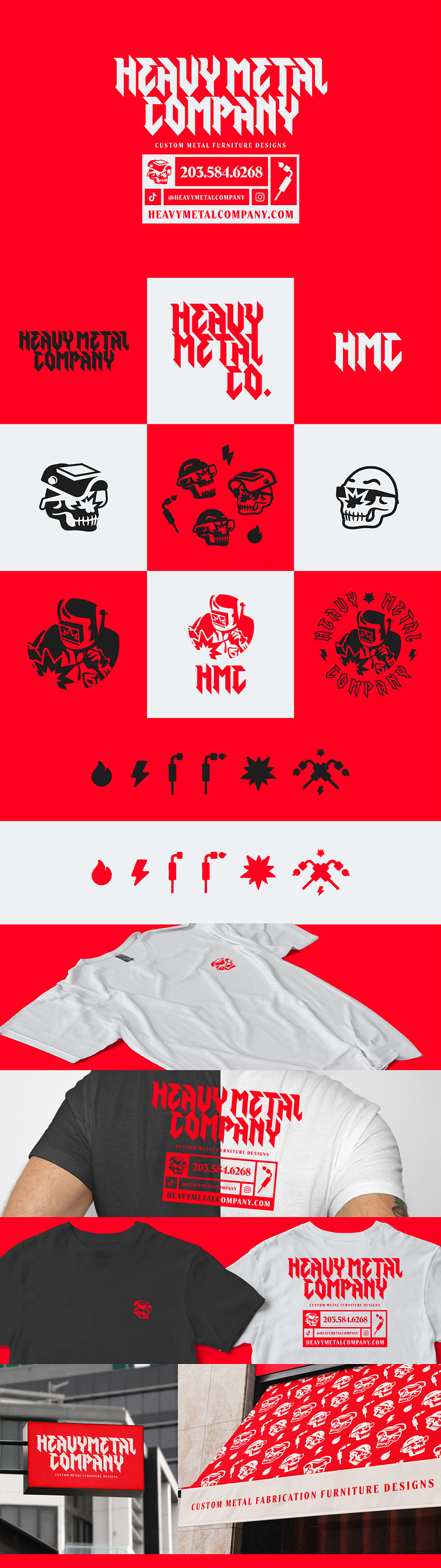
Heavy Metal Company - Branding project

The project goal was to rebrand from the previous name, Dividing Designs, and come to market with a fresh look that the newly formed Heavy Metal Company could easily align with.
Moods: Bold, Edgy, Industrial
The Heavy Metal Company rebrand was approached to emphasize the company's creativity in custom metal fabrication. The logo was designed to convey a sense of bold, edgy, and industrial styles. The edgy logotype was used to emphasize the company's creativity and custom approach to metalworking. The typeface was selected for its bold and distinctive look that helped communicate the brand's focus on edgy and industrial design. The use of a bold molten red helped to convey a sense of energy and strength, while the industrial black color helped to create a sleek and modern look. The tertiary mill white offers a fresh neutral option to contrast the dark and energetic black and red giving the color palette a grounded neutral option to balance the other bold colors. Combining these colors helped create a cohesive visual identity that reflected the brand's focus on high-quality metal fabrication design. With these choices, the logo design successfully communicates the brand's focus on metalworking and industrial design while conveying a sense of creativity and a forward-thinking approach to custom metal solutions.