Venmo Redesign Case-Study


Year:
2020
Business/Product Summary:
Venmo is a mobile payment platform that helps people transfer funds from one user to another using their mobile app.
A person with SearchTag installed on their phone gets access to a massive database of people and their careers, including the occupations of people in their phonebooks.
Duration:
One Month (August 2020)
Project Type:
Personal Viewpoint
Project Goal:
My work aimed to reimagine and refine the current design, bring the core features to the front row, and make the app experience straightforward.
User Problem:
Exploring the app's design and interface, I identified the following pain points:
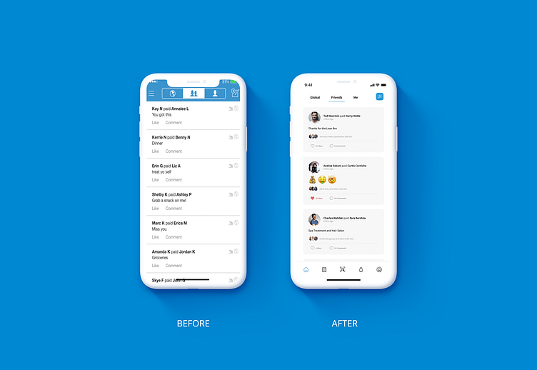
A somewhat distracting home page. The social media aspect of the app is understood and welcomed, but the core features, which most users would expect to interact with, need to be visible.
Slightly Confusing Phrases are used. For example, I found using the term Transfer balance somewhat confusing. I later understood it meant sending money to a bank account.
Process:
I researched competitors and other businesses doing similar businesses, created user personas, information architecture, and storyboards, and identified potential use cases and
I sketched my ideas of what the different pages could look like.
I created the lo-fidelity design and design system using Venmo's brand guide.
I created the hi-fidelity designs in Figma.
Solution:
I made a bottom navigation menu to hold the core components of the app. These core components include the Home, Request money, Scan QR, Notifications, and Settings buttons. Using white, black, and blue as primary colors for the app, I made white the background color so that both blue and black would easily stand out.
I changed the tab type from a pill type to a bottom-border one so users can intuitively access either category by swiping left or right.
Clicking the Send money button opens a dropdown; under this is a Pay a Venmo User and Transfer to Bank option. A quick scan QR code button sits at the center of the bottom navigation menu for easy access.

I placed the amount to be paid section in the top middle, increased the font size, and changed the font color to black. Also, I placed a small cancel button beside it in case a user makes a mistake while keying in the amount to be paid.
I separated the request money feature from the pay money feature(currently, they exist on the same page) to avoid confusion. To hasten transactions, I added a frequent contacts section to the request and pay money pages.

I placed the scan area slightly higher than the current design in my redesign. Two reasons guided that. The first reason was to create more space to accommodate the Scan QR code from a photo button, a feature that will help users scan a QR code on a picture saved on their phone.

I reduced the transfer to bank feature from two steps to one step by bringing the transfer options page into the primary transfer to bank page.

I also improved the user area, adding payment methods and my QR code page visual aesthetics to match the new design style.


