Expense Tracker for Apple Watch

**Currently participating in the 90 days design challenge, where prompts are provided by the team at DesignDrug.
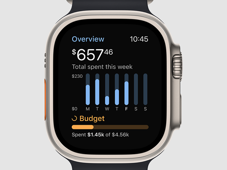
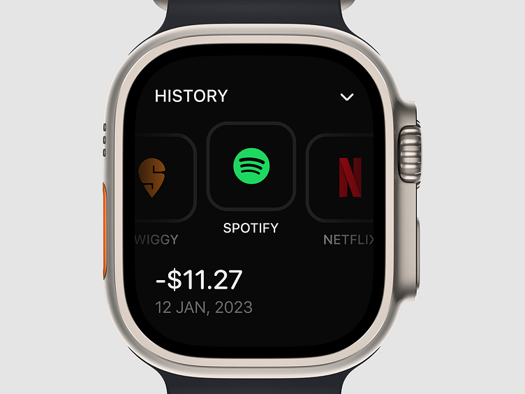
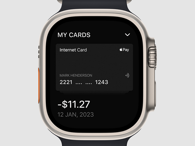
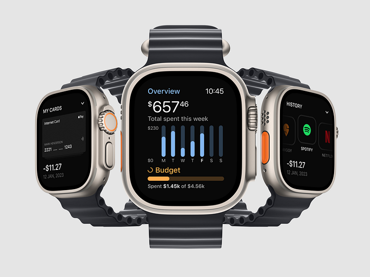
Designing for smartwatch interfaces presented a whole new set of challenges, and I was determined to tackle them head-on.
Delving into the intricacies of sizing, colors, and usability specifically tailored for this innovative device was enlightening. My mission was to deliver a seamless user experience without overwhelming the user with excessive information. This resulted in a minimalist aesthetic that allows effortless navigation through expenses, while keeping the focus on what truly matters—the user's financial health.
Let's take a closer look 🔎