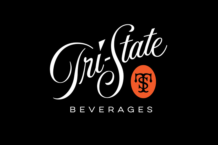
Tri-State Beverages Co.
This logo work is a study in taking an older, obscure logotype and redrawing it to improve the clarity, flow and overall impact and effect. In the original bottle image you can see many inconsistencies in the main word mark. Most notable of these being where the upstroke of a previous letter shows an abrupt or "hard" angle join into the next letter as well as overall spacing issues. Also, the lead stroke line on the first "t" in "State" was unnecessary and therefor eliminated. Tri-State was a smaller bottling company out of Baltimore, Maryland in the 1940’s.
adobe
beer
beverage
branding
brand refresh
cutom lettering
design
graphic design
illustrator
lettering
logo
logotype
packaging
typography
wine
wordmark
View all tags
Posted on
Jul 26, 2023
More by Jeremy Friend View profile
Like


