UI Component - Checkbox | Uzence


🔳 Mastering Checkboxes: A World of Choice and Style! 🔳
Unlock the checkbox's enchanting realm in UI design! Here's your sneak peek into their versatile universe:
🔤 Types: From the iconic checkbox icon to single selections, checkbox groups, and convenient checkbox lists, explore a spectrum of choices to engage users.
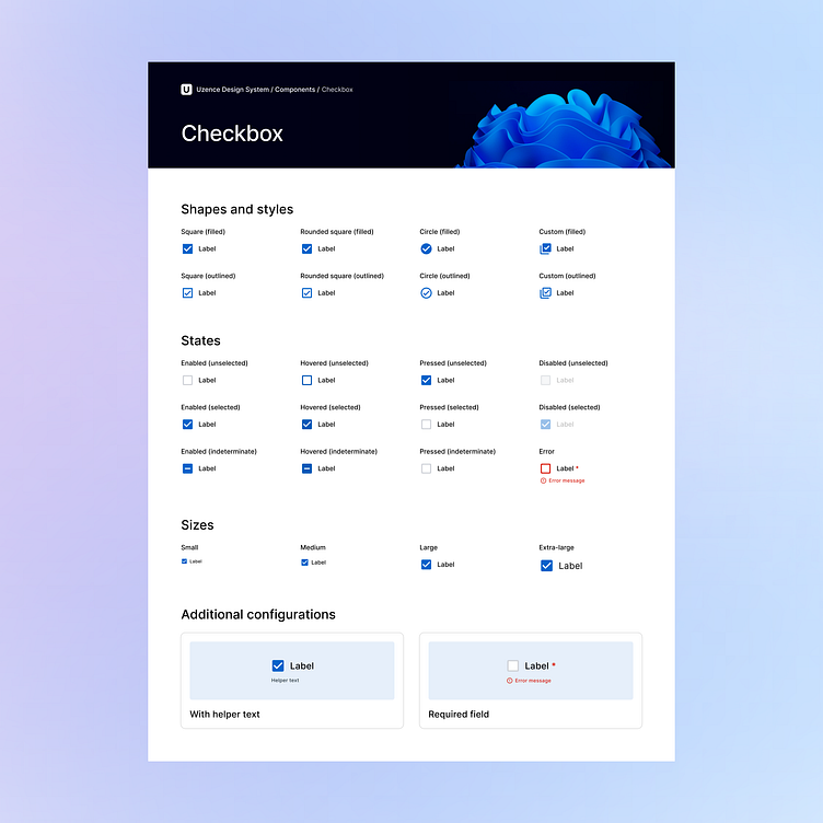
🎨 Shapes & Styles: Dazzle with design diversity! Choose square, circle, or even custom shapes, and opt for filled or outlined styles that resonate with your visual language.
✨ States: Checkboxes wear emotions! Witness their transformations as they navigate through states like unselected, selected, and the intriguing indeterminate. Hover and press states add a touch of interactivity.
📏 Sizes: Size it just right! Pick from small, medium, or large checkboxes that harmonize perfectly with the rhythm of your layout.
⚙️ Additional Configurations: Elevate user interactions with finesse! Offer helper text for guidance, mark fields as required, and enhance user-friendliness with thoughtful configurations.
Stay tuned for more insights on other UI components of the Design System, as we unwrap more design treasures, one element at a time! 🚀🔍
💖 If you're loving this exploration, hit that 'Like' button and share your thoughts. Happy designing! 🎨✍️
Got a project? Let's talk.
Ready to create unforgettable experiences together? Schedule a call with us for exciting projects and collaborations! Let's shape the future of design, one masterpiece at a time. 🎨🌟
To learn more about us, visit our website at uzence.com
Don't miss out on the creative inspiration and updates! Follow us on LinkedIn Instagram and Facebook 🌈🌌


