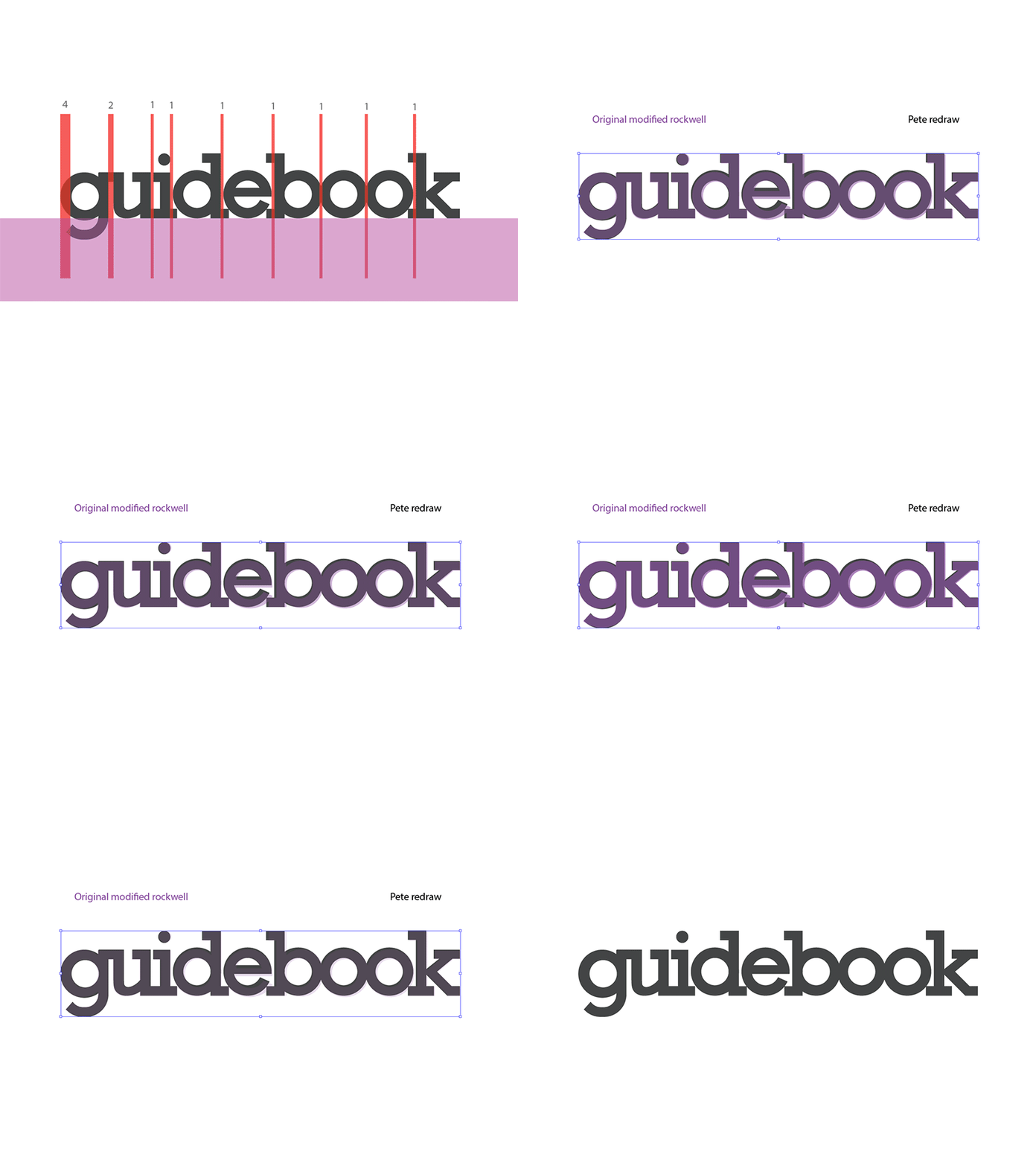
Guidebook logo redraw
I recently redrew the Guidebook logo to clean it up a bit, here is a gif showing some of the differences. We wanted to get more uniform construction, better alignment, consistent spacing and improved clarity.
Pretty minor changes all around. Let me know how you think I did!
(can't let google have all the fun!)
More by Guidebook View profile
Like


