Rebranding EDESA

Our client, EDESA, provides funding and capital to medium and small businesses. They are a spinoff brand from FINCA. They tasked us with refreshing their brand identity as they were sharing the same logo as the original brand, FINCA.
Our brief was to create a unique brand identity for EDESA while maintaining a common thread between them and its partner brands, Finca and Empresas de Crédito. This would allow the brands to have their own look and feel while still remaining part of the bigger 'family' of brands.
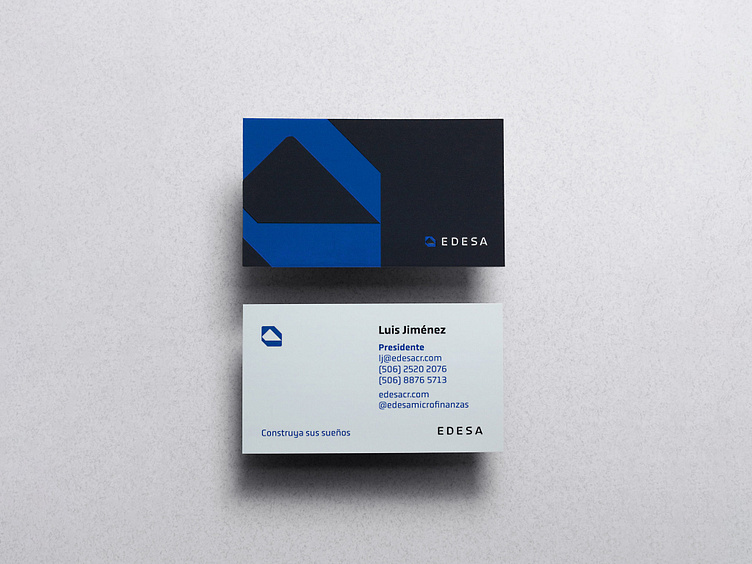
For EDESA we opted for a more graphic and modern approach for the brand. We maintained the concept of the mountain, as it speaks to the idea of dreams, goals, and aspirations. For the logotype, we created a custom typography that lives alongside the other two sister brands.
We chose blue as the primary color palette for the brand, which also served as secondary colors for the other brands providing a sense of continuity.
👉🏽 Revitalizing your brand identity might be the key to more sales!
Send us a message and let's talk about your business and how we can help you with its growth.
More Info: designetiquette.com
Instagram: @designetiquettestudio
Behance: Design Etiquette
Linkedin: Design Etiquette
Get a free project consultation
🤙 Exploratory call : Book a 30 mins call