UX - Flying booking app with Axure prototype


If you want to play with the high-fidelity prototype (Axure RP), you can click here.
Challenge
‘Fly UX’ is a fictitious airline company. We assume that this fictitious airline company enroll me as a UX Designer to create their app.
The final deliverable is to build a high-fidelity prototype which can be tested and to build a detailed wireframe which could be given to the developers team.
Define scope of the project
Before to start the project, I need to learn more about :
A - What do we want to achieve as a company ?
B - What are our business goals ?
C - What are ou KPIs ?
D - Discover the airline sector : competitive analysis
A - What do we want to achieve as a company ?
For the product vision, I love to do some brainstorming / ideation exercices.
To sum up the ideal version of the product using this sentence.
We want to provide a [certain experience] to a [certain user].
"We want to provide a clear, fast and logic booking process so that passengers can book their plane as fast as possible."
To create the best slogan like for an advertising
1 minute. 1 ticket.
A booking process as fast as your next plane.
B - What are our business goals ?
Increase planes occupancy rates / Increase in ticket sales ;
Increase in the number of new accounts in the app ;
More business clients ;
Less trip with trains or cars ;
Good reviews.
C - What are our KPIs ?
Task completion rate : Number of finished bookings ;
Task completion time : Time to finish a booking ;
Error frequency ;
Error recovery rate (quality of error messages)
Reviews on the app store ;
Accessibility score ;
Reviews on the app stores.
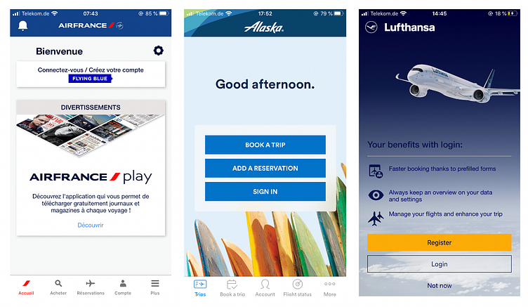
D - Discover the airline sector
With a benchmark, I wanted to find important information :
What are the competitors doing really well that I can use in my project ?
What are they doing not-so-well that I can improve ?
What conventions have been established that I need to follow ?
Some insights :
For 2 apps, the booking process is quite confusing.
Lots of information are displayed at the same time.
Some displayed information are not related to the current task (advertising...)
Booking as a guest is very useful and make the process faster.
The fare benefits are difficult to understand.
Define the problem
A - User Research & Analyze theirs insights
B - Select relevant patterns for problem statement
C - Define the problem statement
A - User Research & Analyze theirs insights
I had assumptions I wanted to challenge like :
"I believed that the main goal of flying app user is booking a flight”
"The most important thing when booking a flight is the price”.
During the user research, I tried to adapt my questions and scripts in order to challenge these assumptions and to discover pain points, needs, goals....
After the user research, I gathered all the data and tried to find the most recurring pain points to define a problem statement.

B - Select the most recurring patterns for problem statement
The process to book a flight is unpleasant because of a confusing booking process : "why do I have to choose the seats right now ?", "What do I have to do right now ?"...
They are frustrating because of useless information related to the current task : "Why do I see a plane I can't book ?"
Price, Flight time and Flight transfer are important information when booking a flight.
Users abandoned the process because of information they didn’t see : "I've never seen that my trip had a transfer flight".
The users use the app to check prices before to book the flight.
C - Define the problem statement
I include 3 things in my problem statement :
Who is the user?
What is the problem?
Why is it important?
Regular and occasional passengers need clear information related to their current task because they often need to check information on a flight before to book it.
Solve the problem
A - User-flow
B - Low & High-fidelity prototype
C - Hand-off for developers
A - User flow
Because of some confusion in the booking process where steps were not in the expected order according user's mental model, I created a new user.
I gathered together all the information on the order of stages expected by the users.


I started to design the solution to the user's problem by making a low-fidelity and then high-fidelity prototype (That's my jam).
User want the right information corresponding to the current task
For each page, I asked myself "What are the most important information related to the current task ?" and select the relevant information for each page
Delete or hide information that does not help the user to carry out the task in hand
"They gave up sometimes the booking process because of Information they didn't see"
Emphasize relevant information so that the user don't miss it with contrast, spacing...
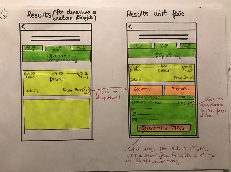
The "Fare benefits" were difficult to scan and to understand.
Redesign of the fare benefits so that it is easier to read and understand.
Confusing booking process
Re-order the steps so that it corresponds to the user's mental model of a booking process.
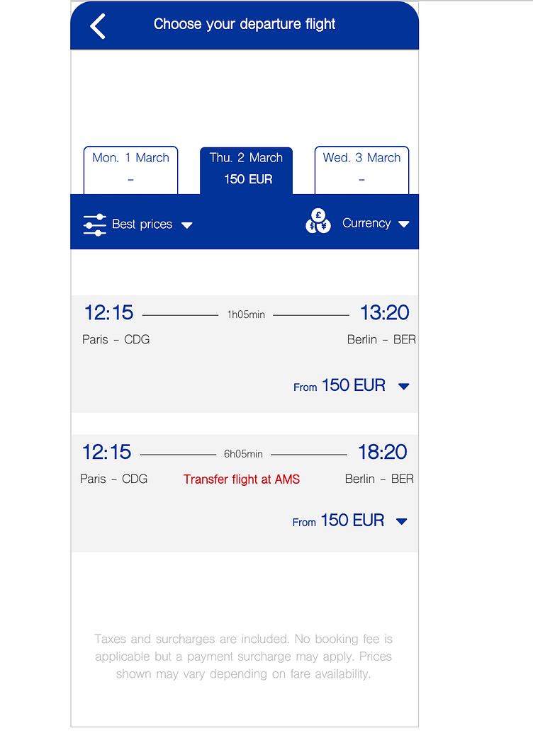
A clear "trip summary" page summarizing in a clear way all the relevant information


Last but not least....
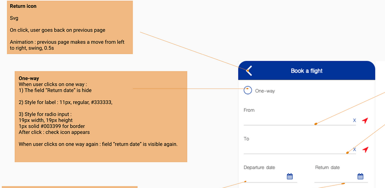
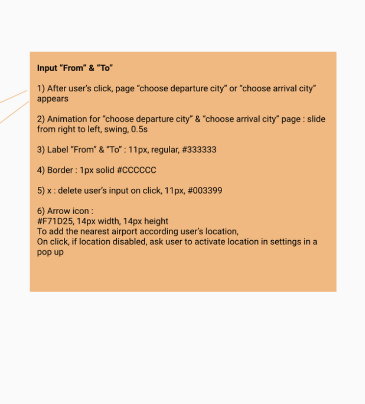
Using my working experience as a front-end developer, I was able to create a very precise hand-off for developer (which was actually me in the project but nevermind...).

Some self criticism....
Be more specific when building my journey map
When I am looking at other UX designer's journey map, I think I could have been more specific. It may be that it didn't help as much as it could have.
Make sense of the data
"There is subjectivity involved. Often there will be gaps between the affinity diagram and the journey map, you need to use your own judgement to fill those gaps”.
It was difficult to trust my own judgment and interpretation to fill the gap when interpreting the data.
The UI
At that time, I didn't have my currrent UI experience. It would have been more than beneficial to design the high-fidelity prototype in Axure RP with design principles and patterns in mind.
Ideation phase
I had sometimes the impression I was designing for myself. When it was the case, I read one more time some data from the user research as well as the problem statement.


