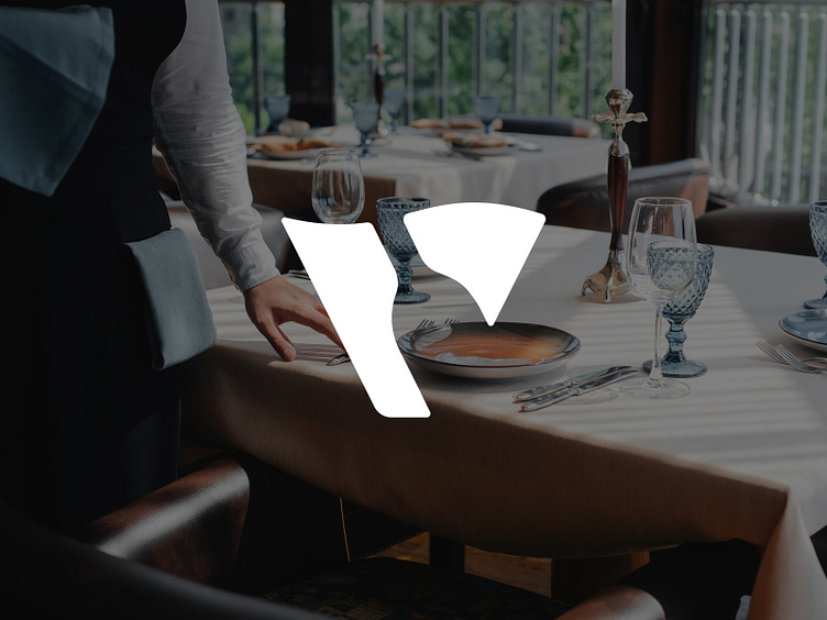
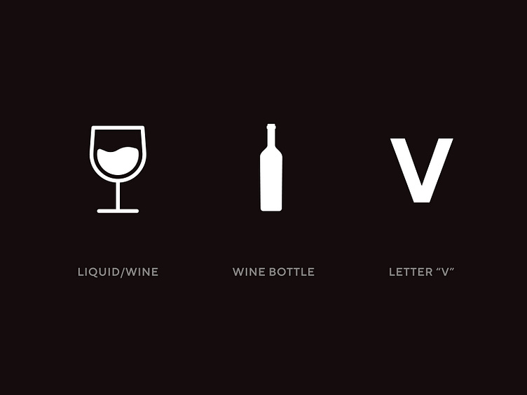
Letter V + Bottle + Wine

Probably one of my most favourite-to-design logos, from this year.
An unfortunately unused concept.
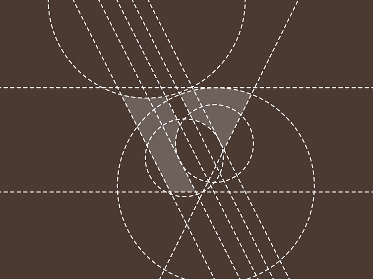
A simple concept using the shape of a letter "V" combined with a negative space wine bottle and utilising the top of the V to resemble what wine looks like in a glass when being swirled.