Invoicing Mobile App - Blank Color Concept

Quick look into couple of screens for the invoicing app that I worked on. This tool is part of larger b2b saas system, for small and medium sized companies, made for accounting-related tasks. The challenge was to simplify interactions close to consumers product level, having in mind how complex these operations can be.
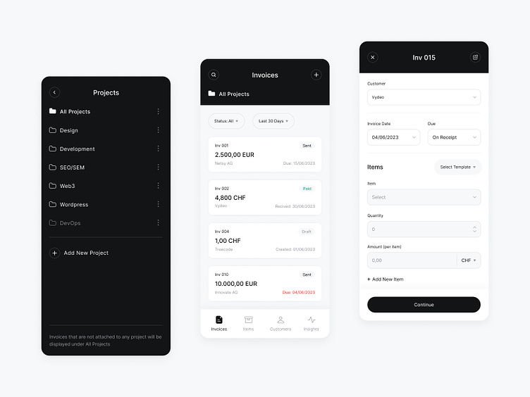
Here are some work insights
We went with the "deep interface" - do not face user with too many details per screen, but allow to discover functionalities naturally after every tap
We have decided what is, not the most important, but one and only important information per field, section or screen. Then using blank color concept (no colors) and one and only color to highlight that information
Fields and filters: I'm using grey background on these fields to indicate that field is not filled or that filter is not applied (value:all)
Since navigation complexity is very big, I've used color indicators to help user feel and learn over time: grey page background indicates main page, white background is for inner pages and modals, while black indicates popovers and other top-level modules.


