Web Analytics Dashboards details ✨

Web-Based Data Visualization Platform 🌿
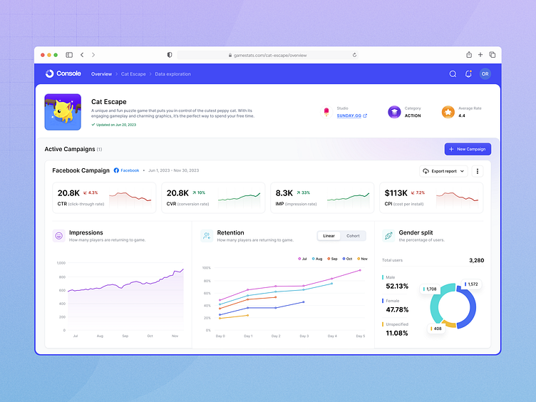
A high-fidelity data exploration page for a game!
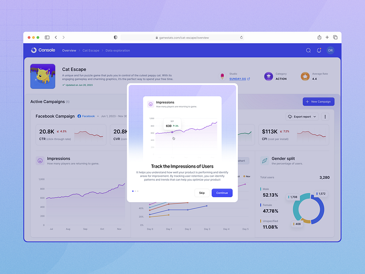
Playing with Charts, Seeing is Believing! 🪄
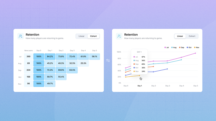
The cohort chart is a powerful tool for tracking and analyzing how different groups change over time. However, it can be challenging to read and extract total stats from the default version, which includes blocks.
To make it more user-friendly, I convert it into a linear chart. They allow users to quickly identify trends and patterns in the data, which can be especially useful when working with large data sets and help them make better decisions based on the information we provide.