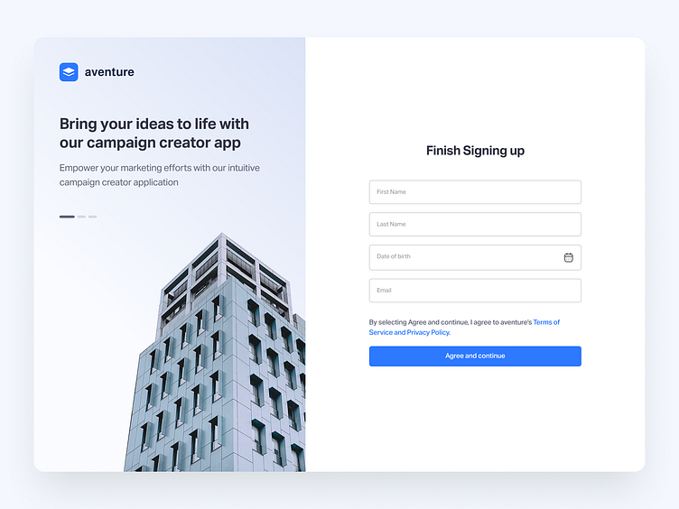
Campaign Creator - Sign In Flow Design


Hey Guys 👋
Take a look at new the design concept for Campaign Creator Sign In screen. We made it as a minimalist one.

What we do?
Keep the onboarding screens clean and clutter-free with just essential elements - username, email, password, and login button. Avoid distractions.
A user-friendly login page should be intuitive, secure, and efficient, ensuring a smooth experience for your users while safeguarding their data.
Organize elements on the page with a clear hierarchy.
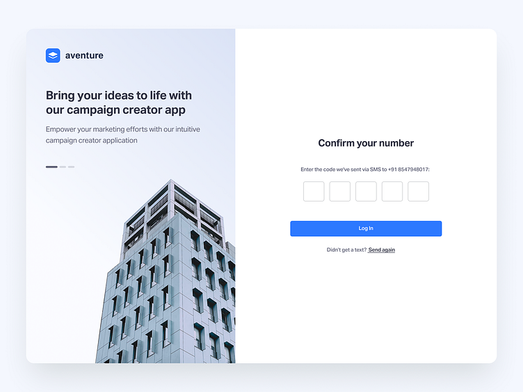
Use ample whitespace to create breathing room around elements. It improves readability, reduces visual clutter, and makes the page more visually appealing.
Choose easy-to-read fonts and appropriate font sizes. Ensure there's enough contrast between text and background for readability.
By applying these UI principles along with the user-friendly design guidelines, you can create a login page that not only functions effectively but also provides an aesthetically pleasing and intuitive interface for your users.
We are available for new projects
Don't forget to press "L" if you love it ❤️ Thanks!
Feel free to leave comments below.
Have an amazing project?
Send to our email: madathilvineeth@gmail.com


