Case Study: Evolving our Brand

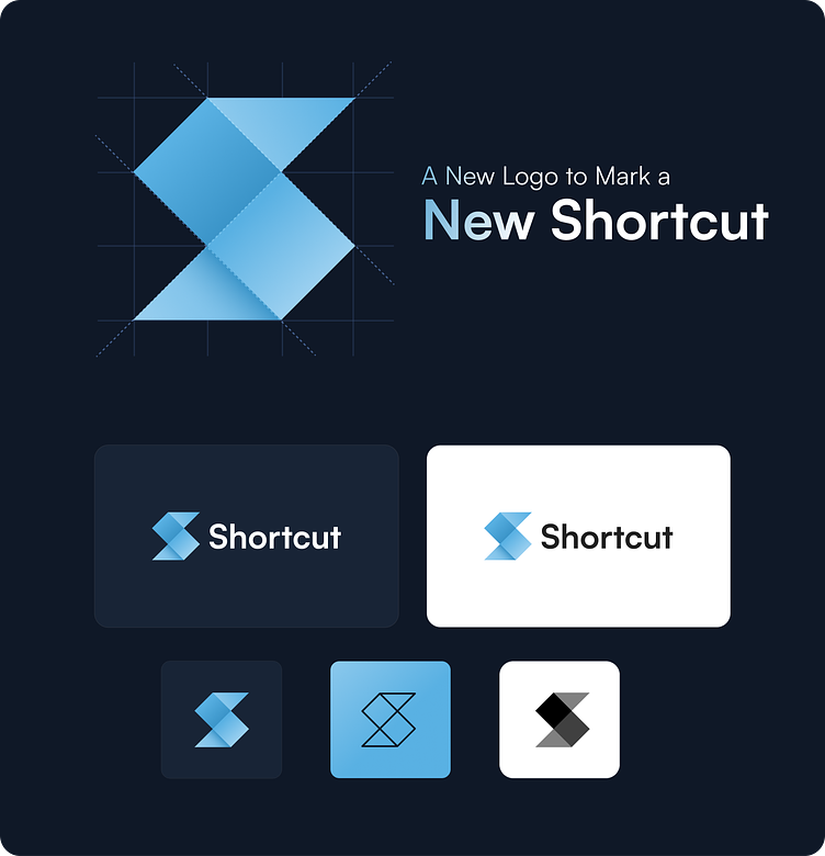
A New Logo to Mark a New Shortcut
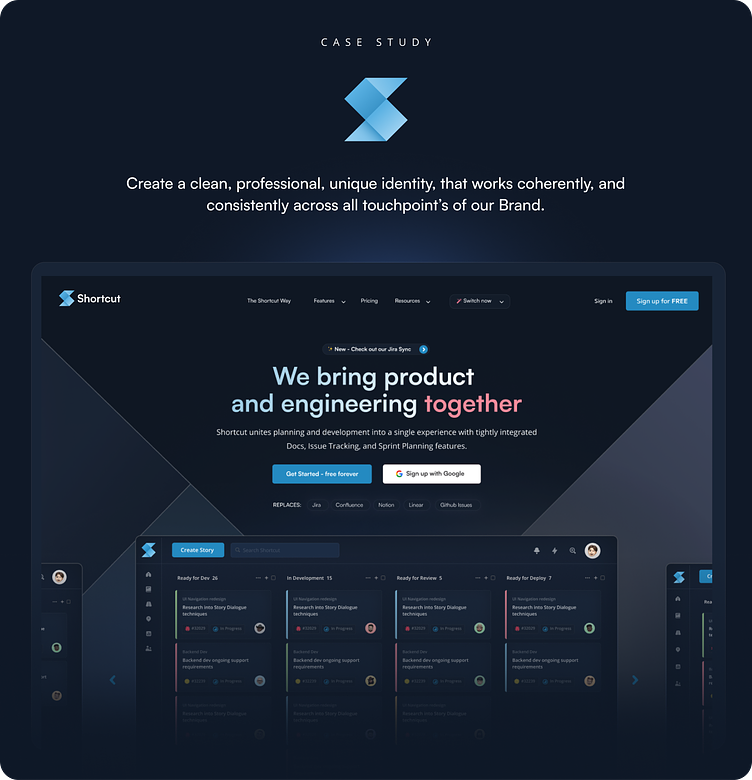
Challenge: Create a clean, professional, unique identity, that works coherently, and consistently across all touchpoint’s of our Brand.
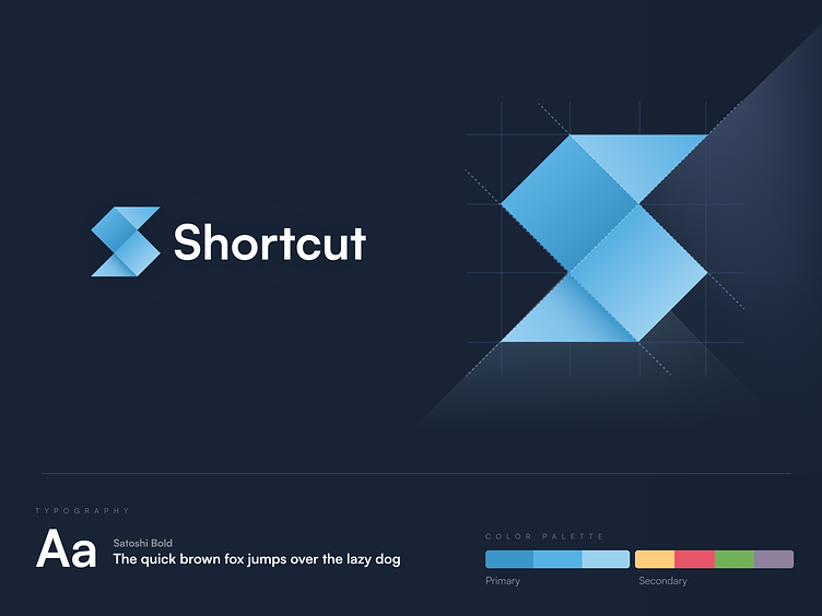
Our Logo
Our logo is our stamp. It’s the heart of our brand, and it’s used across our brand to be the cornerstone of our company. It is consistent, and is never altered.
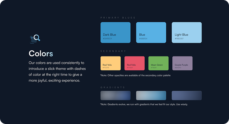
Our Colors
Our colors are used consistently to introduce a slick theme with dashes of color at the right time to give a more joyful, exciting experience....
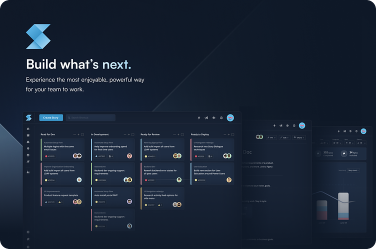
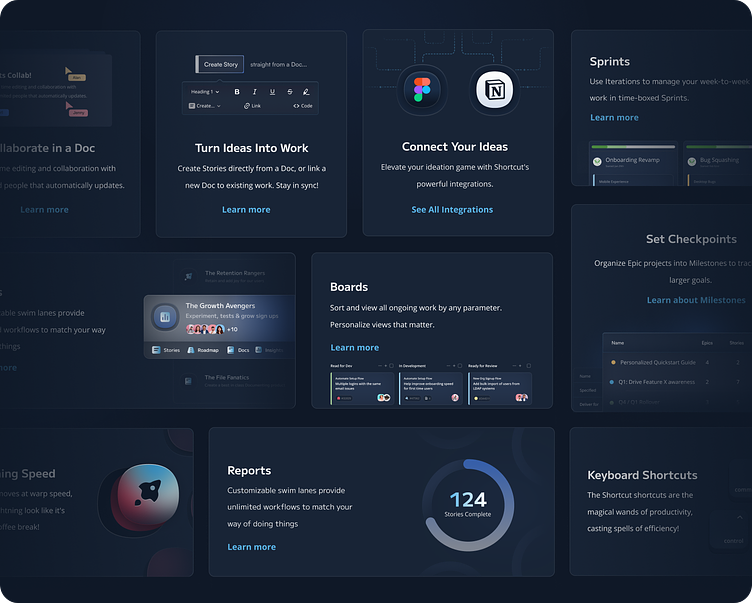
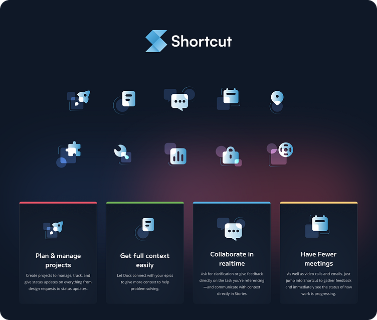
Our UI Approach
We’ve modified our product marketing interface to create a dark, simplified, slick UI. This allows us to focus on what is important for potential users.
Our Visual Hook
We introduce geometric background across our brand identify to create holistic experience to compliment our geometric logo.
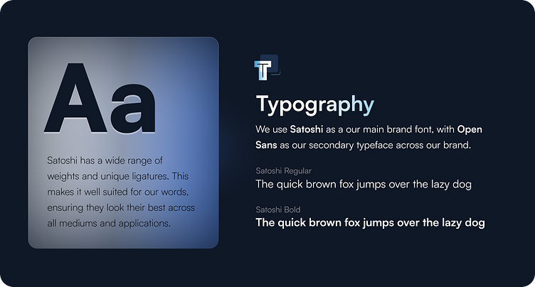
Our Typography
We've updated our font family to create a consistent vibe across our branding, from typography through to logo.
Our Iconography
We use our iconography to enhance our visual style, as well as help communicate our content.
Try out Shortcut!
Check out our brand in real life over at shortcut.com! We're trusted by thousands of modern software teams all around the world!