Personal Trainer Website UI Case Study


Intro
An innovative personal training brand that is breaking barriers in the online fitness space.
Catering to a diverse audience searching for free and premium content, BeaTrained is more than just another fitness platform; it's a complete digital fitness experience.
In this case study, we delve into the meticulous design journey, marrying aesthetics with function, ensuring that users consume fitness content and immerse themselves in an intuitive and engaging environment.
Discover how we translated BeaTrained's vision into a seamless digital interface, prioritising user experience every step of the way.
Project Specifications
In this project, I played multiple roles, including User Experience (UX) Designer, Interaction (IxD) Designer, User Interface (UI) Designer, and Visual Designer. Over the course of two weeks, I worked on various deliverables such as competitive analysis, site maps, and high-fidelity mockups. My primary tools for this project were Figma, Photoshop, and Illustrator.
Overview
Designing for BeaTrained was an intricate dance between user types and their unique expectations. Here’s a breakdown of my approach tailored for each segment:
The Fitness Newbie
Simplicity was vital for those embarking on their fitness journey. I prioritised easy navigation and clear, concise content presentation, ensuring new users felt welcome and unintimidated.
The Advanced Trainee
Experienced users often seek advanced routines and detailed information. I ensured that more profound, more intricate content was accessible without overwhelming the broader user base.
The Casual Browser
Recognising that not everyone would come to commit immediately, I designed teaser content and engaging visuals to entice casual browsers, providing glimpses into the premium offerings.
The Paying Subscriber
I aimed for a seamless experience for those investing in premium content. This involved smooth payment gateways, exclusive content access, and personalisation features to make their subscription feel valued.
The On-the-Go User
With increasing number of users accessing fitness content on mobile devices, responsiveness and mobile optimisation were paramount. I ensured the design looked and felt consistent across all device sizes
This multifaceted approach to design ensured that BeaTrained appealed to a broad user base while maintaining a cohesive brand identity. Each type, from the novice to the professional, was considered in crafting a holistic and engaging digital fitness platform.

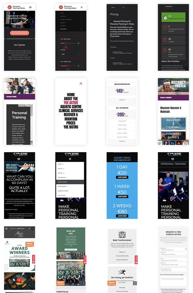
The Competition
Similar websites, consistency, design and elegance often need to be clearer to navigate and far from mobile-friendly.
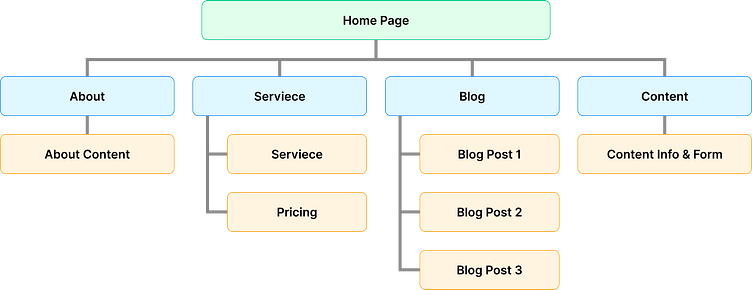
Basic Flow Map
Similar websites, consistency, design and elegance often need to be clearer to navigate and far from mobile-friendly.
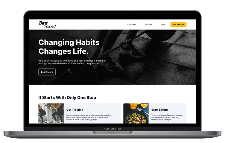
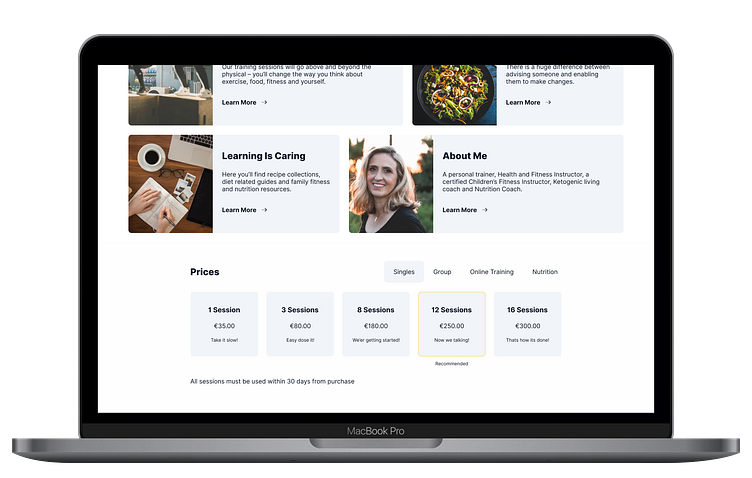
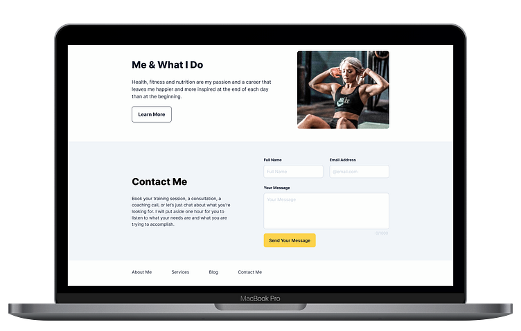
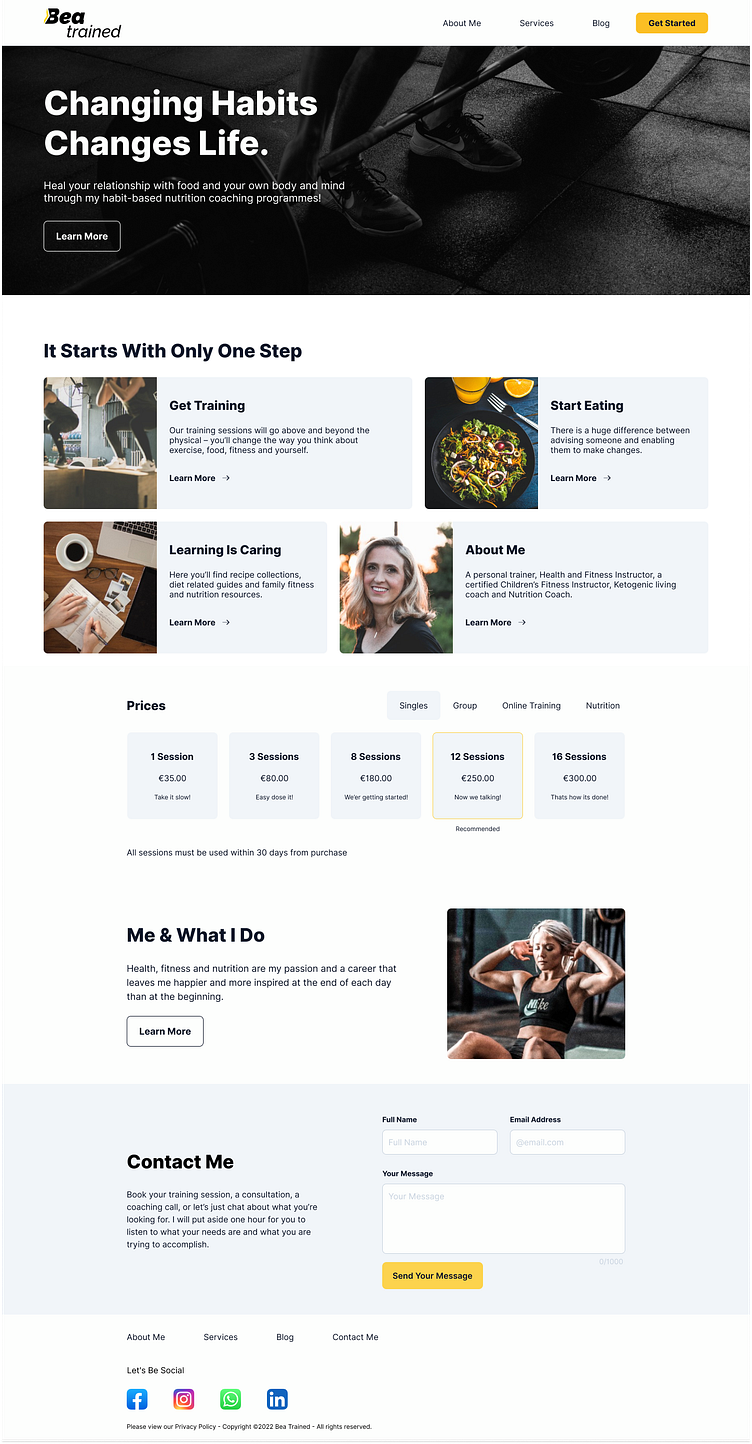
Desktop Home Page
Here, you will see a mock-up of the proposed homepage, which acts as a hub for all the website's main and most important selling points.
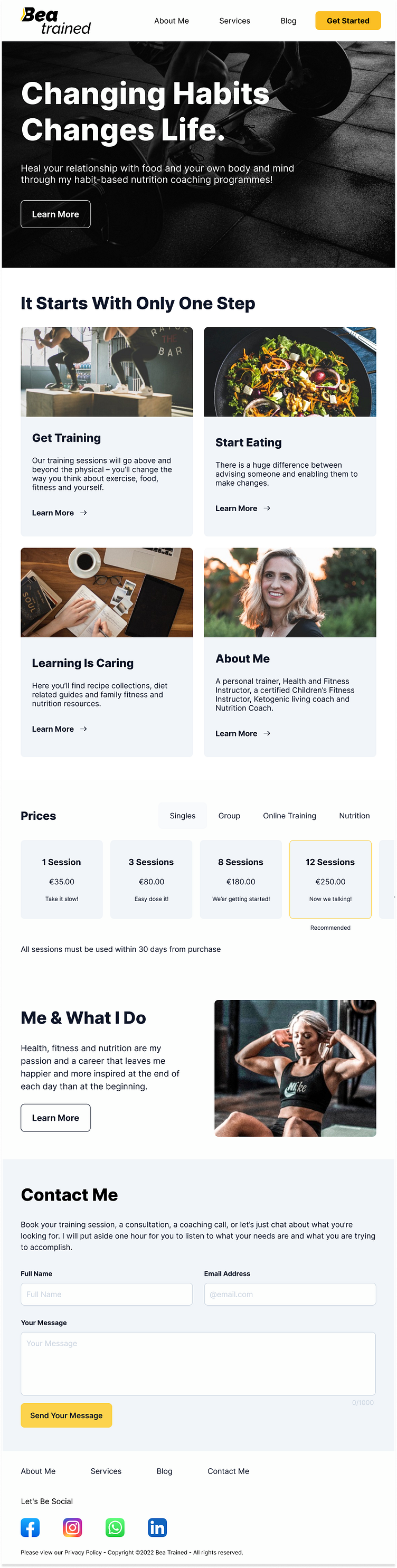
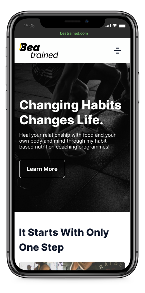
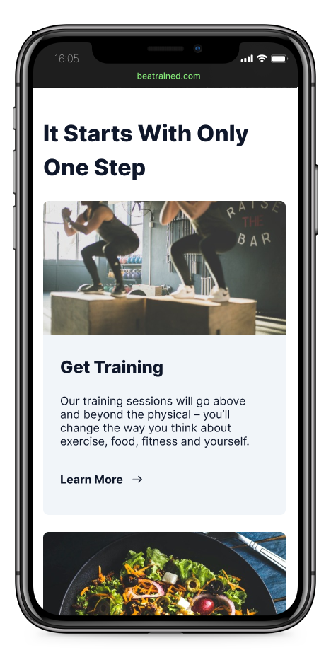
Mobile Home Page
Here, you will see a mock-up of the proposed homepage, which is a hub for all the website's main and most important selling points.
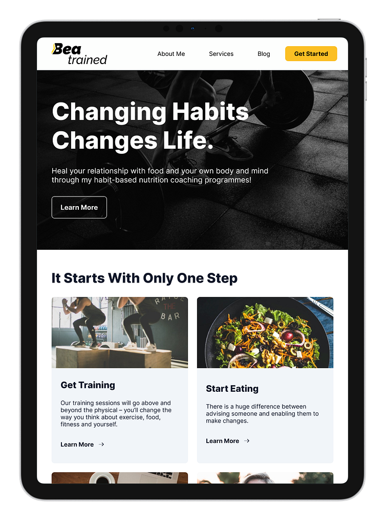
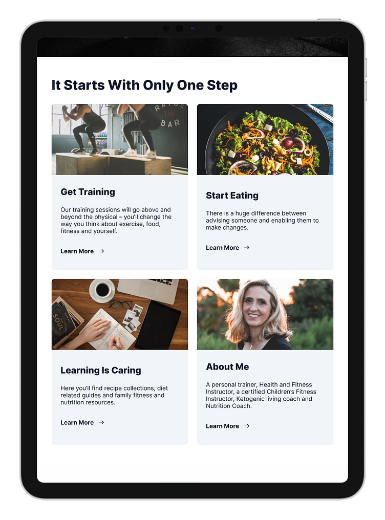
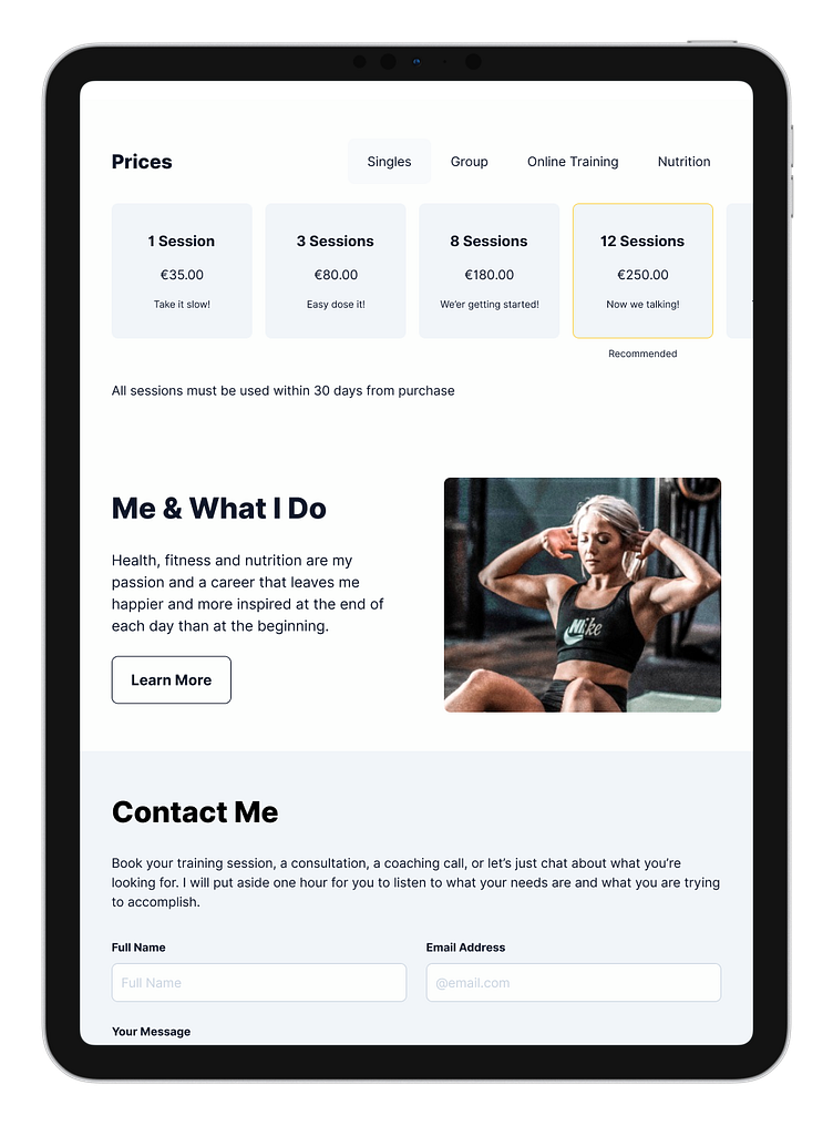
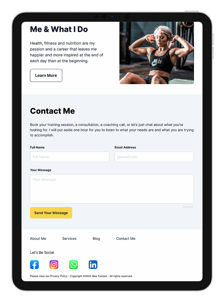
Tablet Home Page
Here, you will see a mock-up of the proposed homepage, which is a hub for all the website's leading and most important selling points.