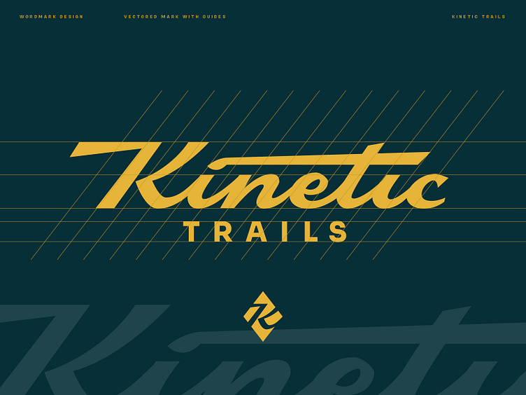
Kinetic Trails Wordmark

Project
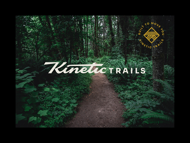
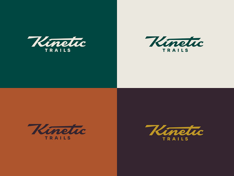
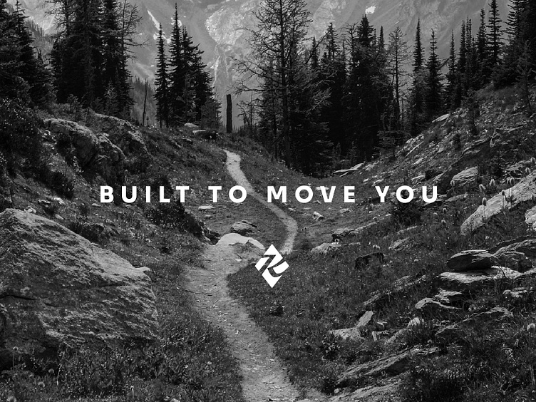
Identity Design for Kinetic Trails - a Colorado company founded by a team of industry veterans who specialize in the construction, restoration, and maintenance of soft surface, aggregate, and hard surface trails and pathways. The Kinetic Trails wordmark is a dynamic script with an even mix of sharp angles and rounded, flowing letterforms. The diamond shape is pulled from trail marker signage, and symbolizes an expert level of efficiency and skill. The color palette uses earth tones, but with a hint of speed inspired by the British racing green.
Interested in logo and brand identity design?


