NFT App Design Case Study ✨ Moon 🌚

Hello 👋 Welcome to my VERY FIRST NFT app design - Moon 🌚
I completed Moon during the Dribble UI Fundamentals Design Course in August 2023. This was my first time diving into a UI Design course and learning how to use Figma to create design systems to help refine, polish and scale designs ✨

The Brief
We were asked to design an NFT app for our client Moon. The objective was to create a well designed app that would grab the attention of design enthusiasts. Something that was forward thinking and would revolutionise the NFT marketplace! - Sounds exciting huh!
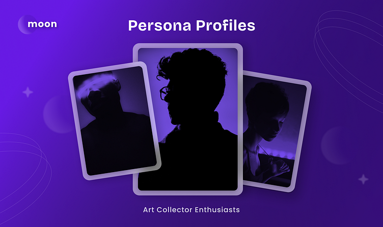
Persona Profiles
When I think of design enthusiasts, the type of profiles that come to mind are Art Collectors, Designers/Creatives, Artists, Influencers and Musicians who range between the ages of 22 - 56. Moon is the app that design focussed people will definitely flock too. These people have a keen eye for great design, and appreciate clean UI and flawless UX experiences.

Timeline
Discovery Phase: After researching the target audience, the next step was to create two mood boards that were tailored to fit the persona profiles.
Creative Phase: From here I chose one of the two mood boards to use as a guide to create my first design. The creative phase is where the initial design came to life.
Components & Scale: Once I was happy with the final concept and design,
I created components and modules which were used to help scale the final design.
Finalise Design: The last weeks were used to finesse the final design - this is where every came together!
1. Discovery Phase - Mood Board
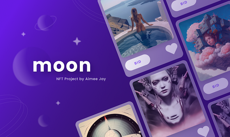
My mood board consists of bright gradient purples. I avoided darker shades to ensure the app didn't feel overly moody and so it wouldn't be mistaken for other NFT apps. The bright colours help bring the app to life, and add a splash of joy in the design. The images in my mood board are clean, sleek and stylish, all of which are ideal for my target audience.
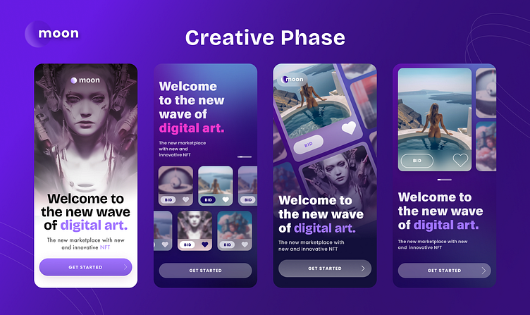
2. Creative Phase - Concept Designs
The creative phase is where I had a lot of fun. This is where I dove into how I envisioned Moon's personality coming to life. I used my mood board as a guide to assist with choosing colours, but the real time was spent exploring layouts and fonts, and how to create a layout that would showcase the large amount of NFT's that are world wide!
If you're wondering what option I went with....keep scrolling 😄
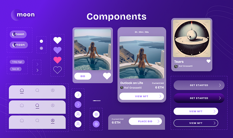
3. Components & Scaling
Creating components and modules helps when you are looking to scale your design and create a functioning prototype!
I aimed to keep my components and modules consistent within the styling I had created, so incorporating a heavy background blur and a white opacity background. Each component has very different functions, but it all looks within the same family.
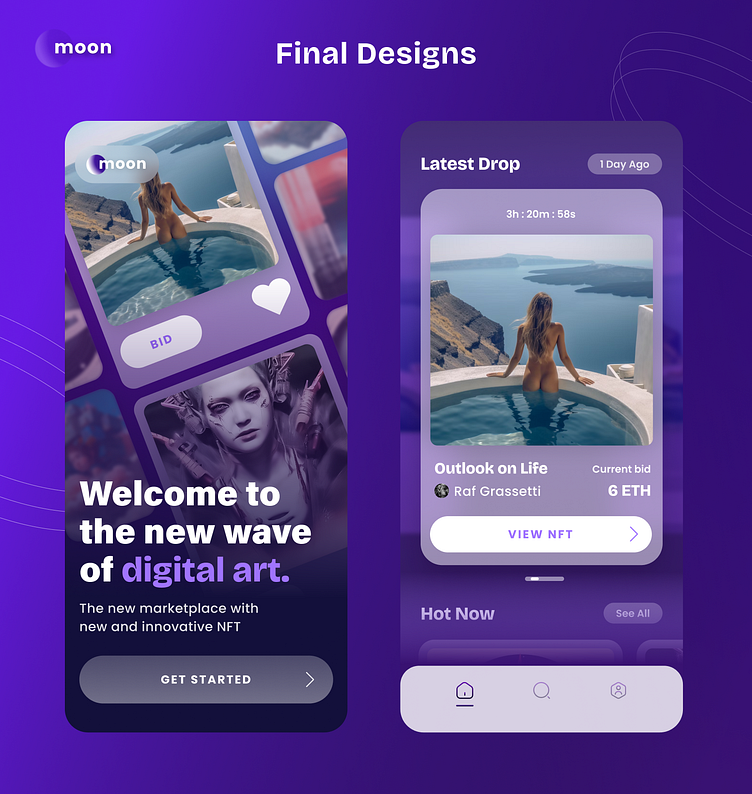

4. Finalise Design
Over the course of five weeks, we have successfully completed our UI Design journey, and created a presentation of the final design.
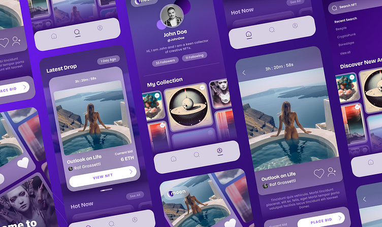
I chose the angular grid layout for the splash screen to showcase the large number of NFT's available to everyone worldwide! Once I had chosen my final concept, it was time to use the fonts, colours and components to scale my design.
I wanted the app to feel clean and sleek, and have full focus on the artwork. This intention allowed me to create frames and boarders for the artwork that were clean and simple, and an app layout that really allowed the artwork to POP.