Guideline Design System component spacing specifications


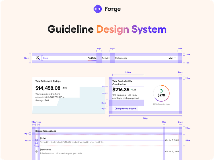
Guideline's 2020 rebrand called for a Figma-native design system, uniting their design language across their products and properties.
🎨 Design Foundations: We built a versatile design language based on #designtokens. Starting with color primitives, we created semantic palettes for various use cases and contexts then created design tokens for grids, sizing, spacing, radius, and more.
🛠️ Component Library: We prioritized the most used components, like buttons, and then combined them to create more complex components, patterns, layouts, and templates.
🚀 Pilot Exploration: To test the system, we recreated existing product interfaces, giving us key insights into how to refine styles and enhance user experience.
📚 Documentation & Training: We created design guidelines, conducted live training sessions, and recorded "how-to" Loom videos to foster the adoption of the new system. We're so proud of this project.
More cool projects in our profile
Follow Forge Studio on Twitter and LinkedIn
Looking for research and product design? Let us know at https://www.forge.is


