Speakeasy Brand Pattern

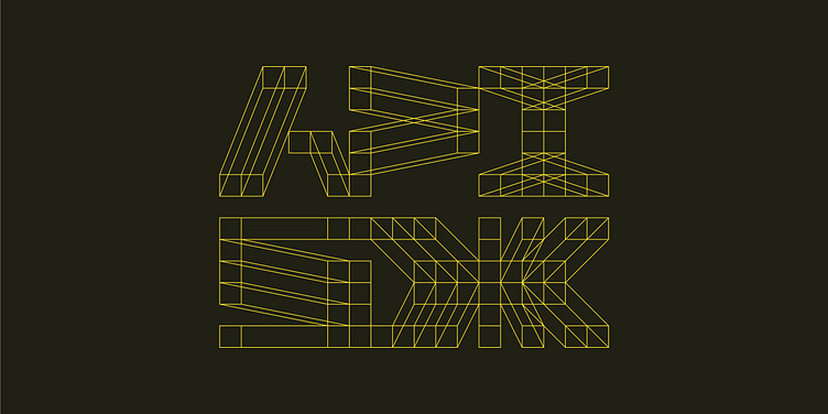
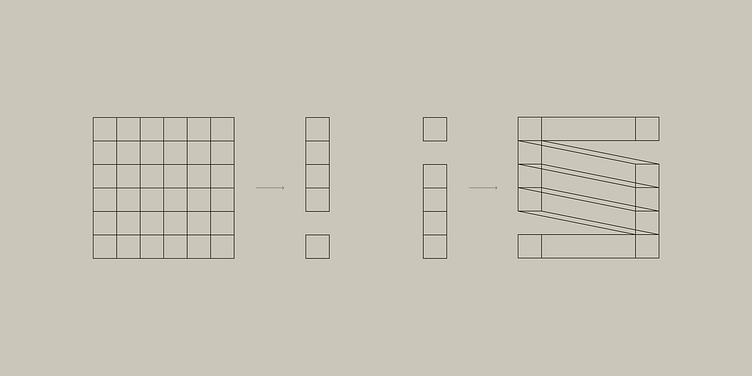
During an earlier round, we explored wireframes as a concept and pushed that idea further for Speakeasy’s visual language. After all, Speakeasy at its core is about creating, managing, and consuming APIs — a highly technical and complicated endeavor — allowing developers to do so with better, more streamlined communication. We took a step back and started with a clean 6x6 grid, then began designing secret letterforms according to our grid.
Nothing calls to mind the concept of a speakeasy quite like a hidden, coded language. 🤫
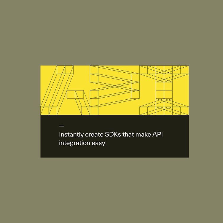
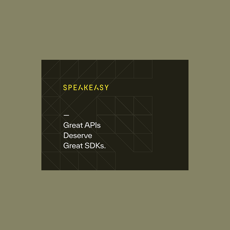
The wireframe characters can be scaled and cropped, or grouped together to include a hidden message in a composition. They can be used at high contrast as an intriguing, innovative, and prolific visual. Or they can be used more covertly with low contrast to create more of a textural background effect. Doing so also creates a nice grid structure within which to house content.
View the full case study: https://odibrand.agency/work/speakeasy
---
Looking for a brand agency? We would love to hear from you.
Email us: hello@odibrand.agency
Our Website / Instagram / LinkedIn / Twitter