Creative Mind — Courses Platform Website


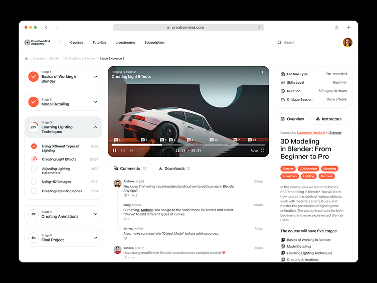
Educational platforms are usually packed with data, so we go for white as a primary color with hints of orange for tags and little details. This decision keeps the interface neat and helps the students navigate the platform. We place the video lesson in the center as it is the main source of information. Other data like stages is hidden under drop-down lists and tabs. As a result, the UI is not overloaded with info, and the students focus on the learning process.
Let's work together!
design@shakuro.com
Discover more about us at shakuro.com


