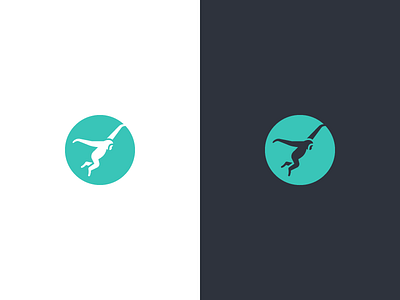
Gibbon.co Logo


The final version of new logo I did for Gibbon. I received a lot of solid feedback from the client and community on the previous version.
Changes:
- Tiny tweaks to the overall shape of the gibbon. Not a big deal though.
- The version on white is now a solid shape in a stroked circle. This makes the gibbon feel stronger.
- I made specific tweaked version for usage on smaller sizes.
Better? :)